


Archtober lounge 
In previous years CFA remade its street-level Margaret Helfand Gallery into the “Archtober Lounge,” but an analysis of production costs suggested expenses were out of step with visitor utilization. This led the client to mandate lower costs as well as increased audience engagement.
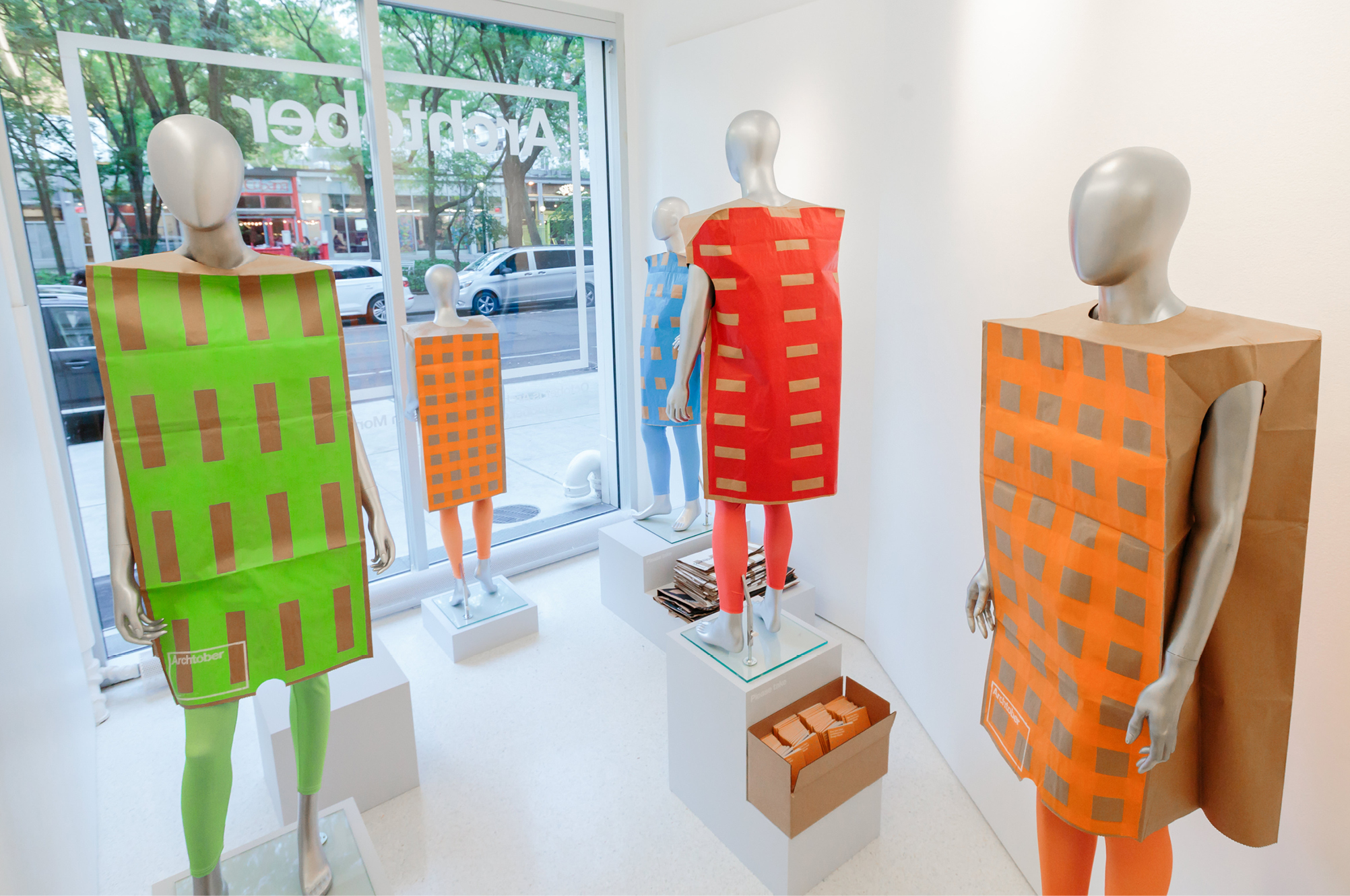
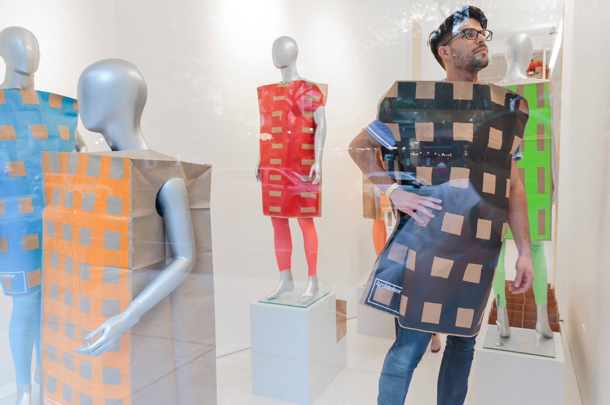
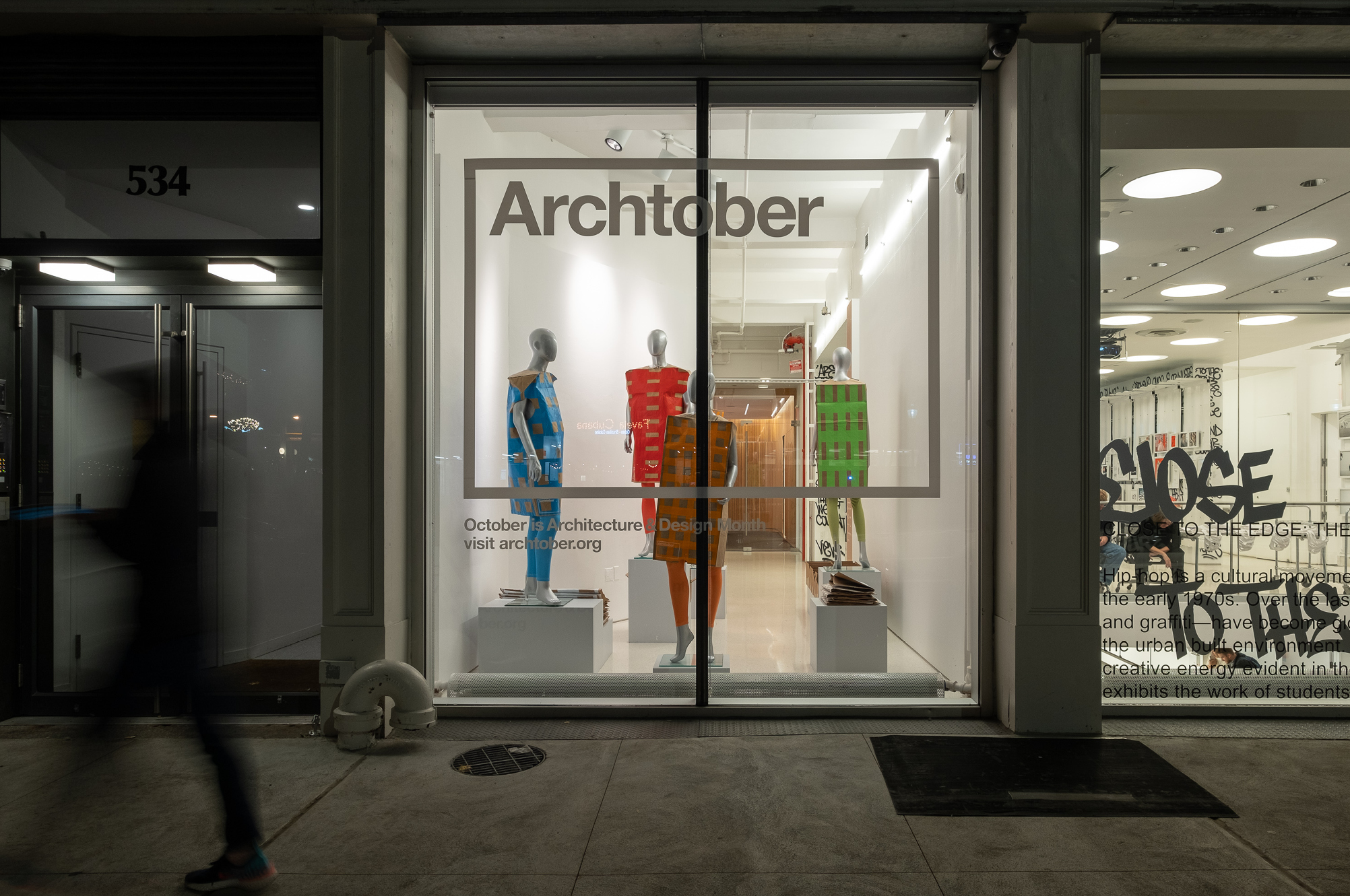
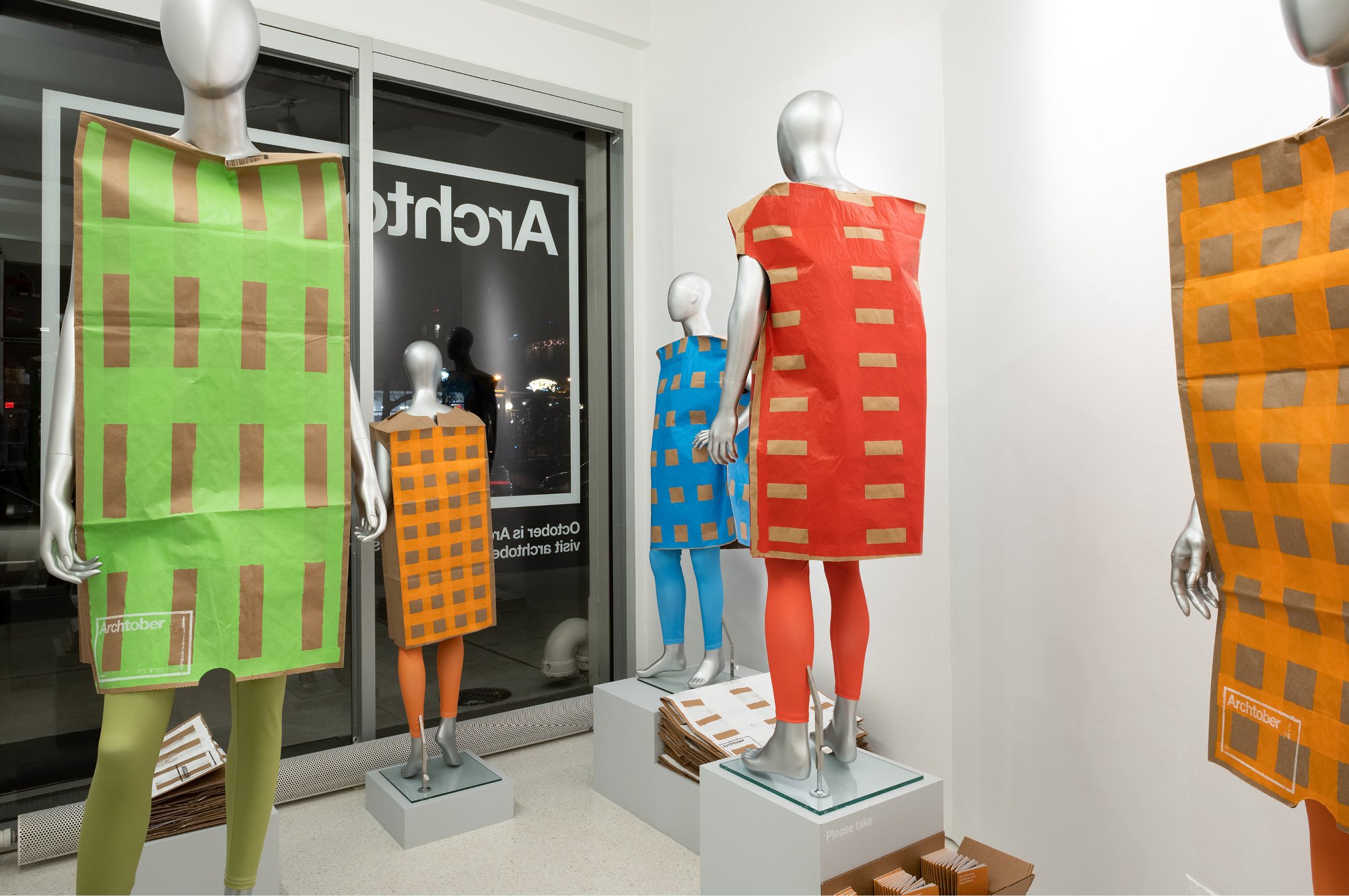
MTWTF reimagined the gallery space as an invitation. Passers-by encounter silver mannequins through the Center’s oversized windows, their colorful, boxy forms set against plain white walls. Coming in off the sidewalk, visitors are immersed in the display. As they move among the figures, they can to pick up a free postcard, put on their own play sack, pose for a selfie…. They become part of the festival.
A crowd of silver mannequins wearing the patterned playsacks occupies stands of varying heights. Each figure faces a different direction. Cardboard boxes placed on the floor contain event listing booklets, “building of the day” postcards, and playsacks. Vinyl signs encourage visitors to “Please Take.”
Client: Center for Architecture
Archtober strategy and identity
The CFA commissioned MTWTF to reimagine Archtober. The Center hoped to expand participation and engage a future audience by speaking directly to young New Yorkers.
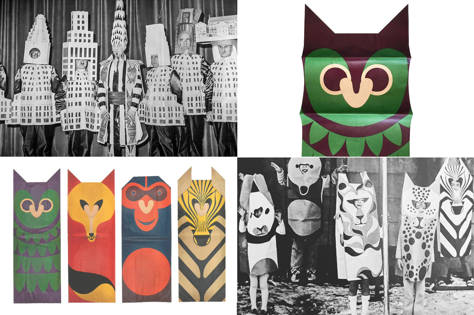
MTWTF encouraged active audience participation in the festival by introducing strategic elements of play. Two images served as inspiration: the 1931 Beaux-Arts Ball, where architects and developers donned cardboard costumes modeled on the city’s latest skyscrapers, and the 1967 release of Fredun Shapur’s Playsacks, where large paper bags printed with animal features transformed children into wild creatures, stimulating imaginative play.
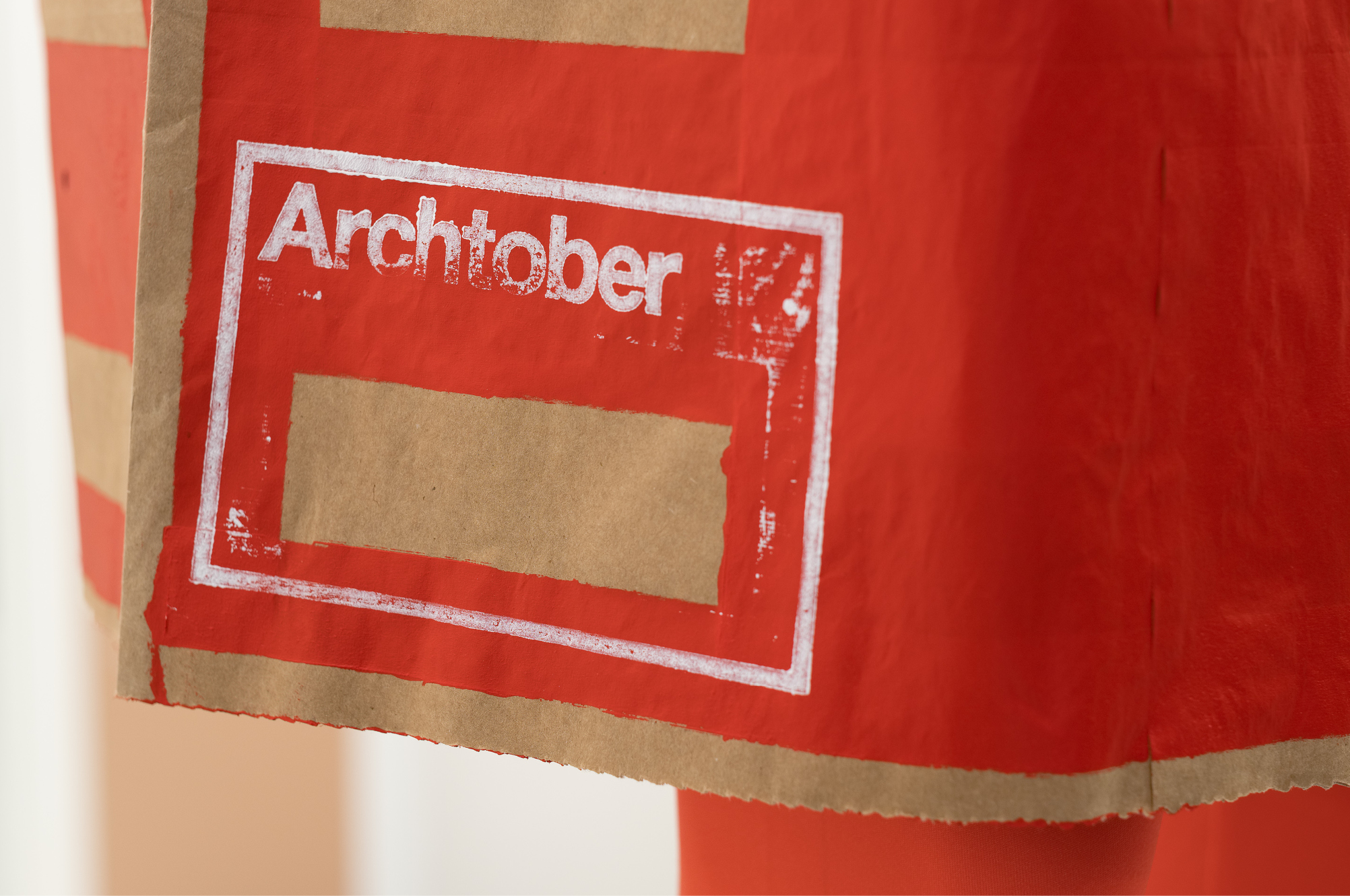
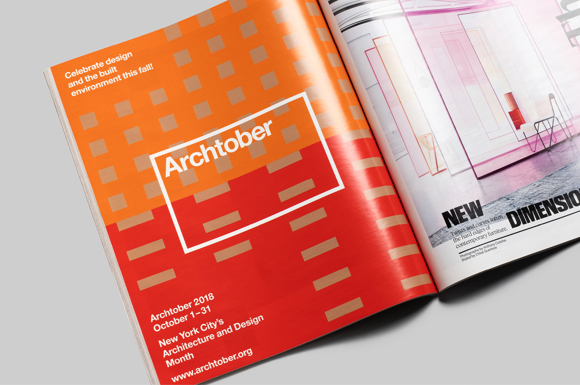
MTWTF’s design centers on brown paper playsacks emblazoned with colorful building facade patterns. Fitted on mannequins, their display acts as a visual prompt to encourage festival goers to inhabit architecture literally and engage it figuratively, through imagination. The vivid color scheme and grid patterns of the play sacks provide the graphic identity for the festival’s multi-channel collateral.

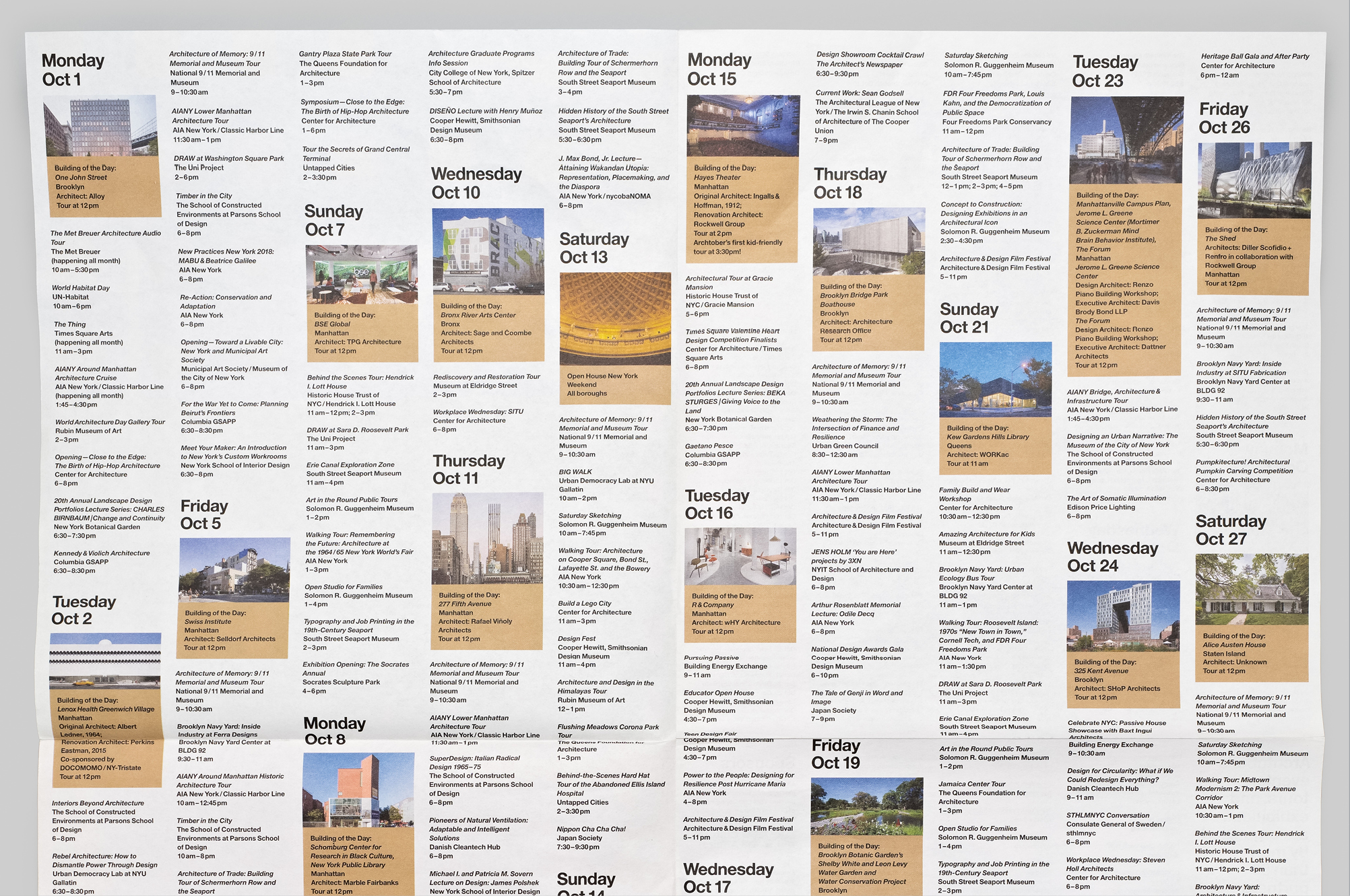
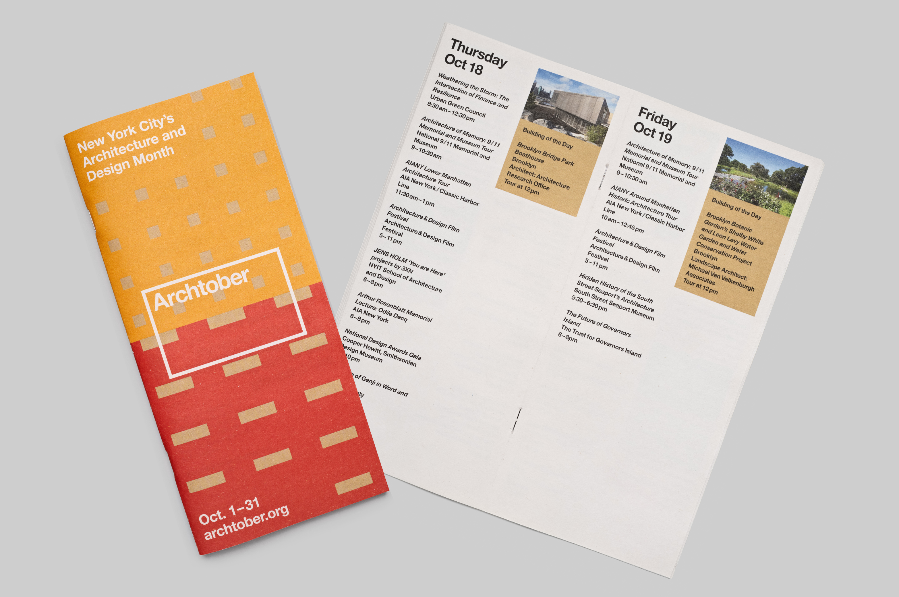
Archtober collateral
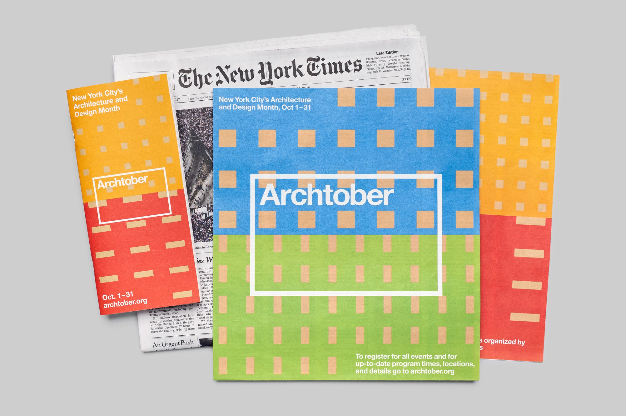
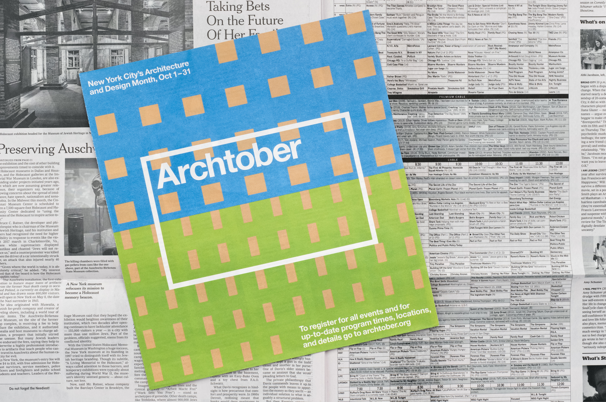
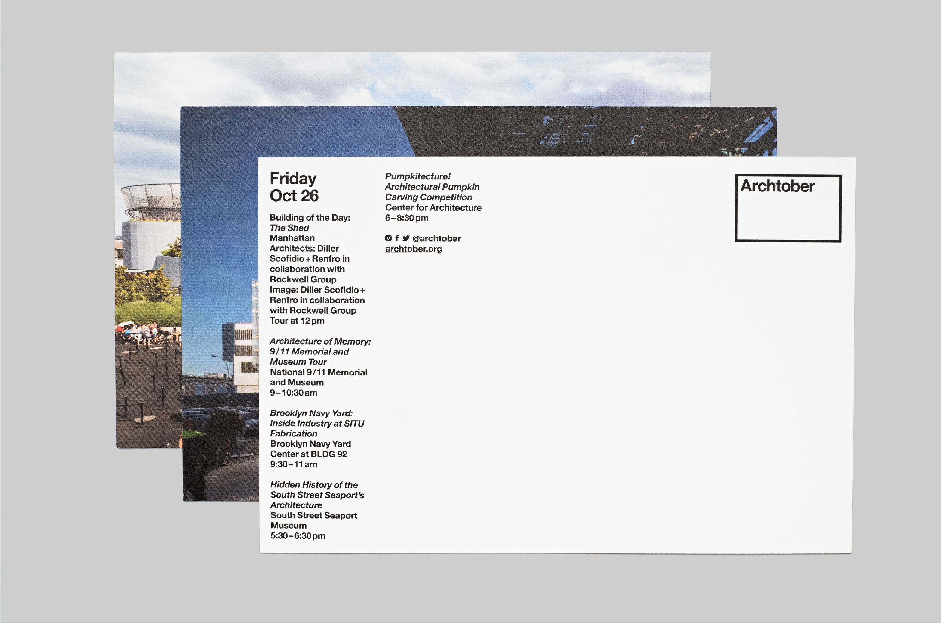
CFA’s hope in commissioning new Archtober collateral was to communicate more clearly than in previous years about the festival’s complex schedule of events, using media allowed by its limited funding.
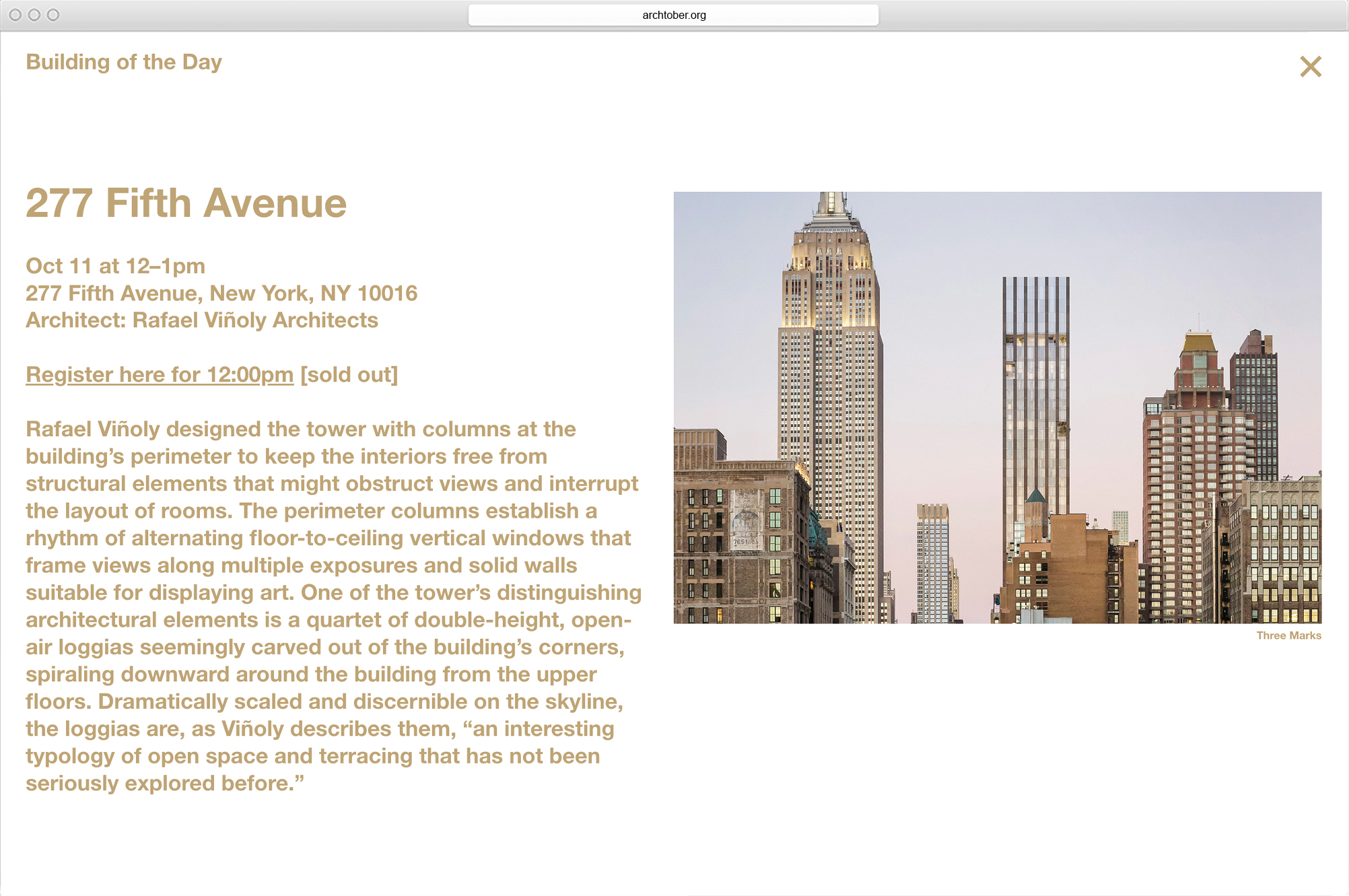
MTWTF prioritized event listings and “buildings of the day” in its print collateral. In order to clarify the festival’s structure and present information in an actionable way, MTWTF stripped away excessive design motifs and extraneous text elements, cross references and redundancies.
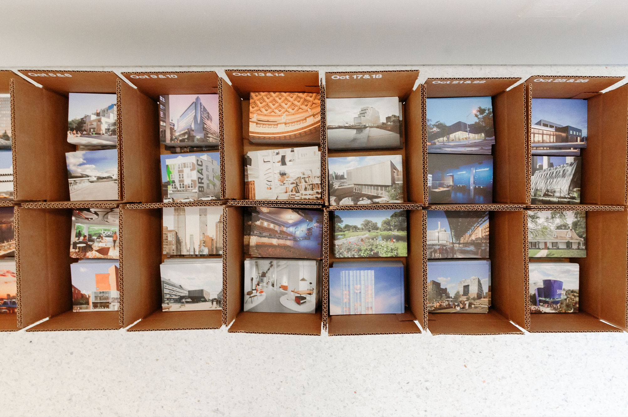
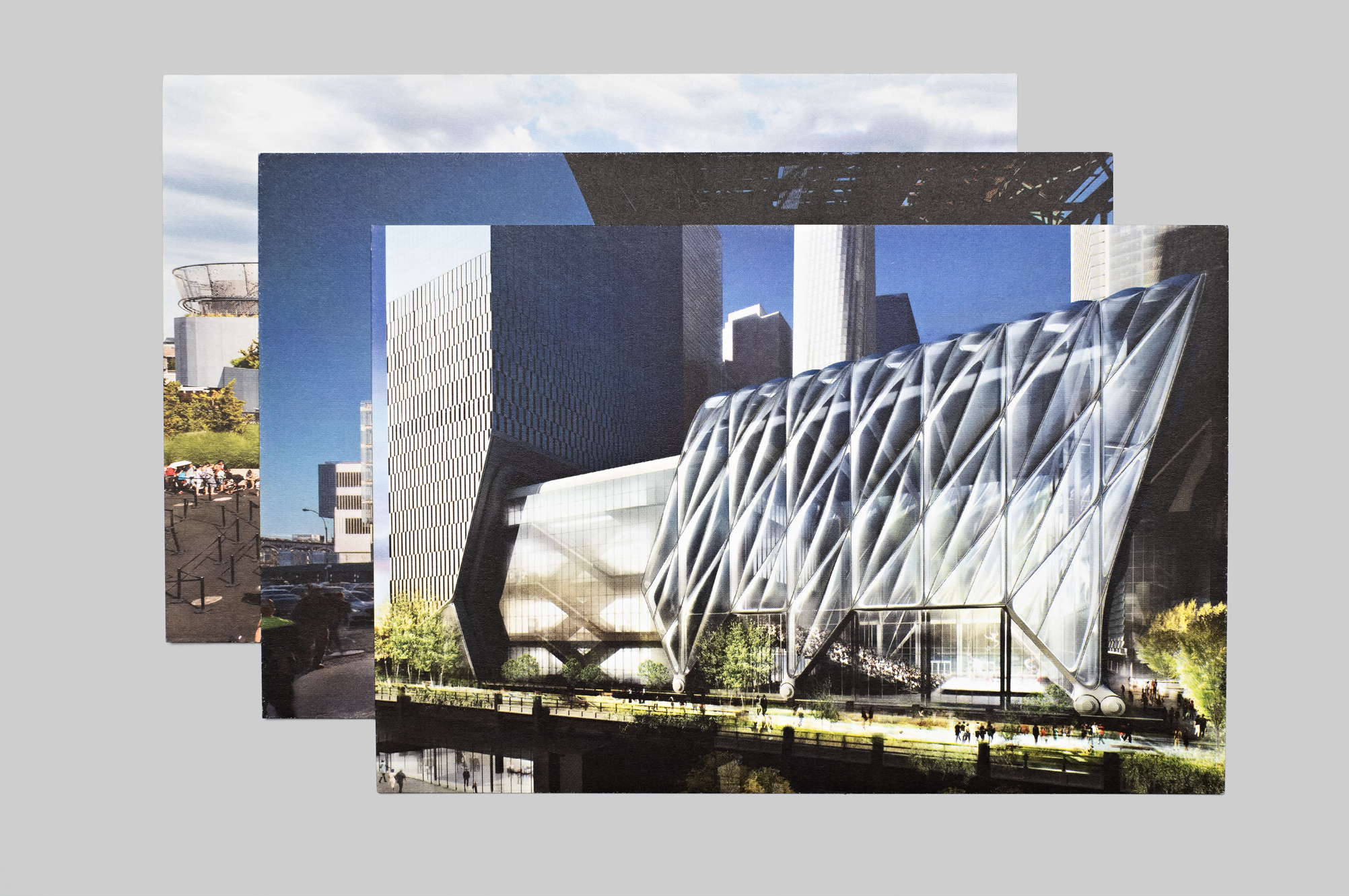
Festival guides take the form of pocket-sized guidebooks. They feature one day of events per page. A NYTimes insert features a bold, colorful cover and a list of events organized by day. A photograph of each “building of the day” appears inside. Archtober advertisements pair direct language with colorful facade patterns as a way of targeting viewers new to the festival. Thirty-one takeaway postcards present full-bleed images of each “building of the day.” Information about the building and associated events appear on the back.
Client: Center for Architecture
Brochure printing: Shapco
Archtober microsite
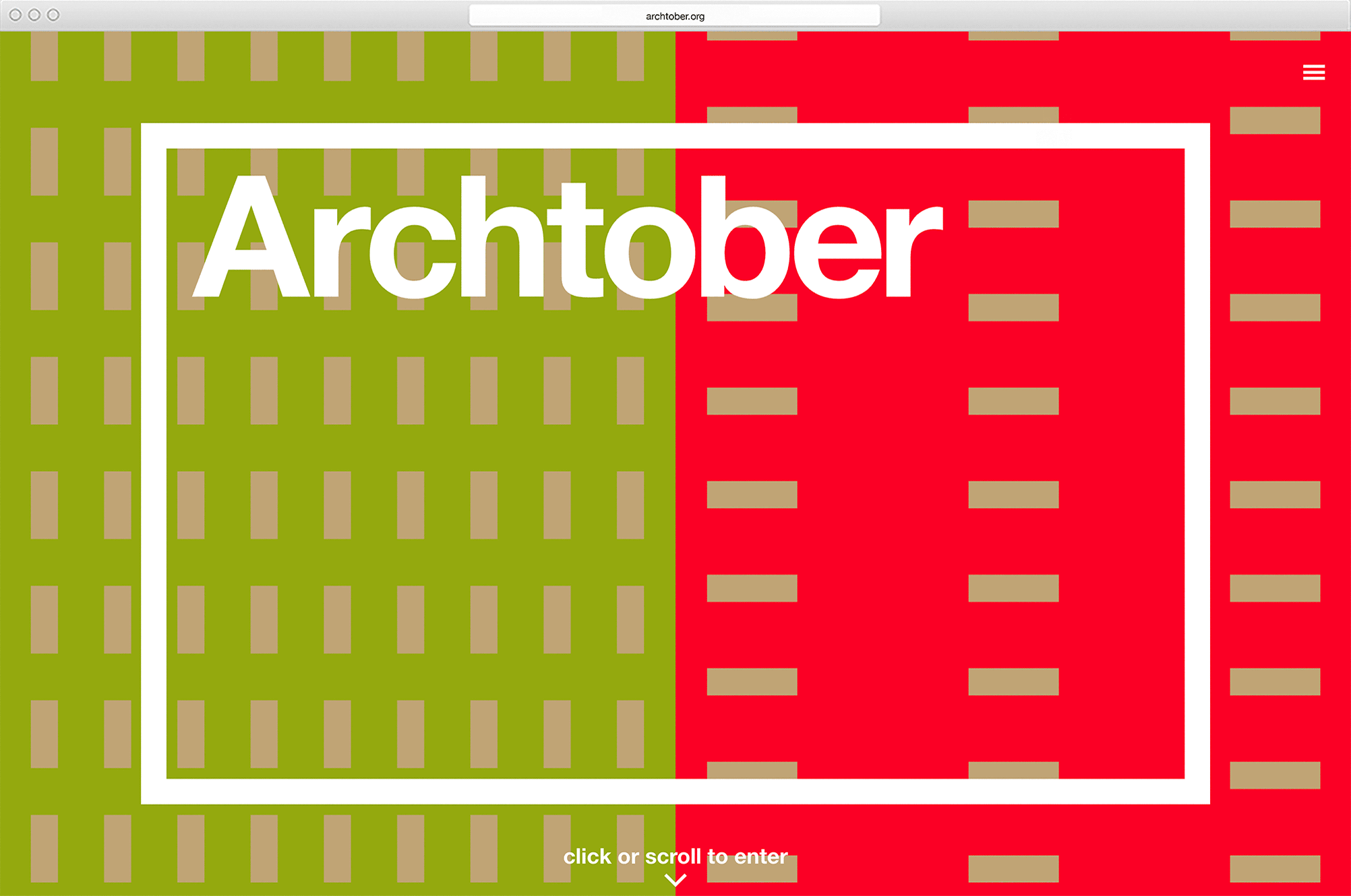
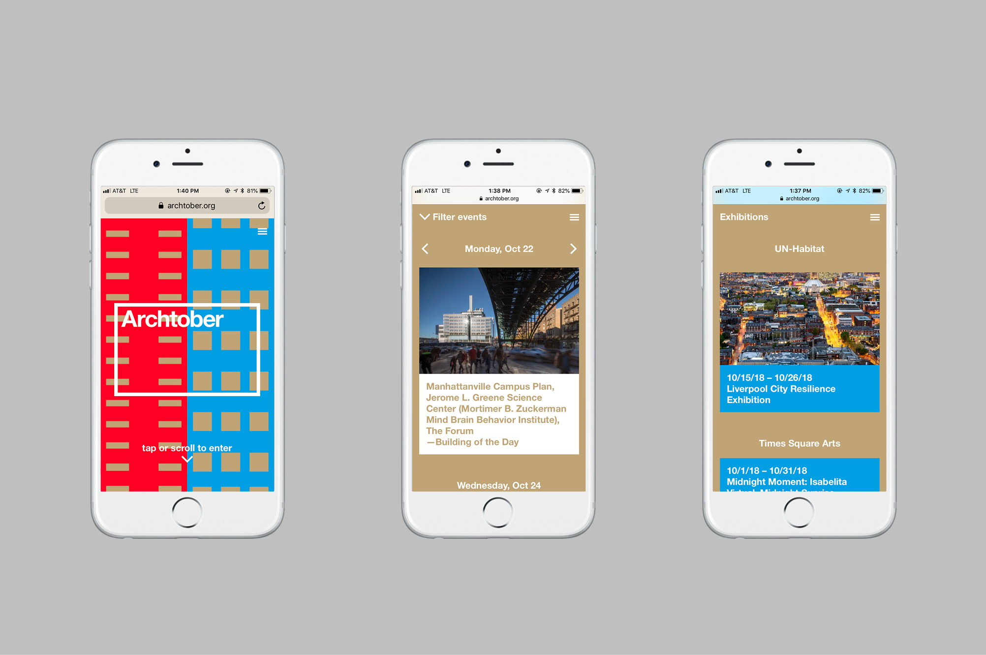
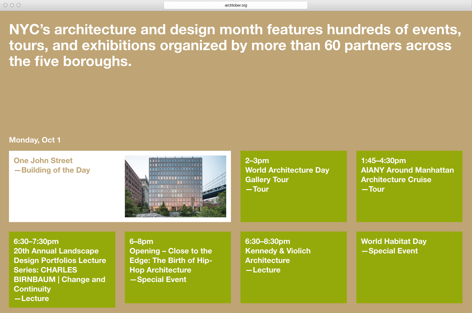
CFA’s goal for the 2018 Archtober Design Festival microsite was to simplify its operation and improve the user experience by connecting potential attendees directly with the host institutions of each event, where they could ask questions, obtain tickets, and receive program updates.
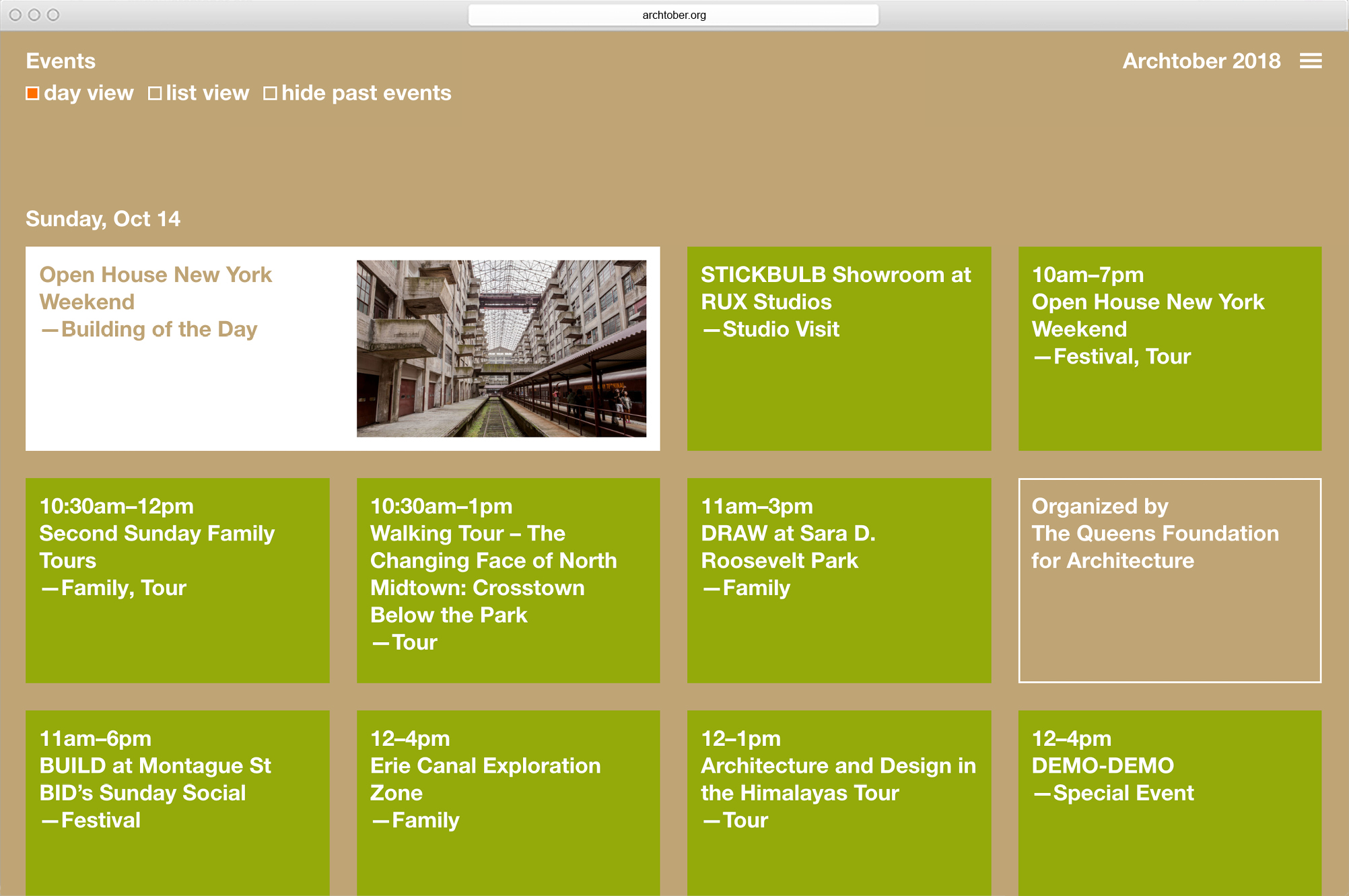
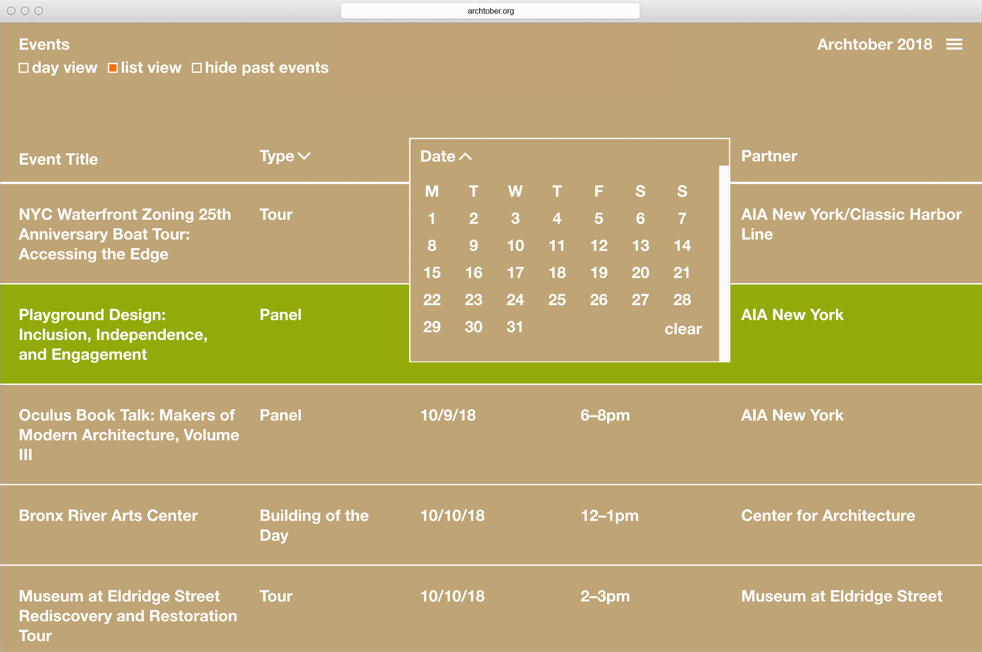
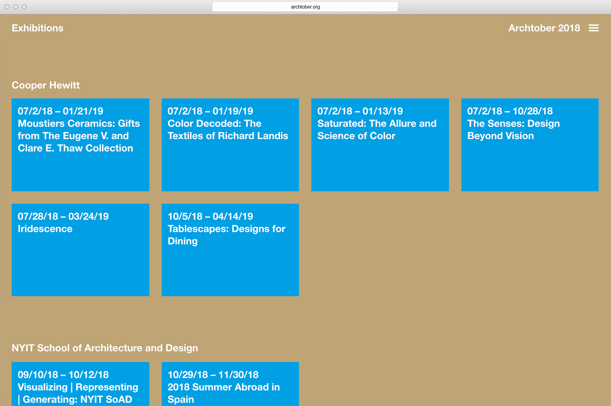
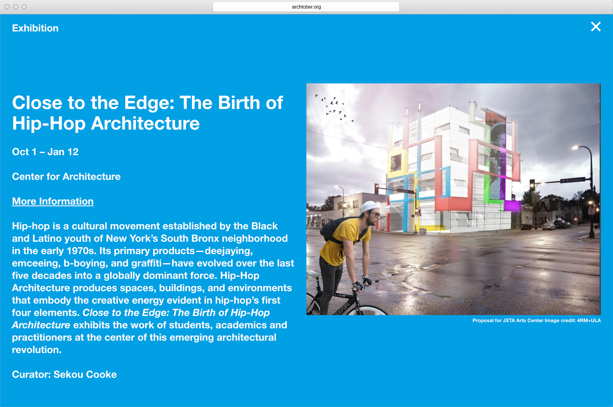
MTWTF’s idea was to sharpen the microsite’s focus on event listings by simplifying its structure and navigational system and removing unnecessary page types. Linking events to their host institutions’ websites reduced the amount of information necessary to present. The resulting site is shallow: everything can be readily accessed by clicking on visible options.
The site uses a color palette derived from the festival’s playsacks. Events and exhibitions appear in blue as a visitor enters the site. Backgrounds are assigned white or paper-bag brown. Orange is reserved for highlights. Users can choose to view event listings in either grid or list format, sorted by date, event type, or location.
Client: Center for Architecture
Web development: Corey Tegeler