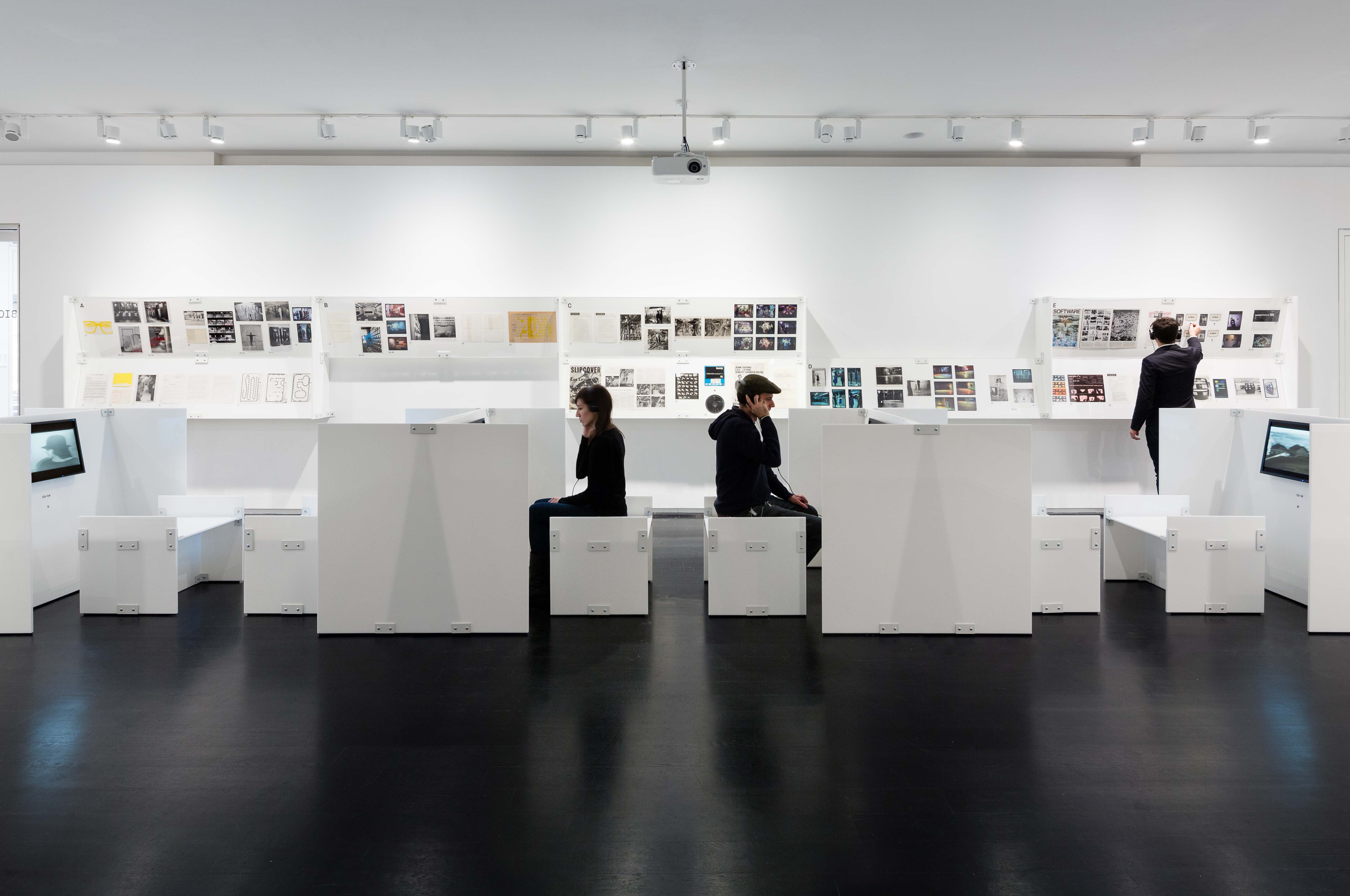
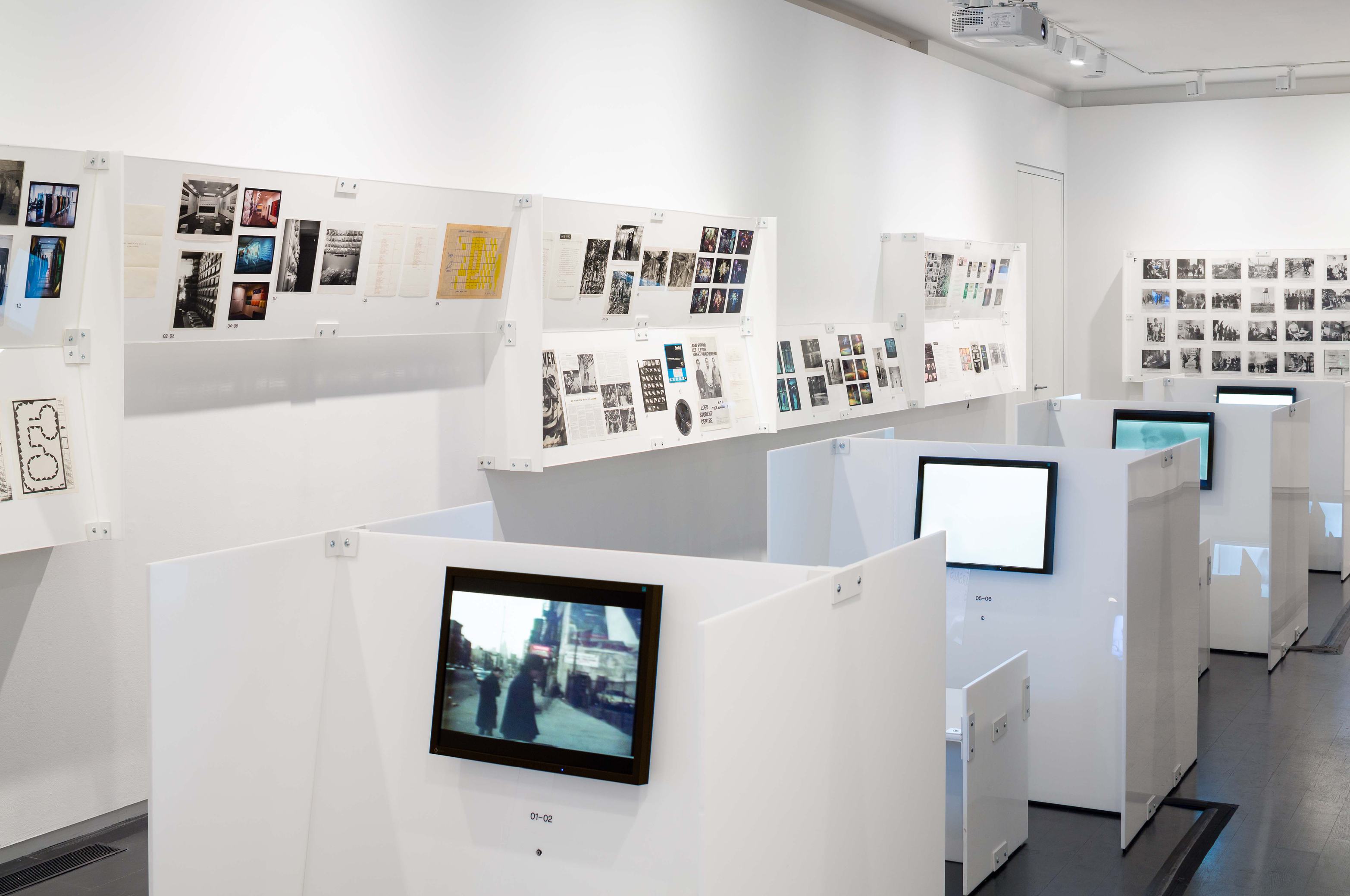
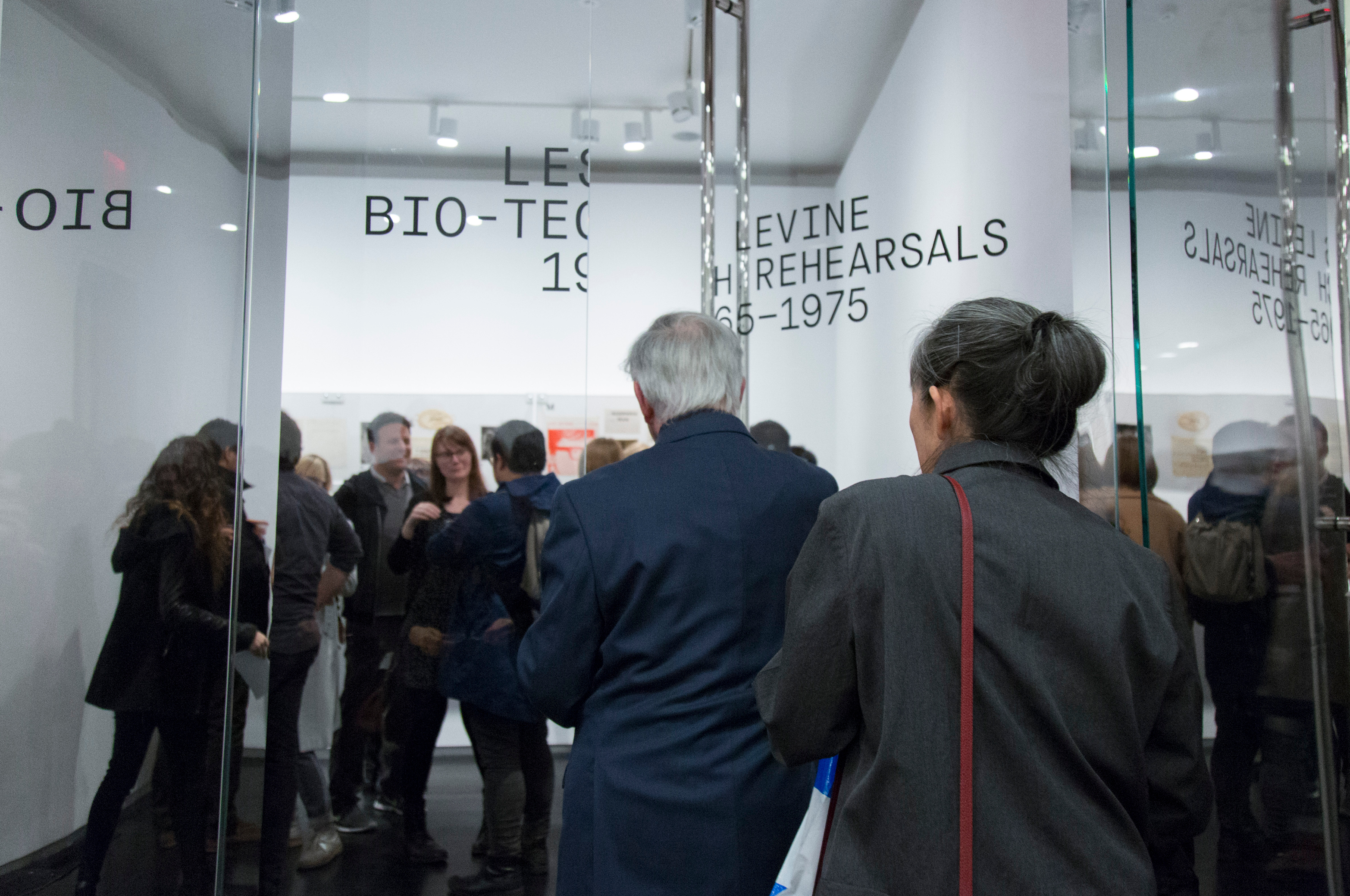
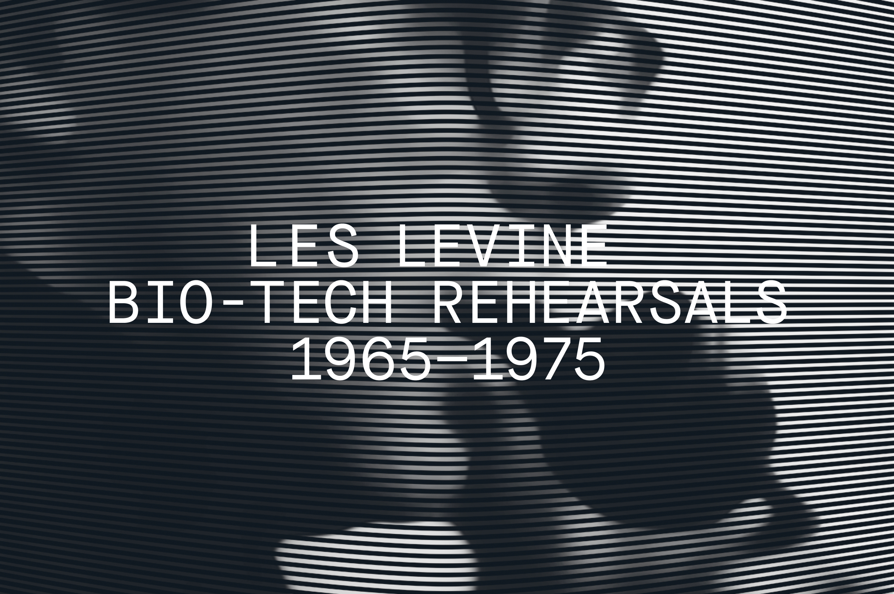
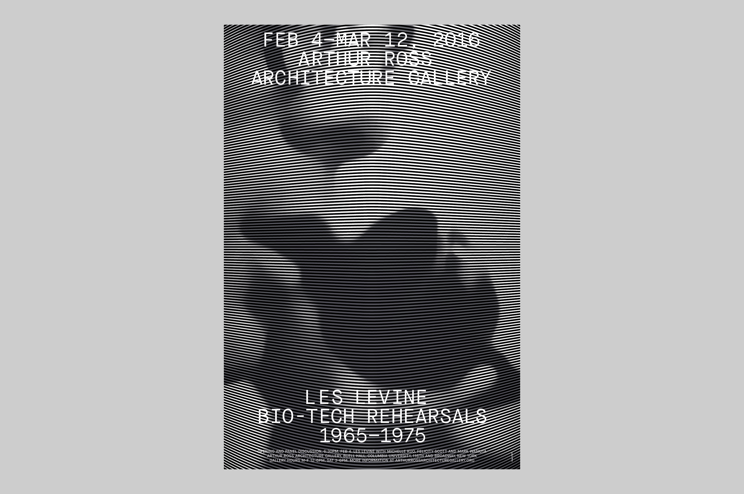
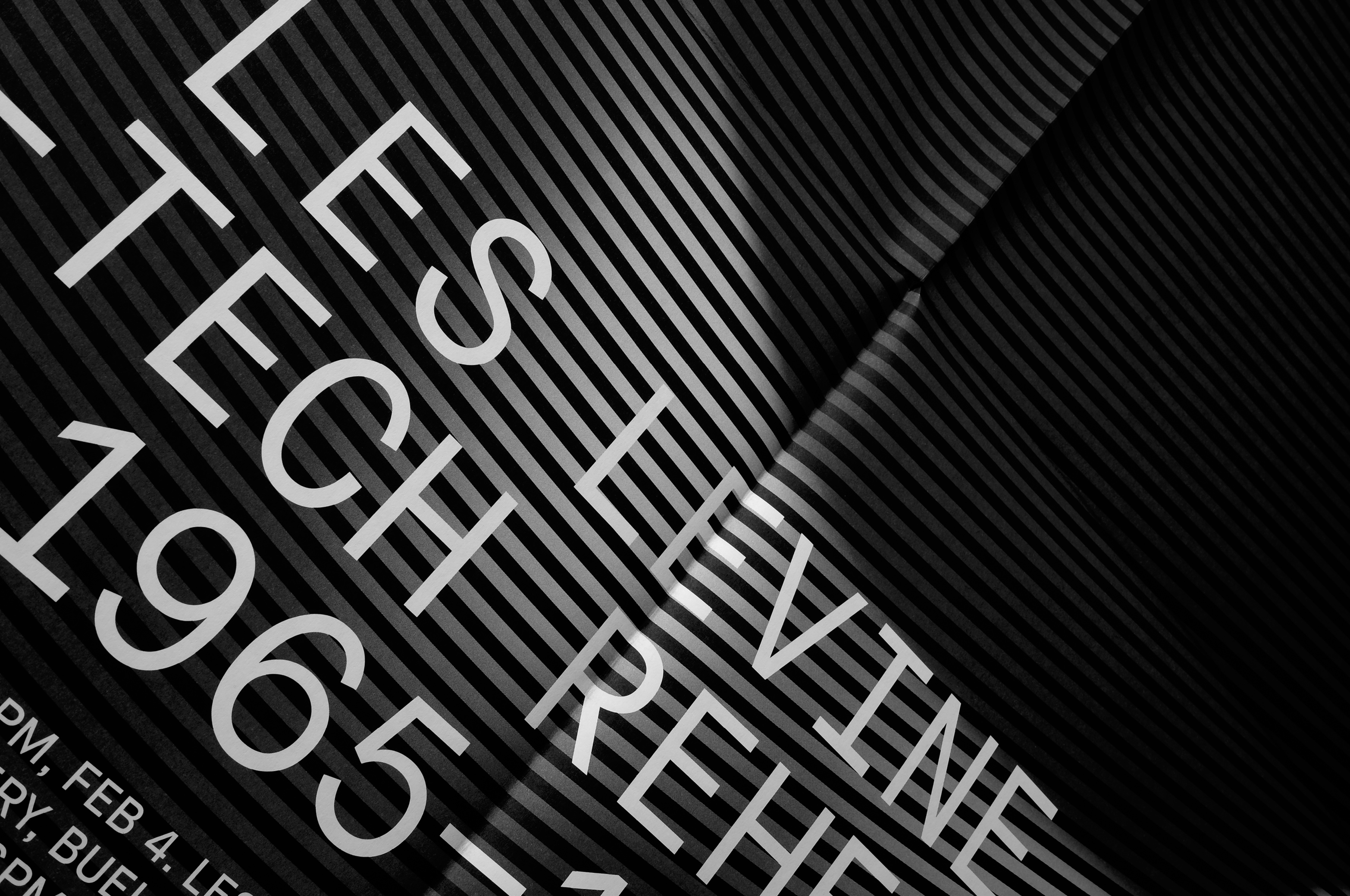
Les Levine: Bio-Tech Rehersals 1965–1975 
Curators: Felicity Scott and Mark Wasiuta
Assistant Curators: Adam Bandler and Florencia Alvarez
Exhibition design: Adam Bandler and Mark Wasiuta
Curators: Felicity Scott and Mark Wasiuta
Assistant Curators: Adam Bandler and Florencia Alvarez
Exhibition design: Adam Bandler and Mark Wasiuta
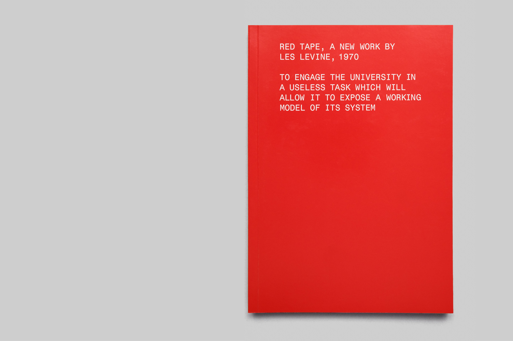
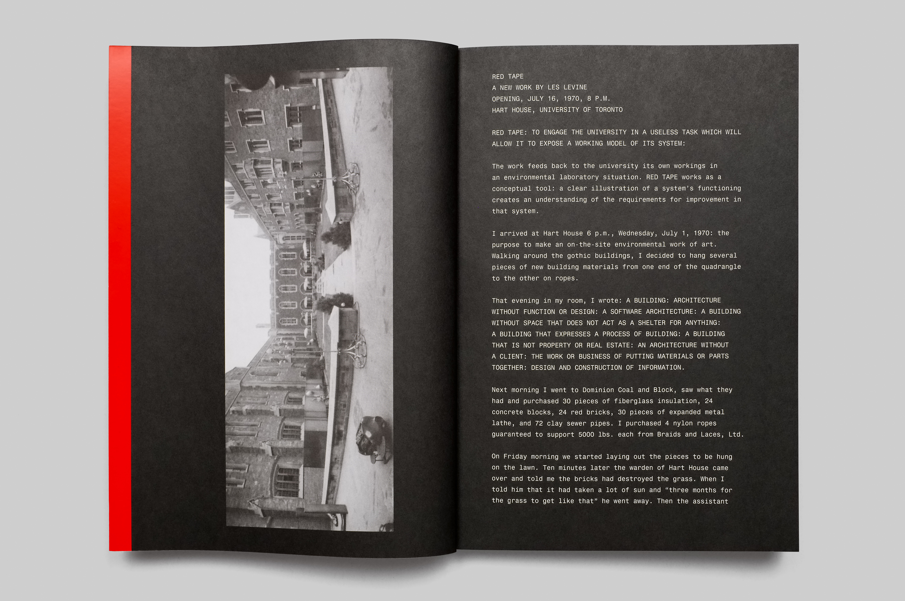
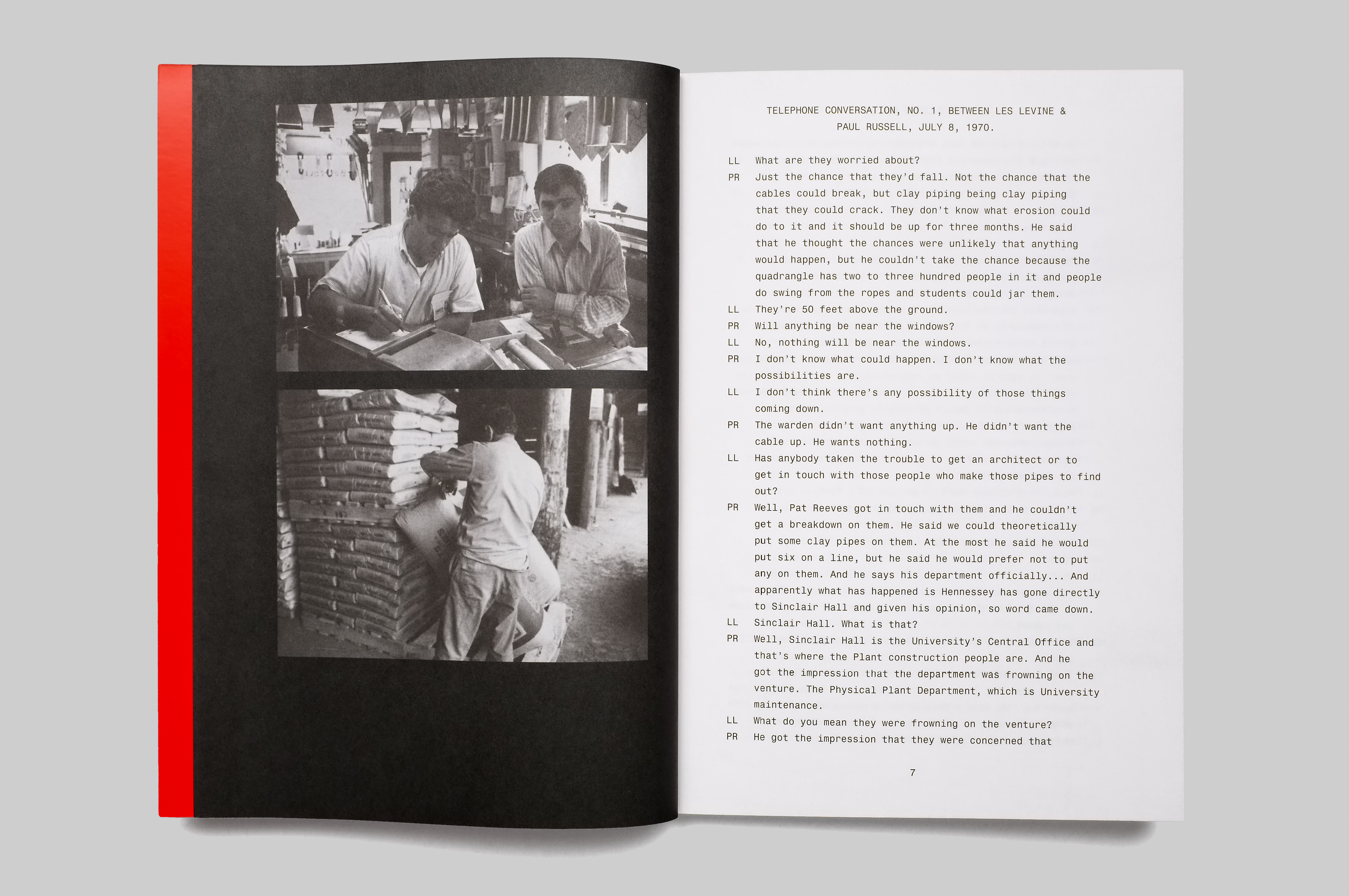
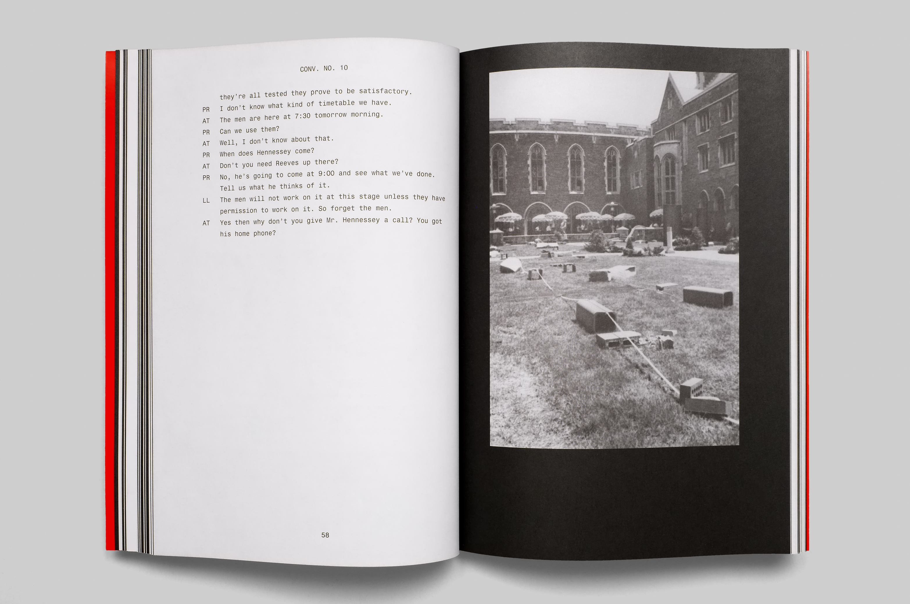
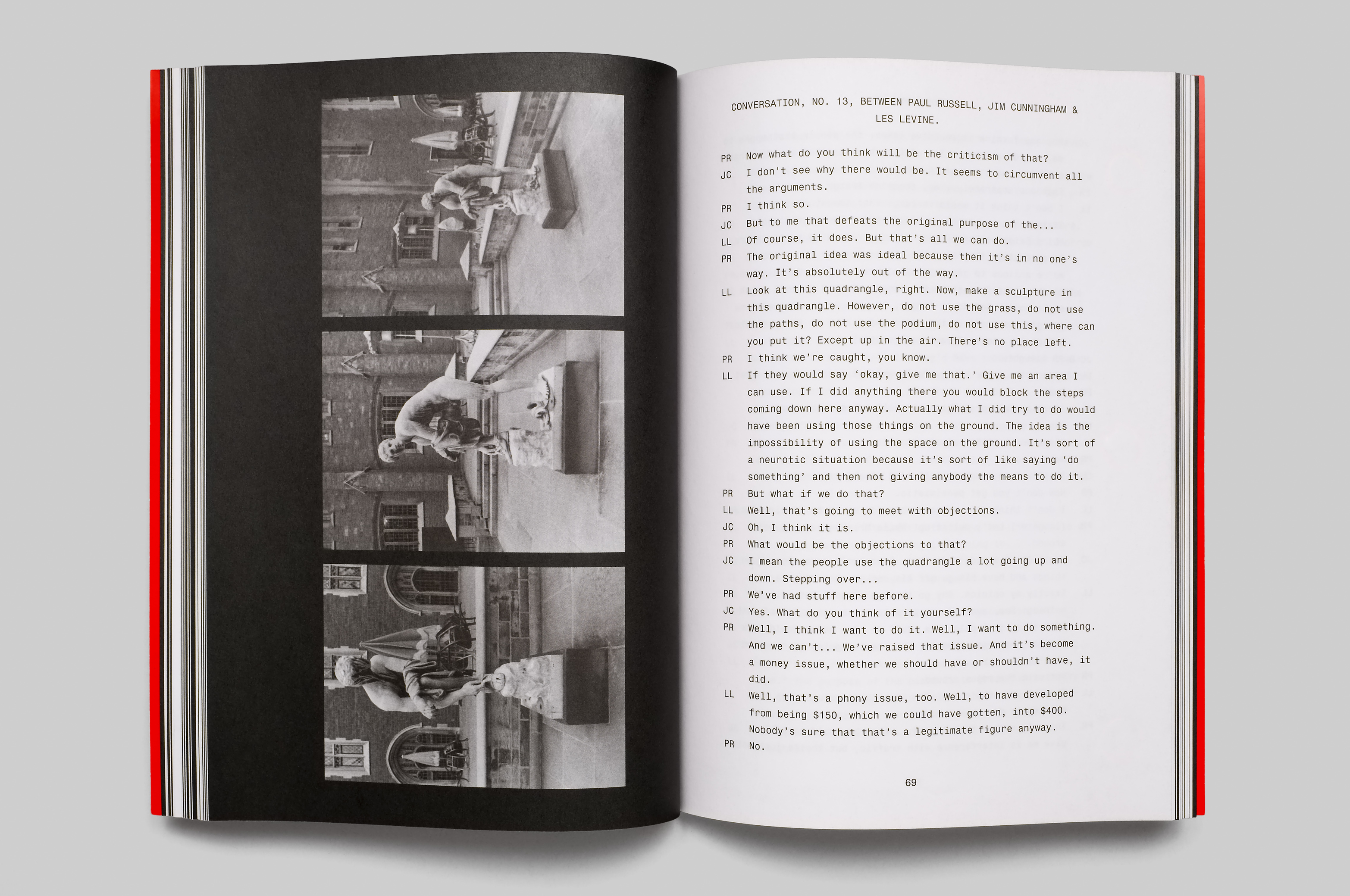
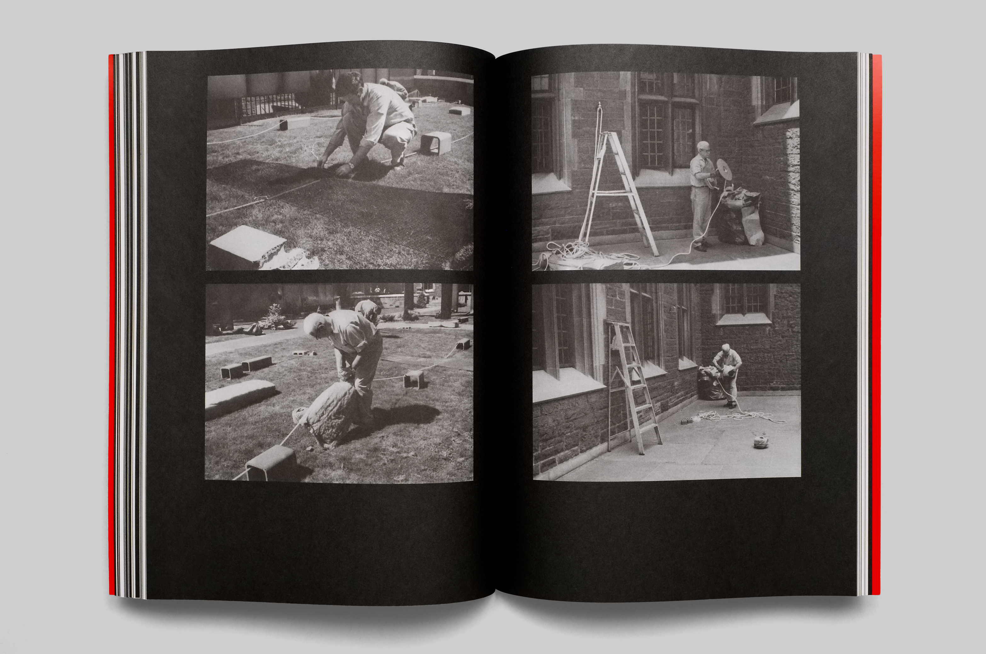
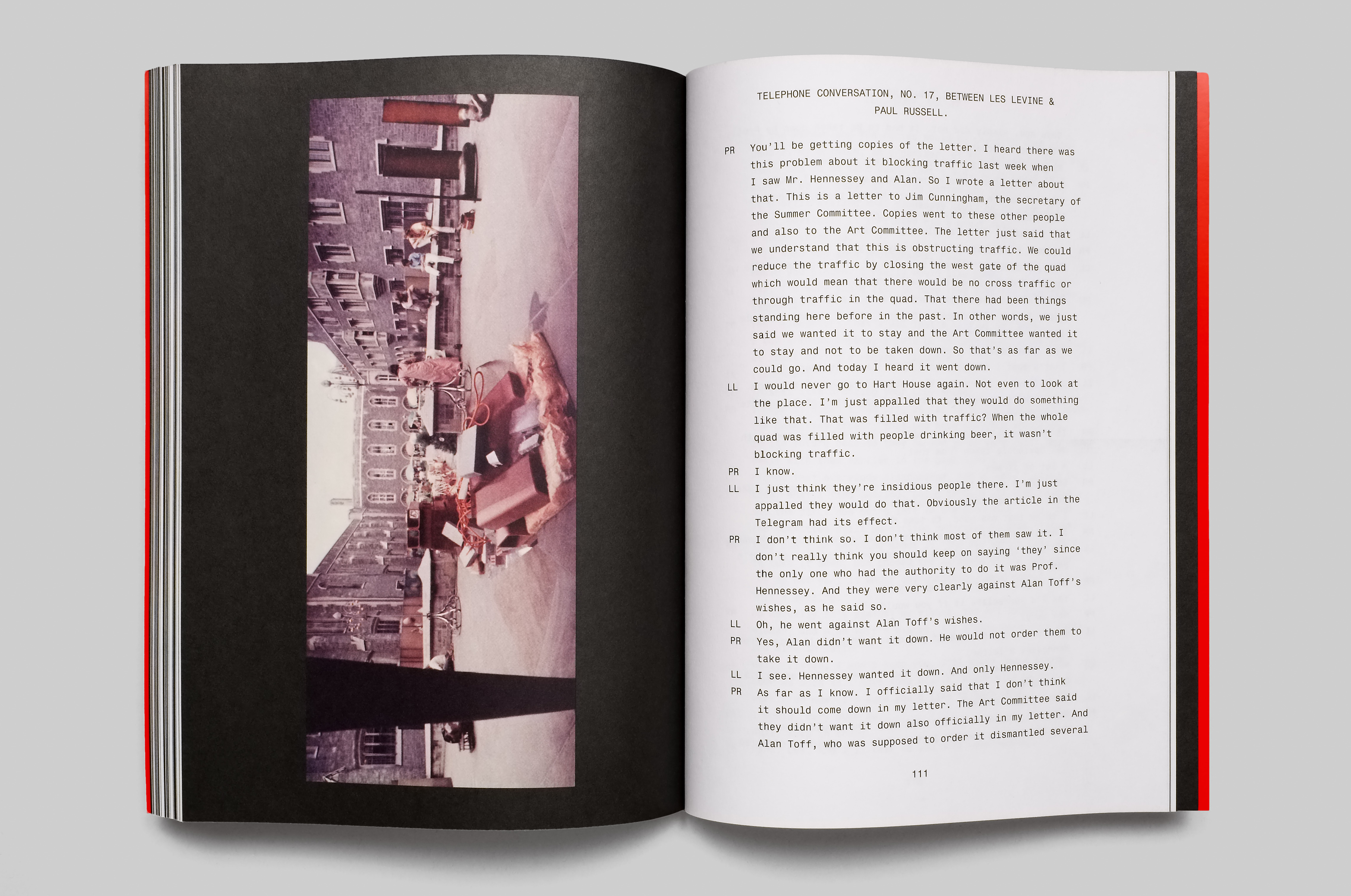
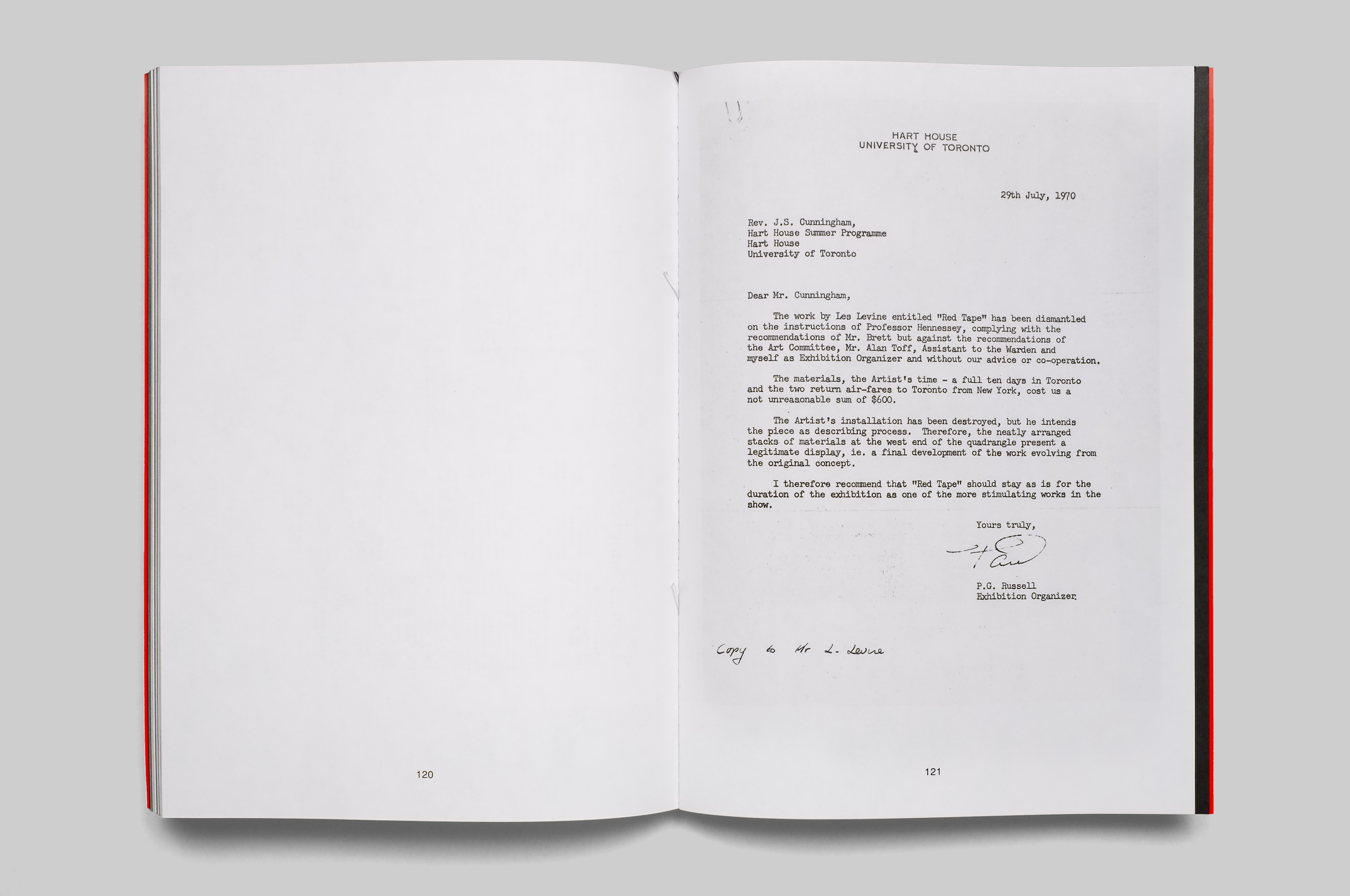
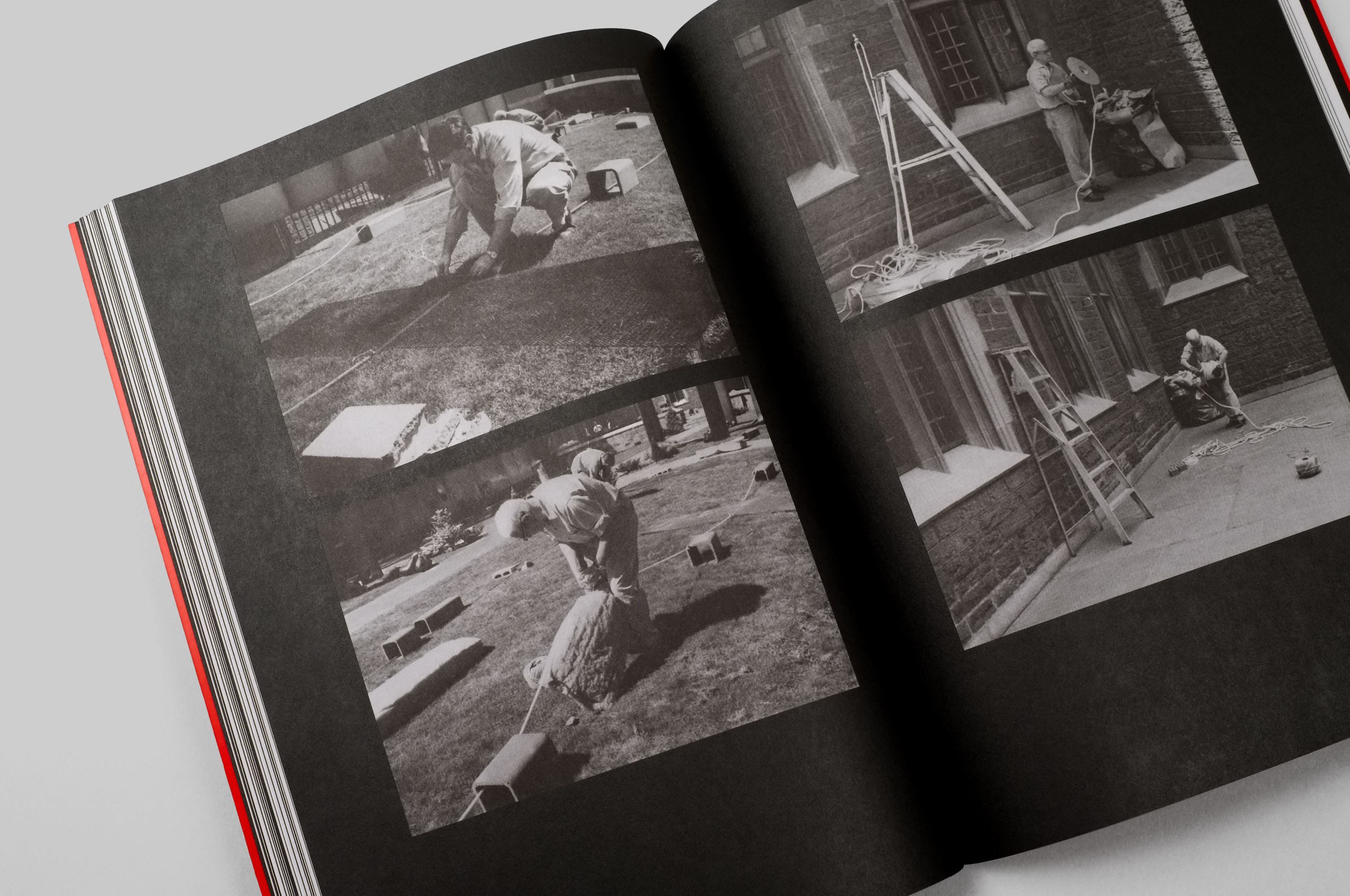
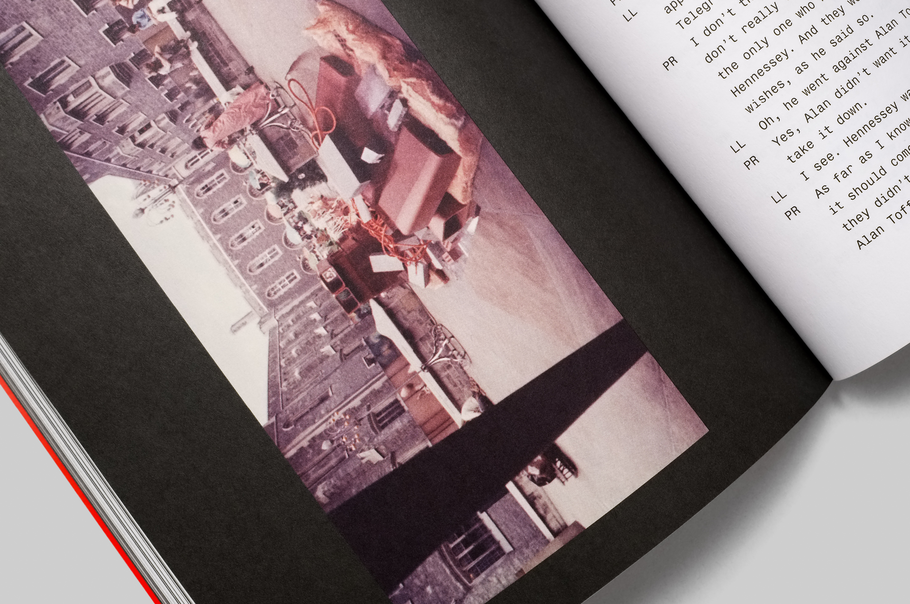
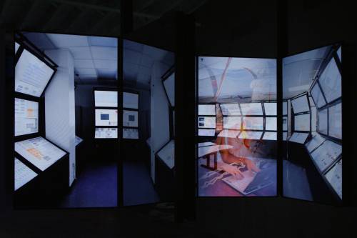
Red Tape, A New Work by Les Levine, 1970: To Engage the University in a Useless Task Which Will Allow It to Expose a Working Model of Its System
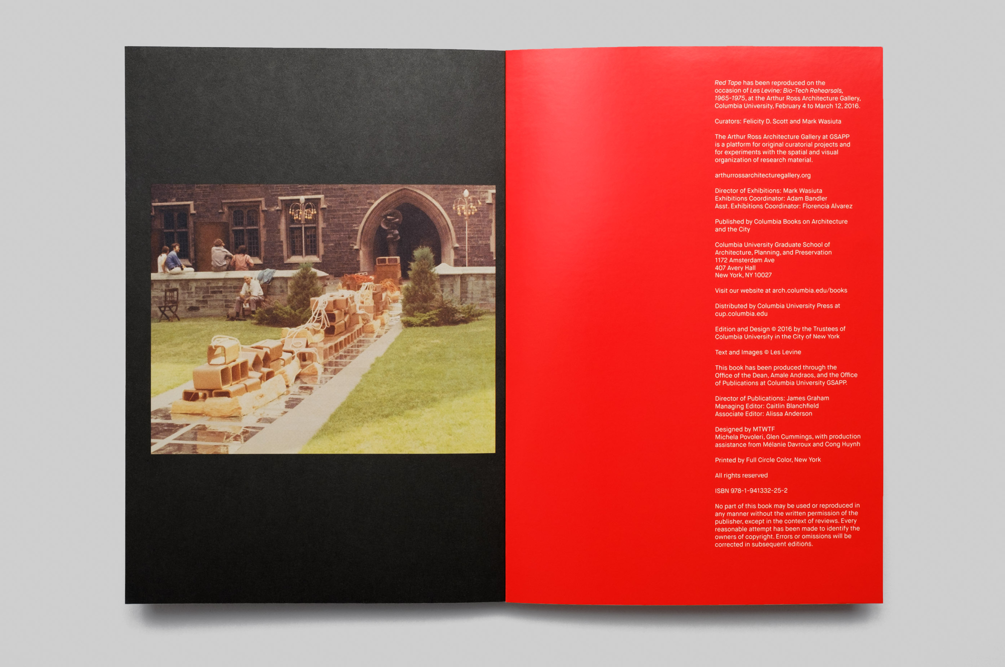
Red Tape has been reproduced on the occasion of Les Levine: Bio-Tech Rehearsals 1965–1975 at the Arthur Ross Architecture Gallery, Columbia University, Feb 4 - Mar 12, 2016, curated by Felicity D. Scott and Mark Wasiuta
Publisher: Columbia Books on Architecture and the City
Purchase a copy from Columbia University Press
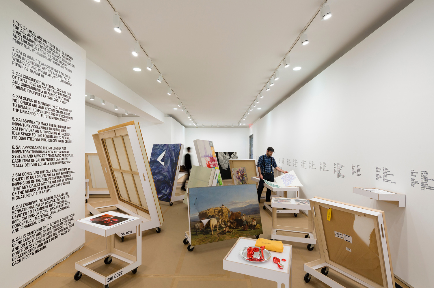
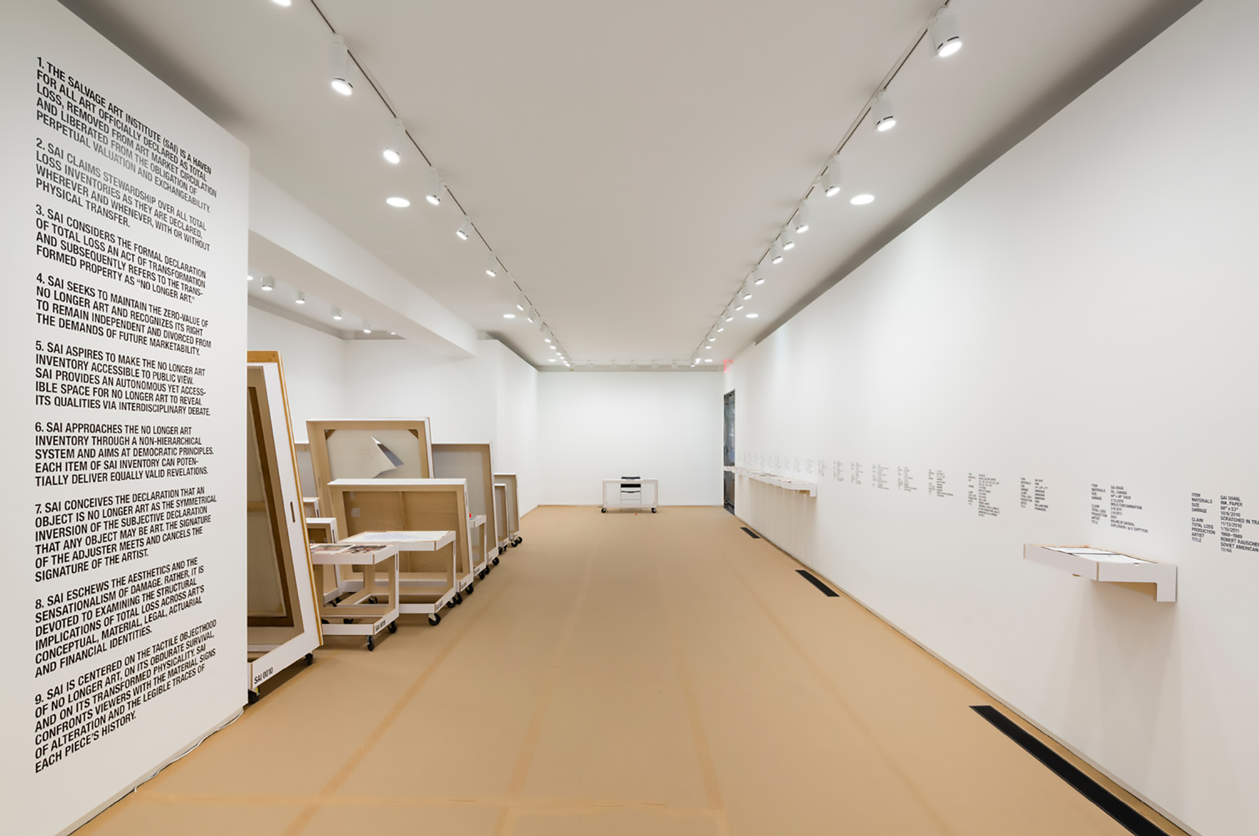
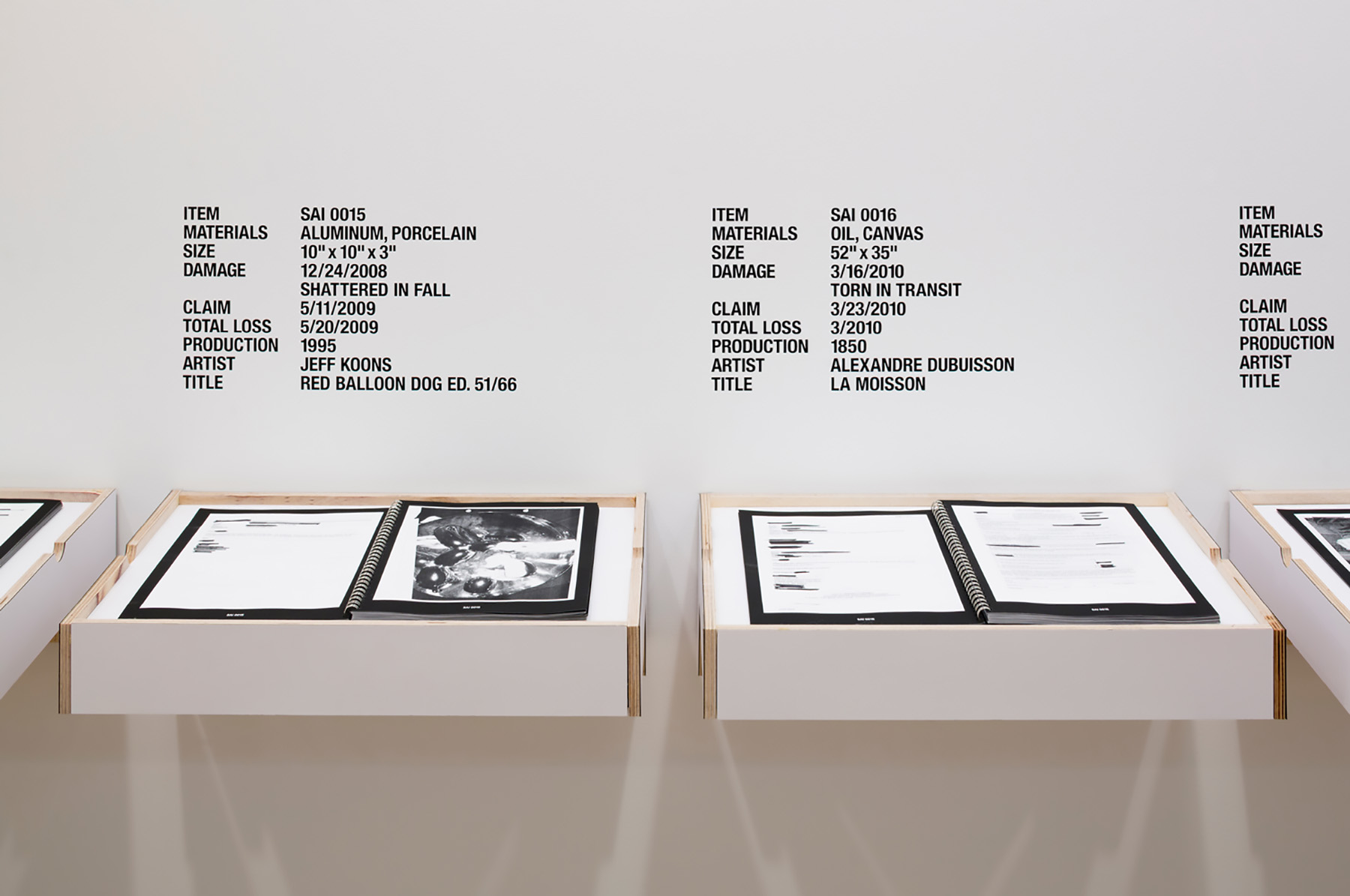
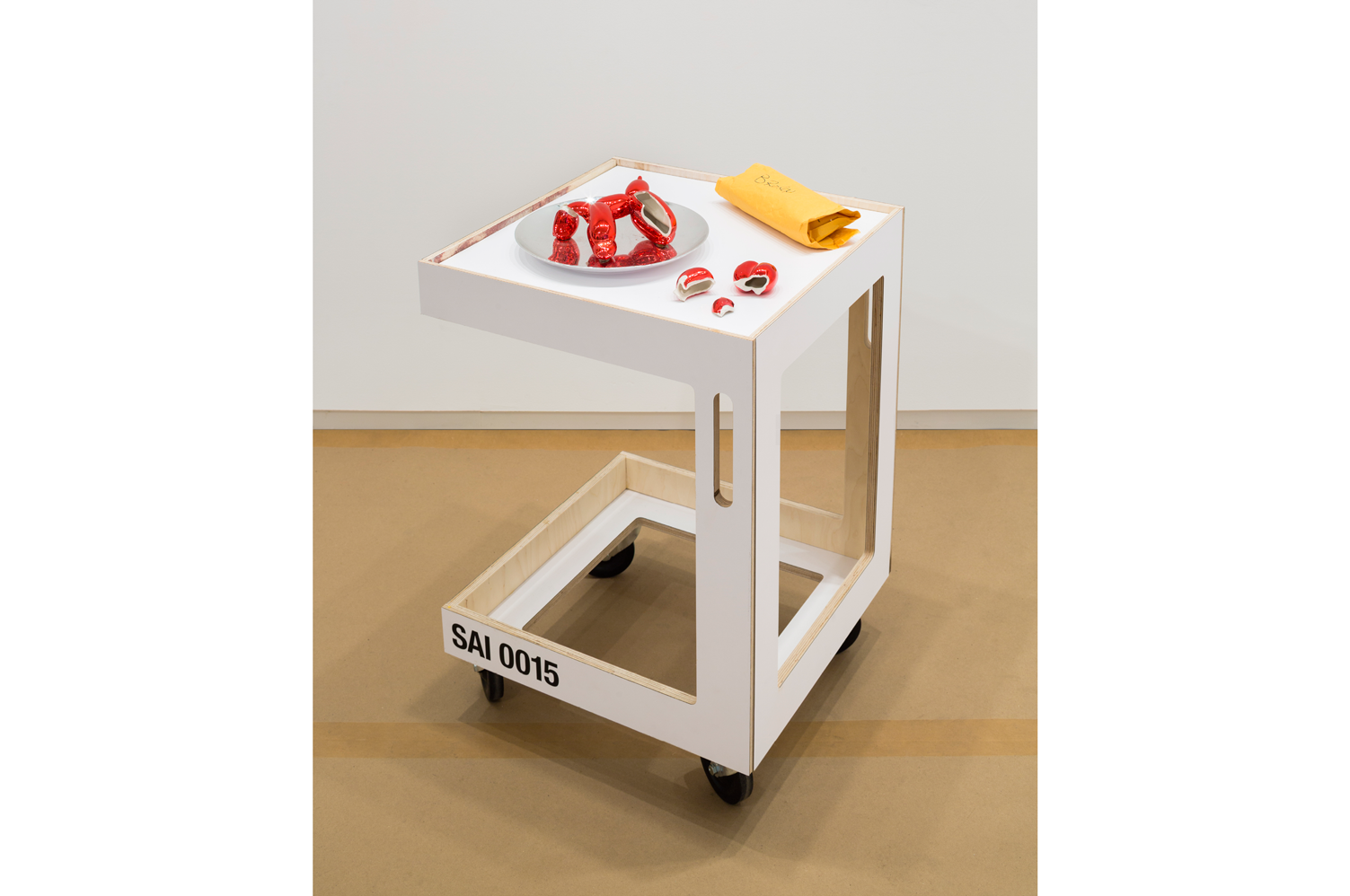
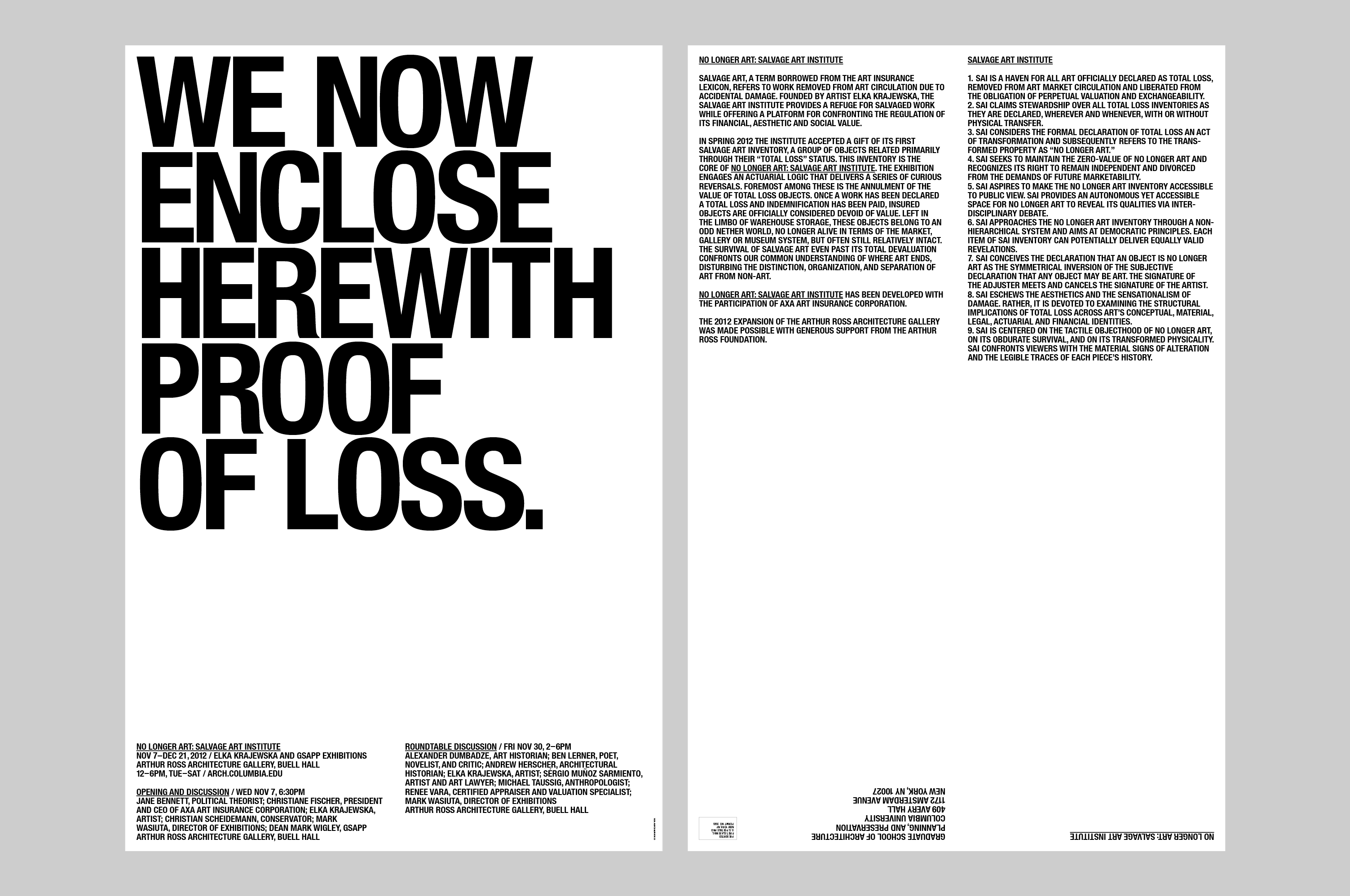
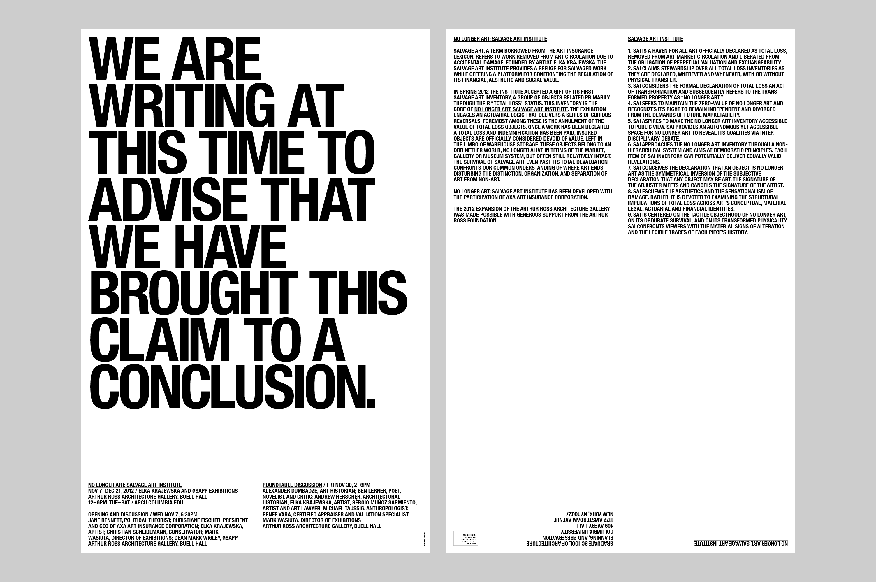
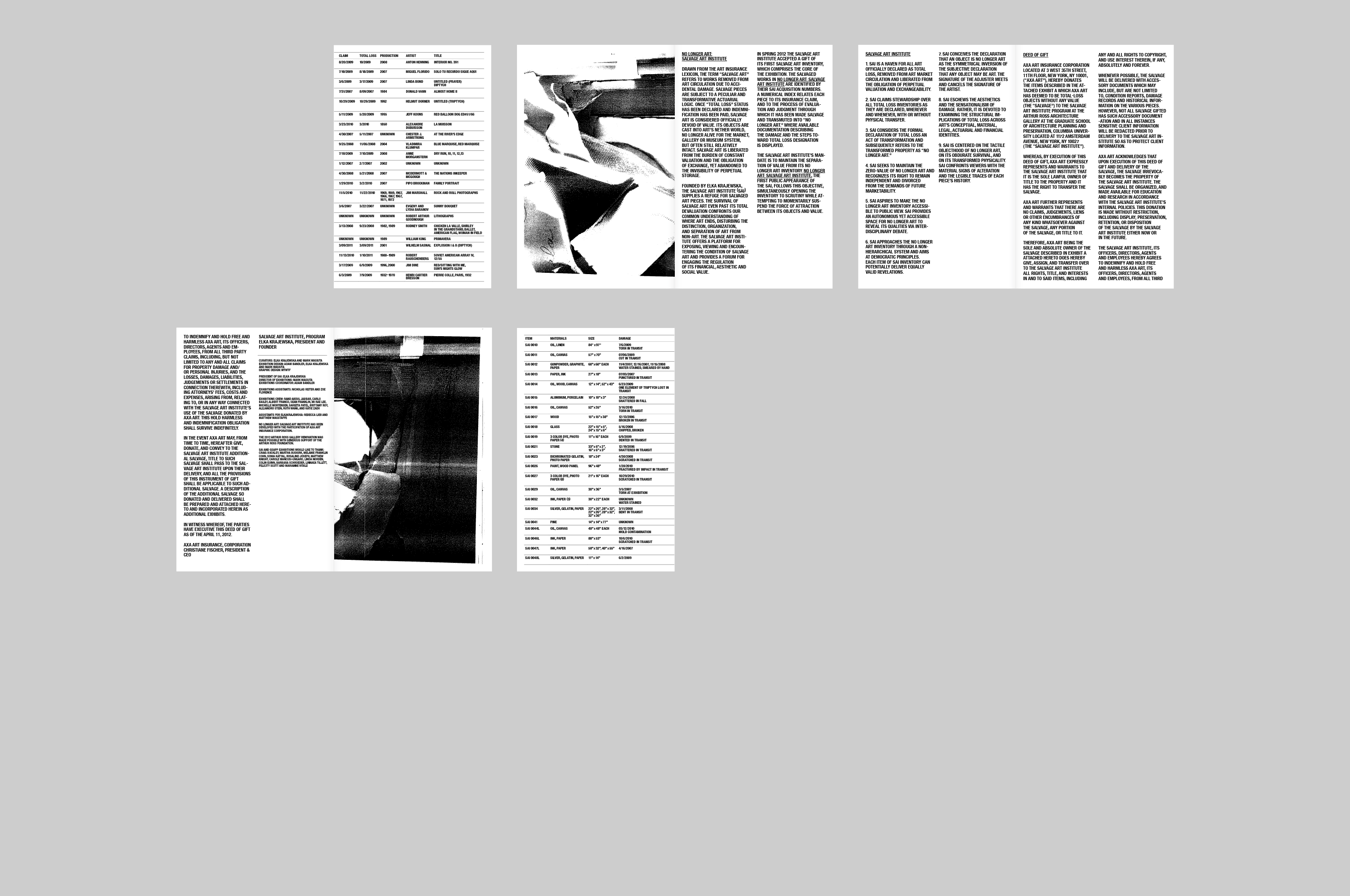
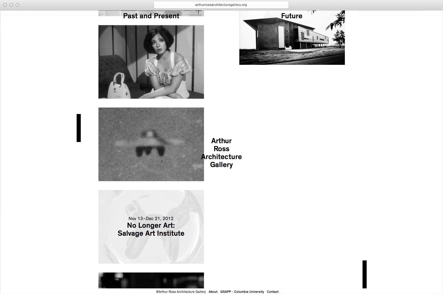
No Longer Art: Salvage Art Institute
No Longer Art: Salvage Art Institute presents a group of objects considered “salvage art”, a term borrowed from the art insurance lexicon, which refers to work removed from circulation due to accidental damage. Founded by artist Elka Krajewska, the Salvage Art Institute provides a platform for confronting the regulation of salvage art’s financial, aesthetic and social status. Once a work has been declared a total loss and indemnification has been paid, insured objects are officially considered devoid of (monetary) value. The survival of salvage art challenges the accepted distinction between art and non-art.
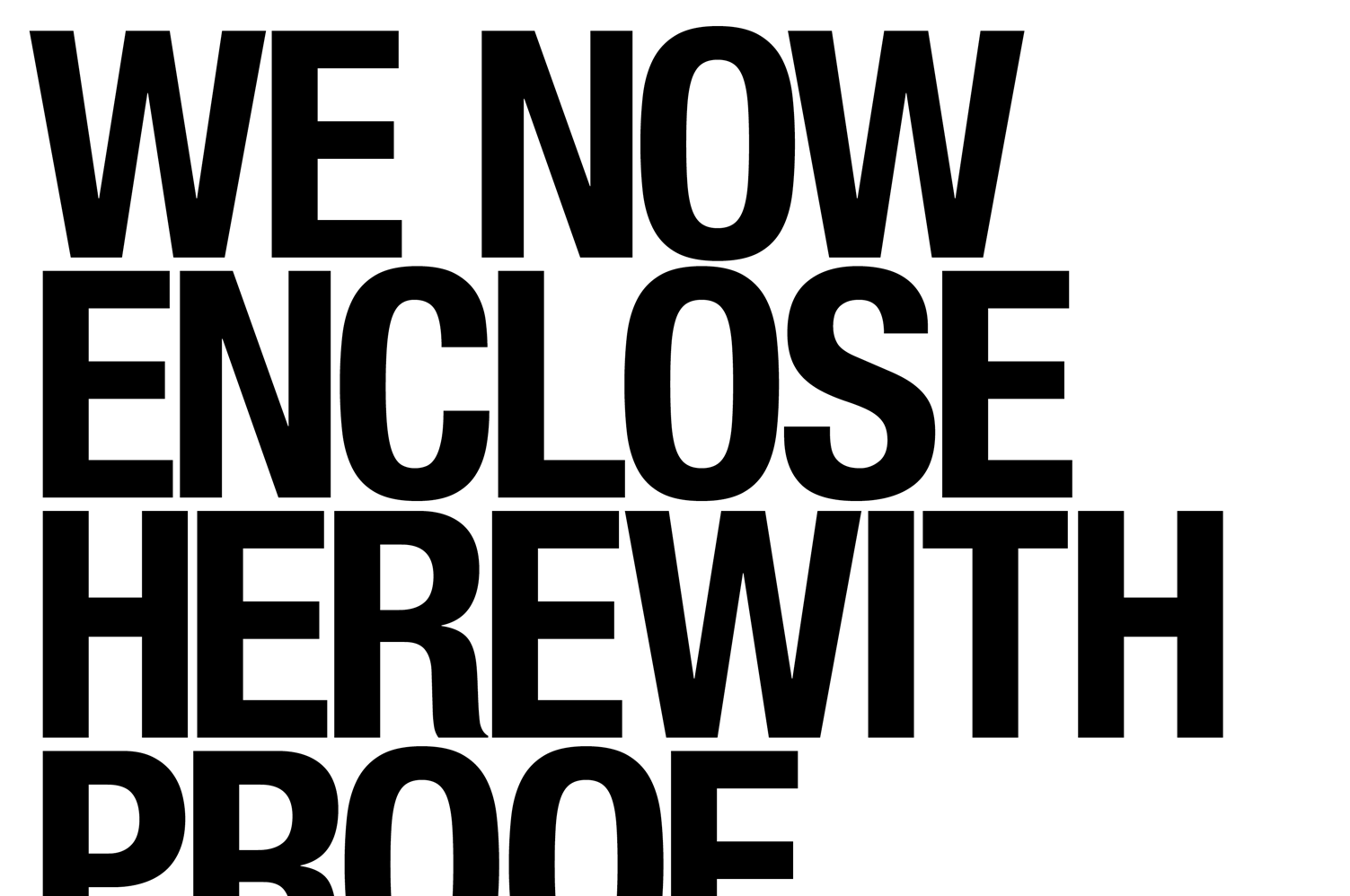
MTWTF designed two posters that mark the start and end of the alchemical process which turns Art into Non-Art: the insured’s request for coverage, and the insurance company’s confirmation that the process is complete. By locating this transformation in legal language, the poster highlights the constructed framework within which the valuation of art operates. MTWTF also created a series of books which chronologically presents the documents exchanged between owner and insurance company which comprise the insurance claim process for each of the objects on display.
If language is a locus of conceptual magic, posters, and graphic design in particular, occupy a particularly powerful position.
Curators: Elka Krajewska and Mark Wasiuta
Exhibition design: Adam Bandler, Elka Krajewska and Mark Wasiuta
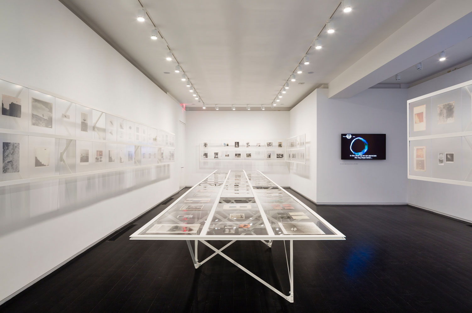
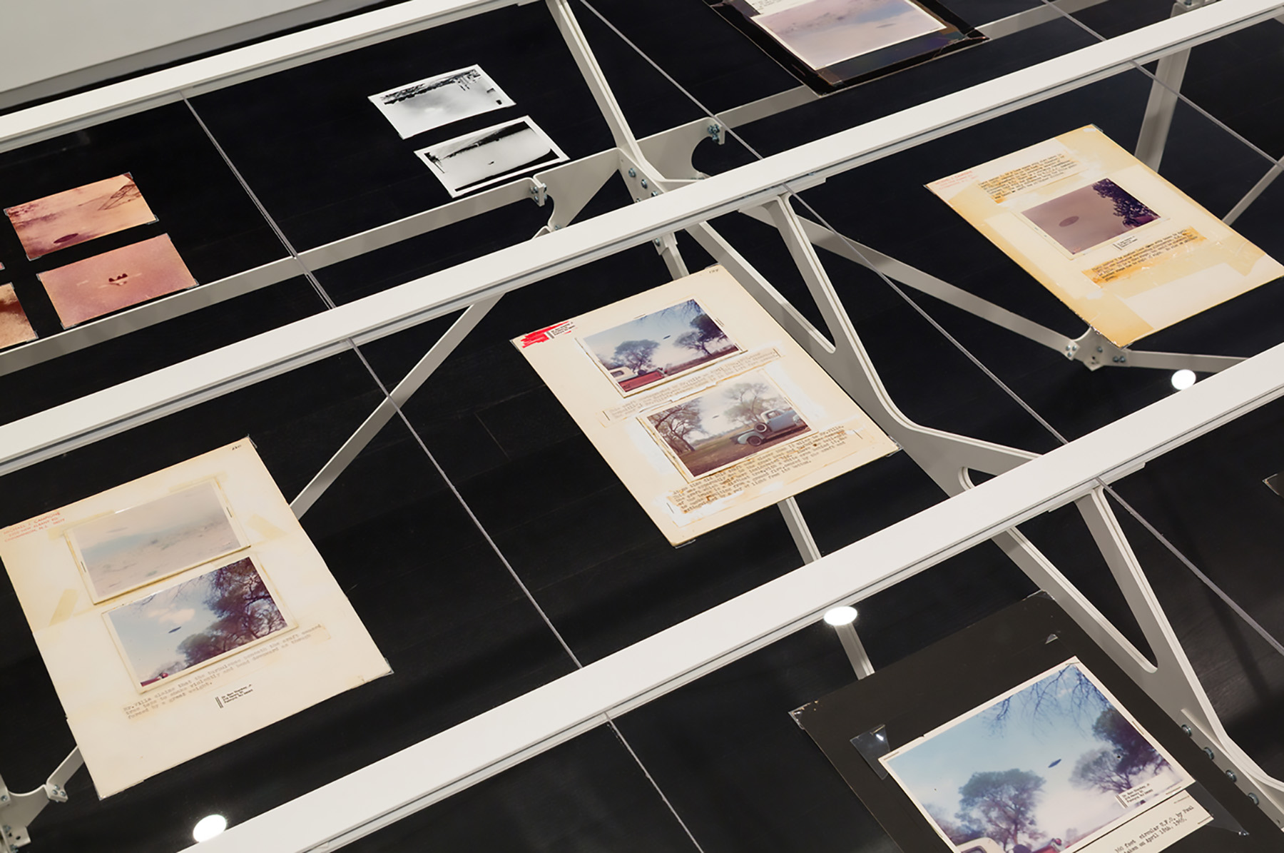
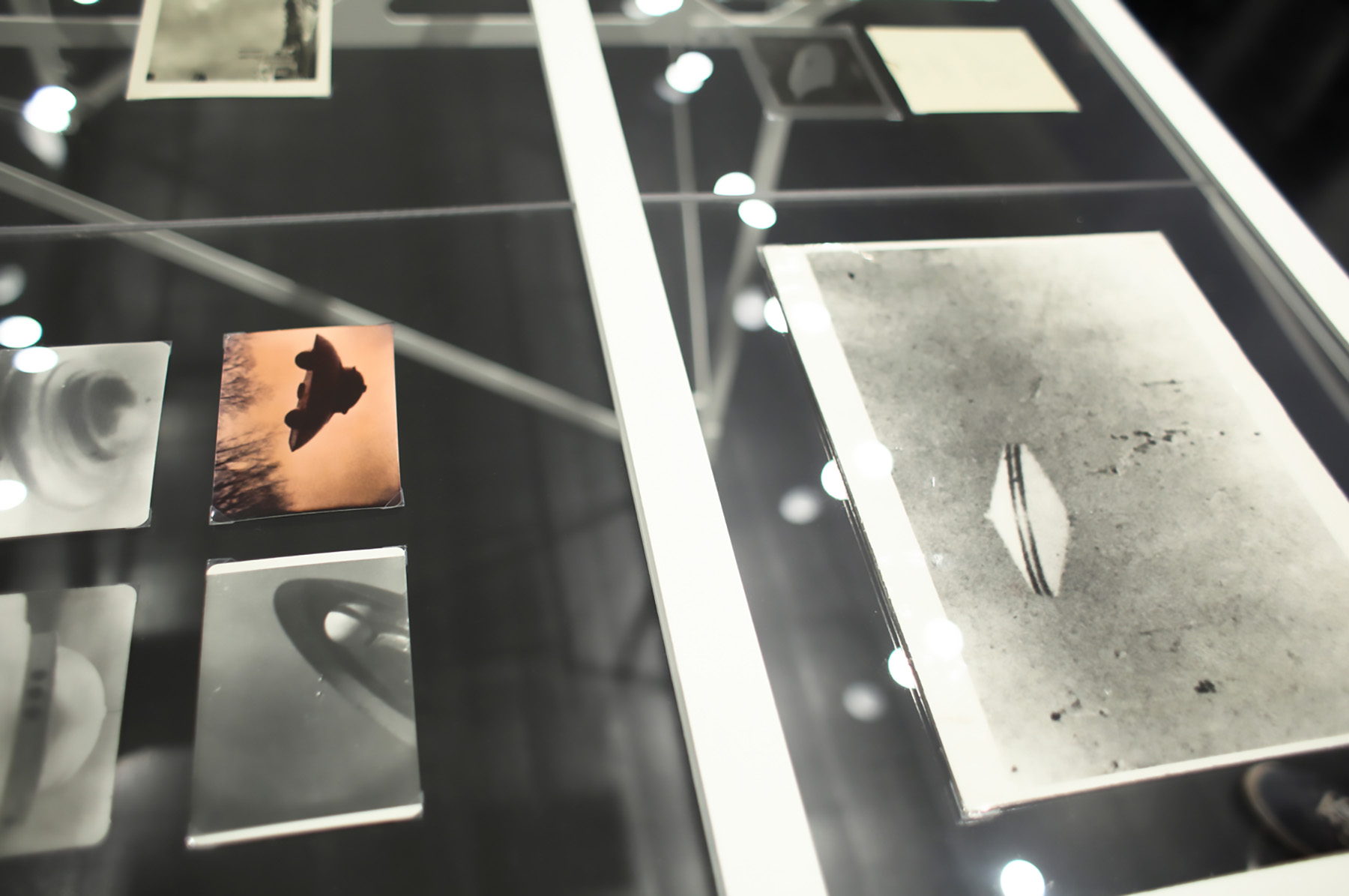
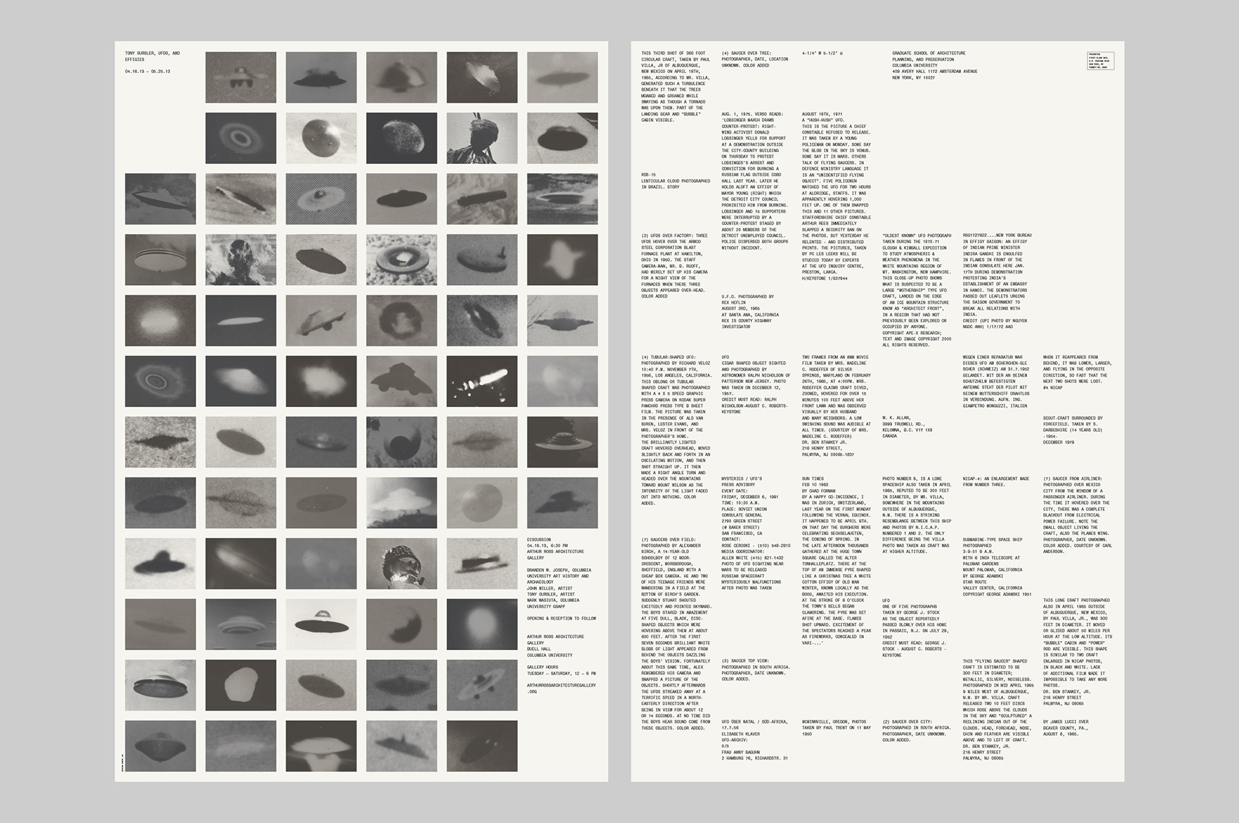
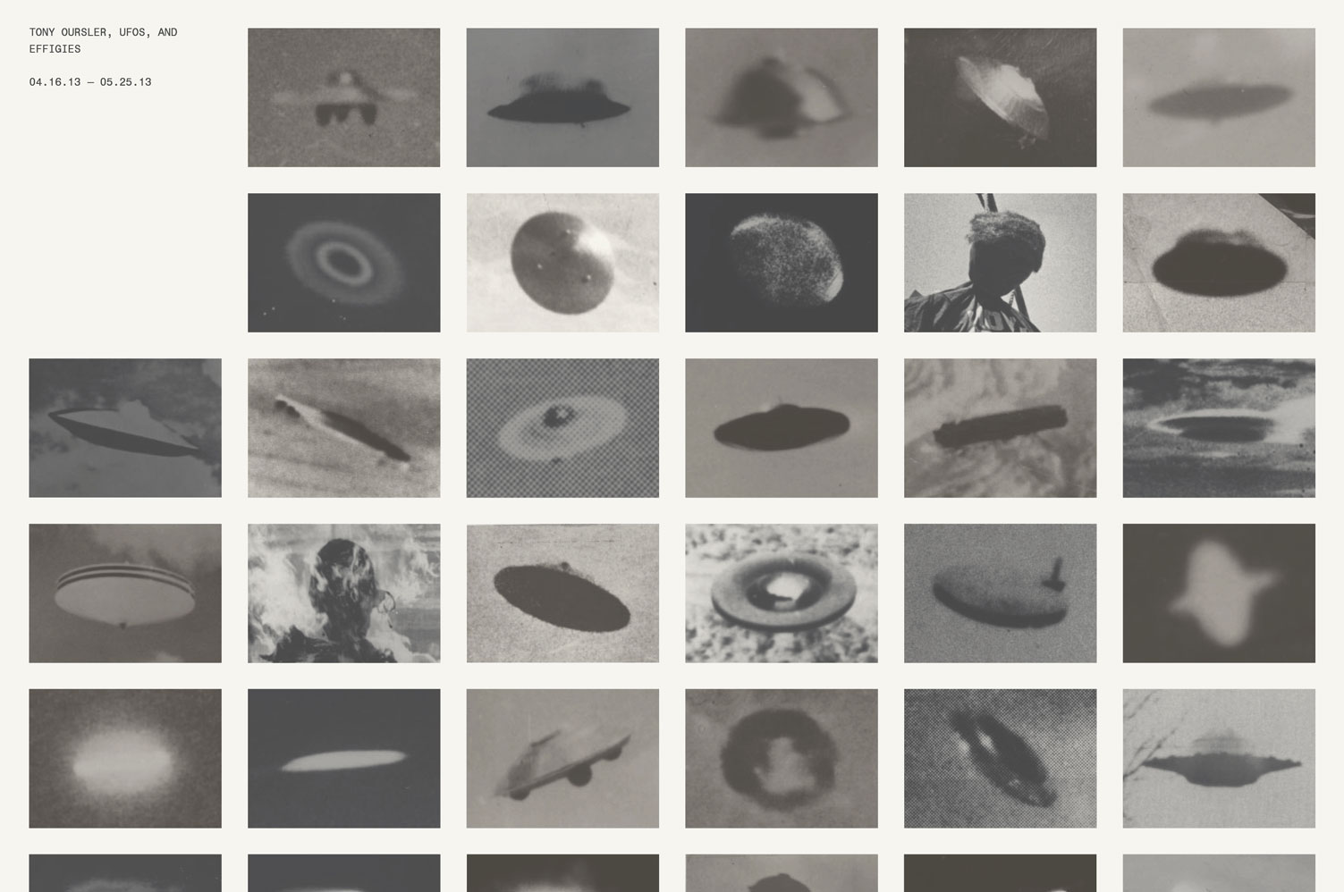
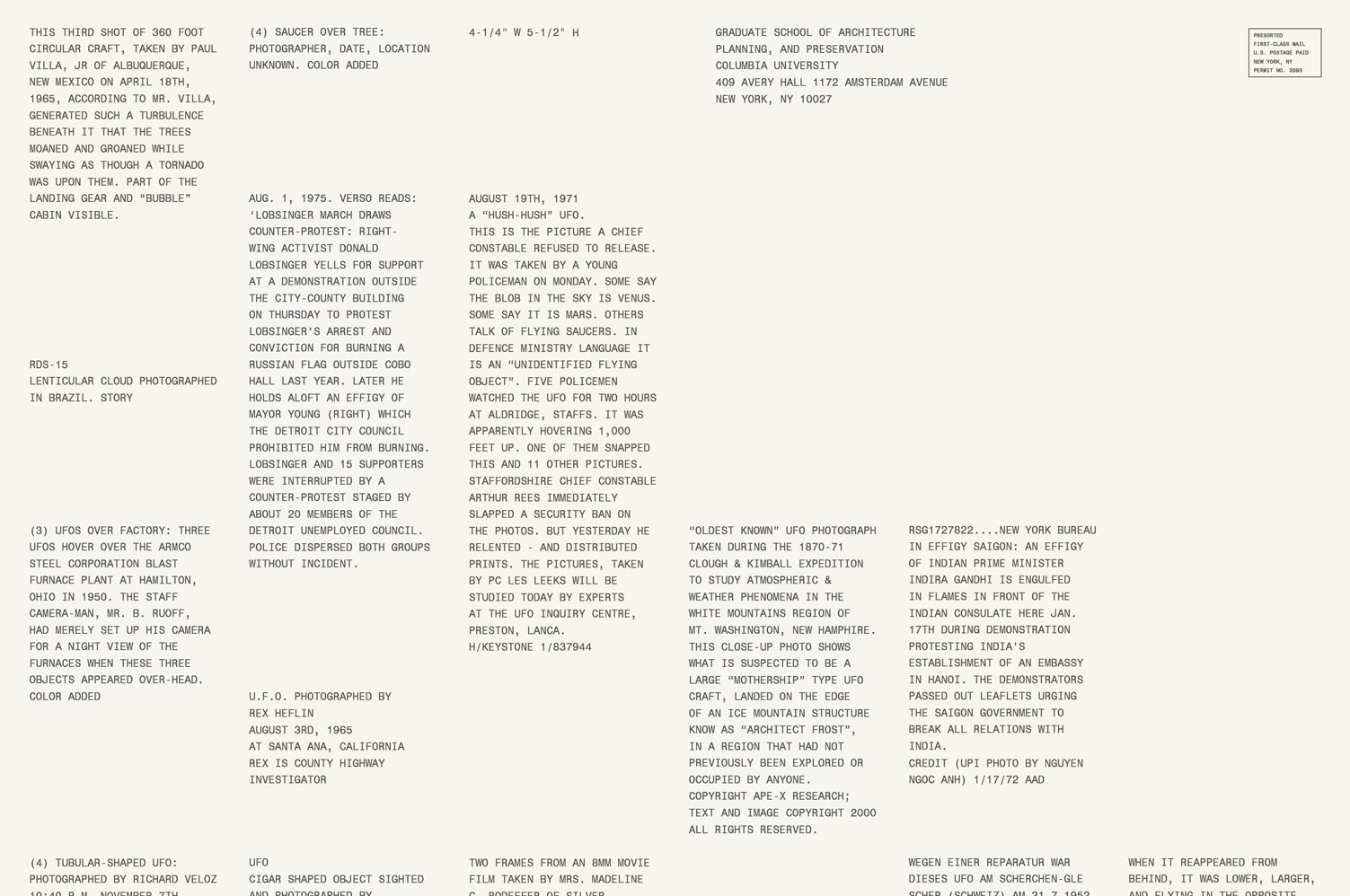
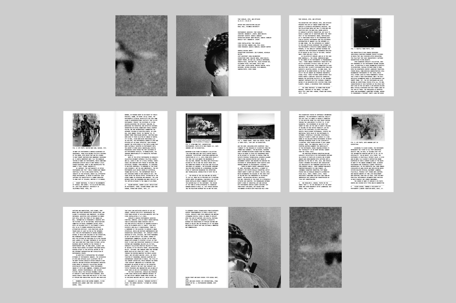
Tony Oursler, UFOs, and Effigies
The exhibition Tony Oursler, UFOs, and Effigies presents two sets of images drawn from Tony Oursler’s extensive photographic archives in order to open new perspectives onto his artistic production and raise larger questions about the rhetoric of the photographic image.
MTWTF’s poster features a grid of cropped photos, which, by removing the subjects’ context and produce a field of shaped objects that can more readily be compared. The poster’s verso presents each photograph’s corresponding label or caption which reveals a range of textual strategies meant to augment or engender the veracity of the photographs. The poster utilizes the proportions of the Hermann grid optical illusion, in which ghostly grey squares appear at the intersections of the rectangles, in order to creates a further tension between what is there and was is perceived. The images are printed in two similar black inks to evoke the varied tonal range of black and white photography. An accompanying booklet presents a standalone illustrated essay by author and co-curator Branden Joseph.
MTWTF’s work engages two discussions which run parallel to the artist’s and curators’ interests: (1) the visual qualities of UFO props and (2) the structural role of text in the construction of images. Both of these identify and play off the intersections between graphic practice and the language of images.
Curators: Branden W. Joseph, Mark Wasiuta
Assistant curator: Adam M. Bandler
Exhibition design: Mark Wasiuta, Adam M. Bandler
Video editing: Amanda Long, Phil Birch
Graphic design: MTWTF
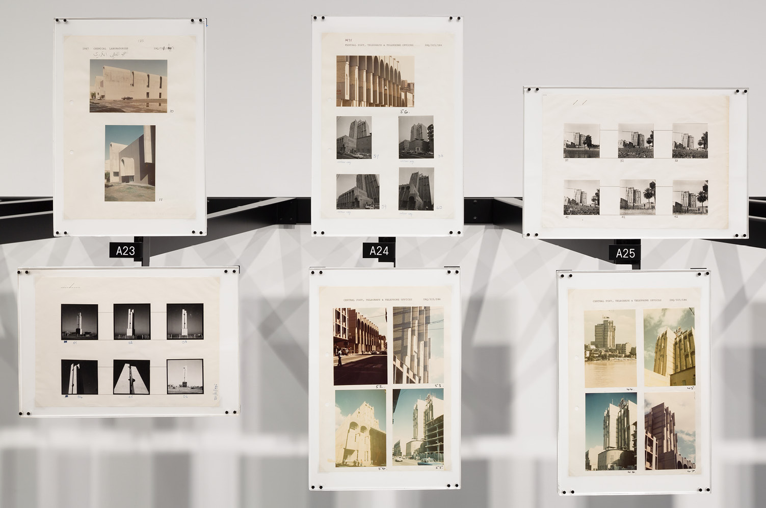
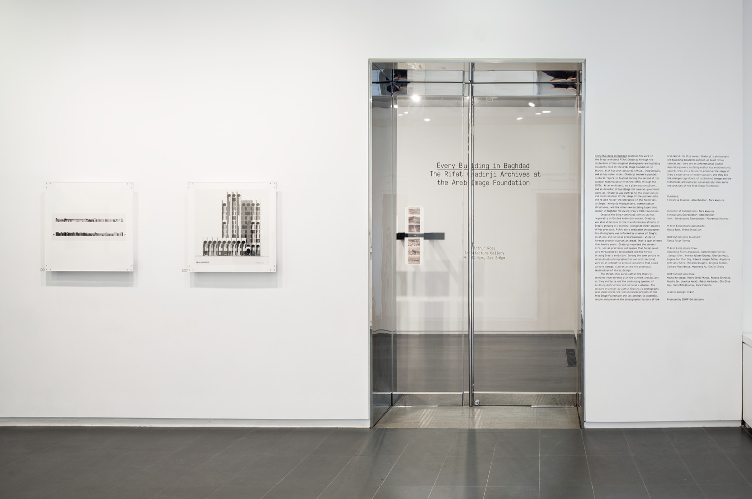
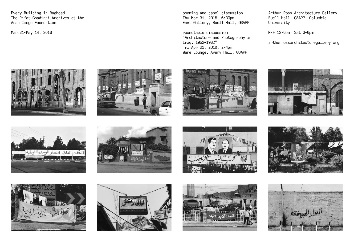
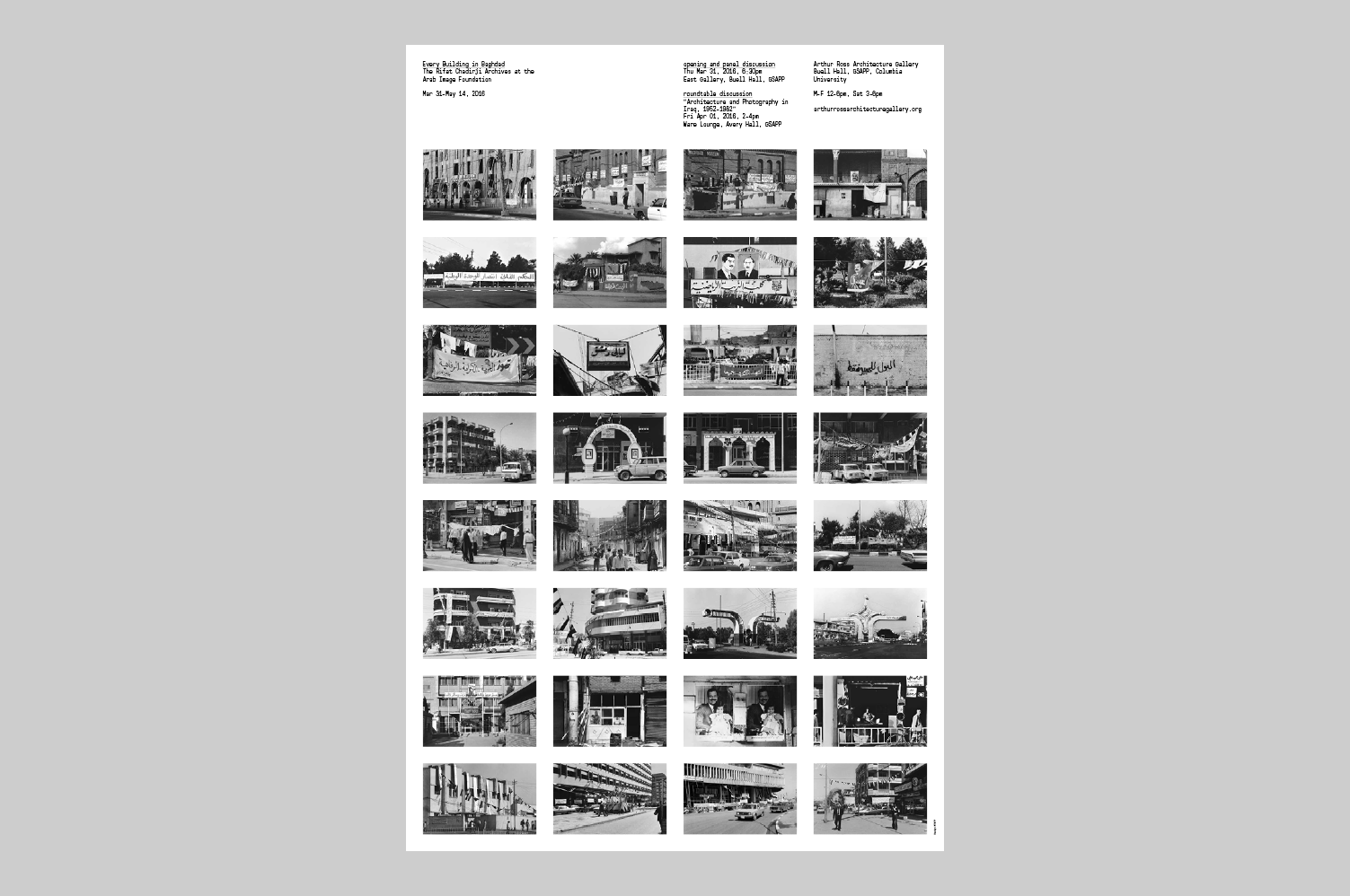

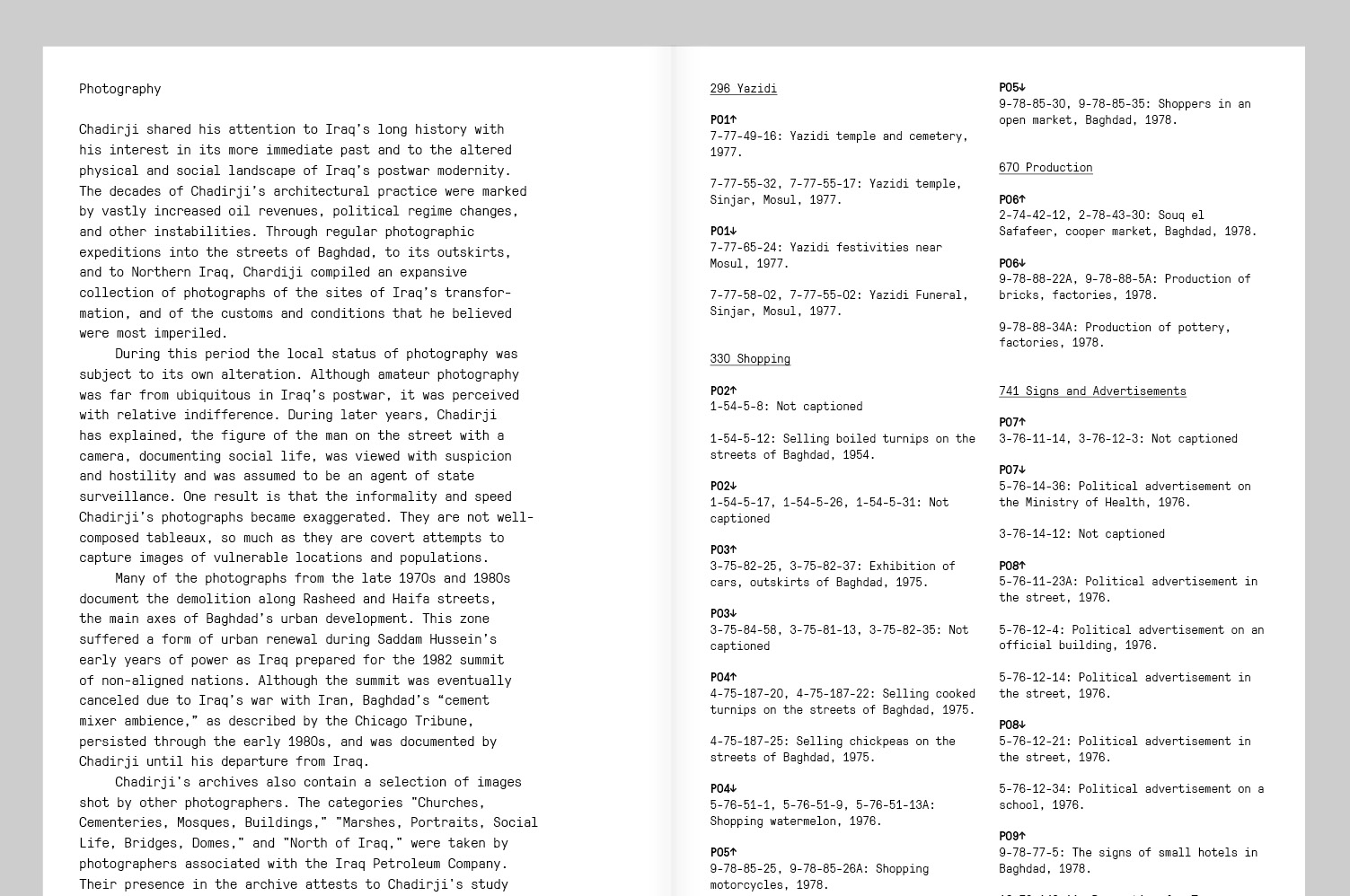
Every Building in Baghdad: The Rifat Chadirji Archives at the Arab Image Foundation
Curators: Florencia Alvarez, Adam Bandler, Mark Wasiuta
Exhibition design: Adam Bandler
Graphic design: MTWTF
Curators: Florencia Alvarez, Adam Bandler, Mark Wasiuta
Exhibition design: Adam Bandler
Graphic design: MTWTF
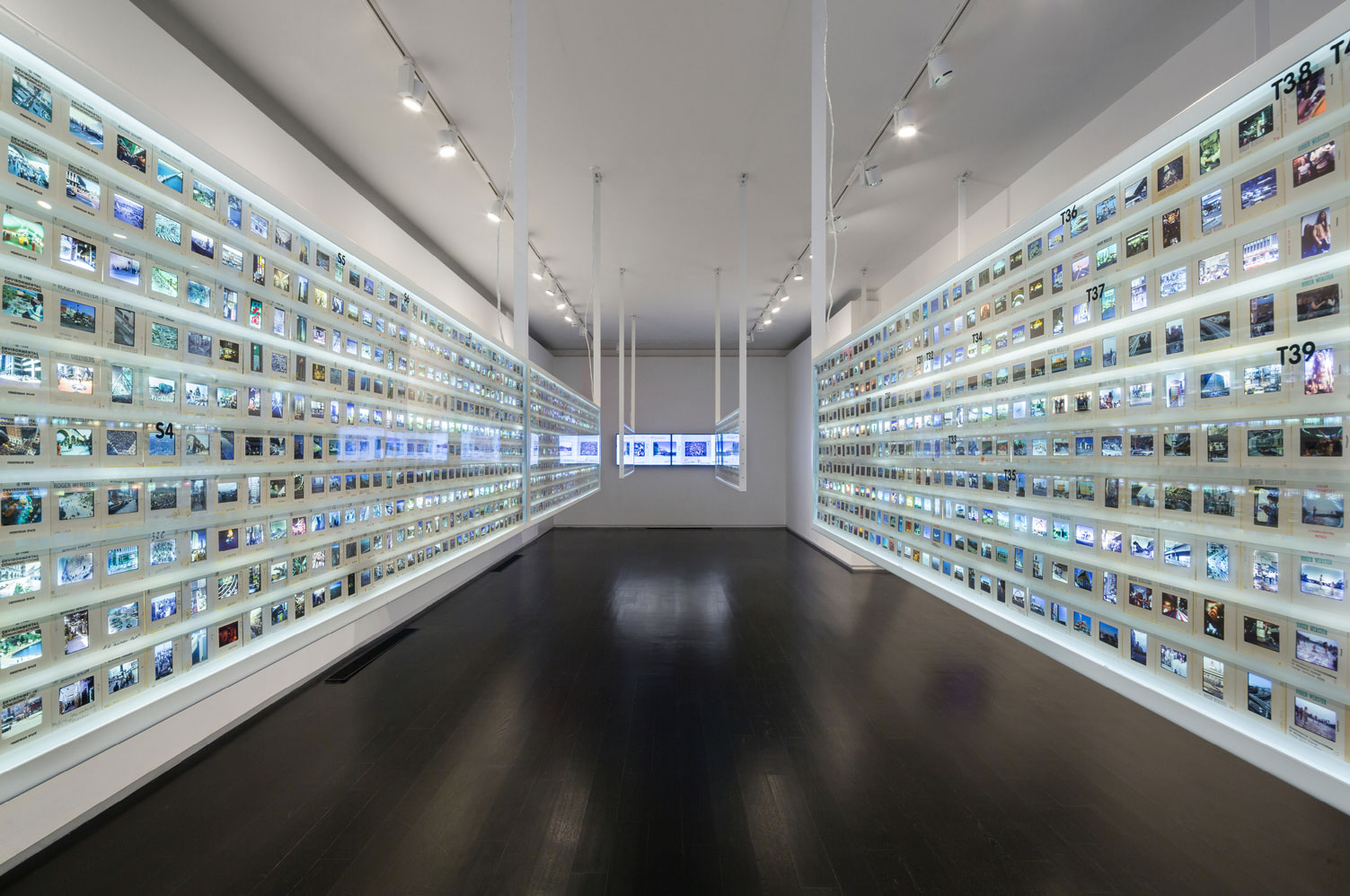
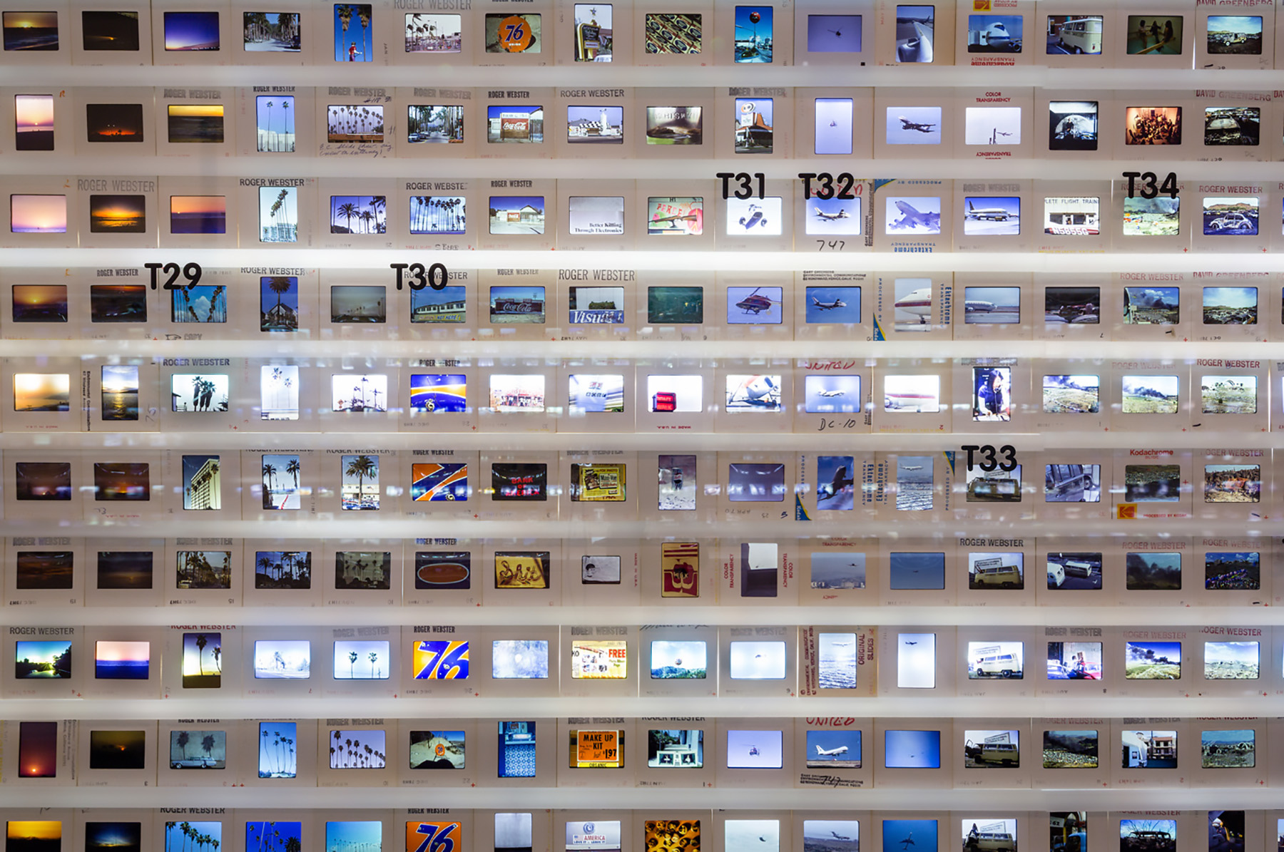


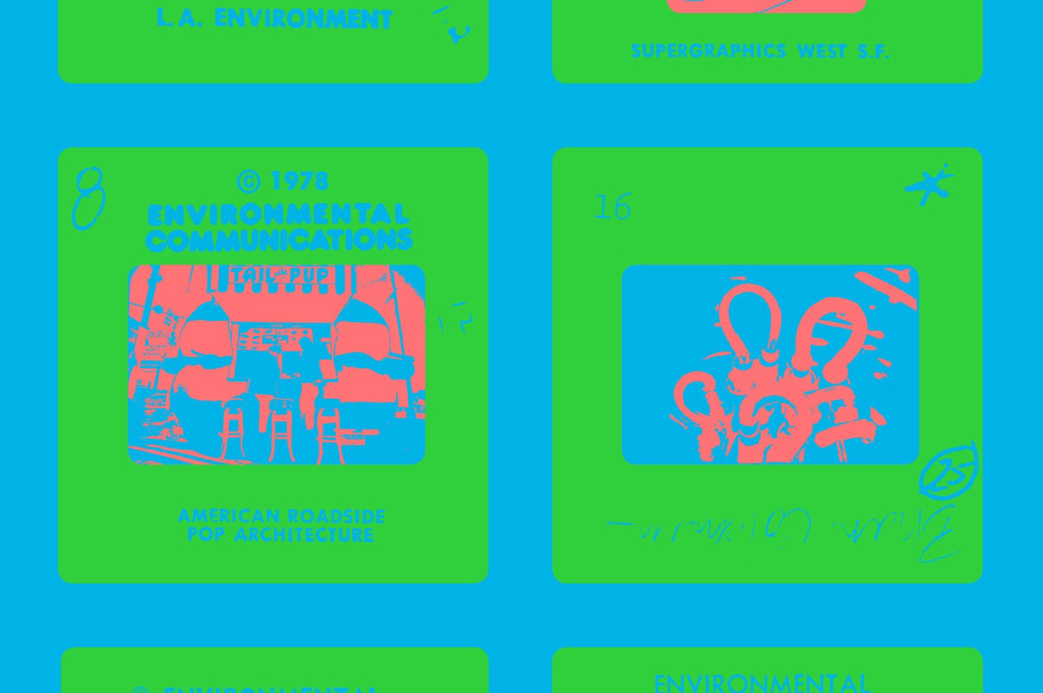
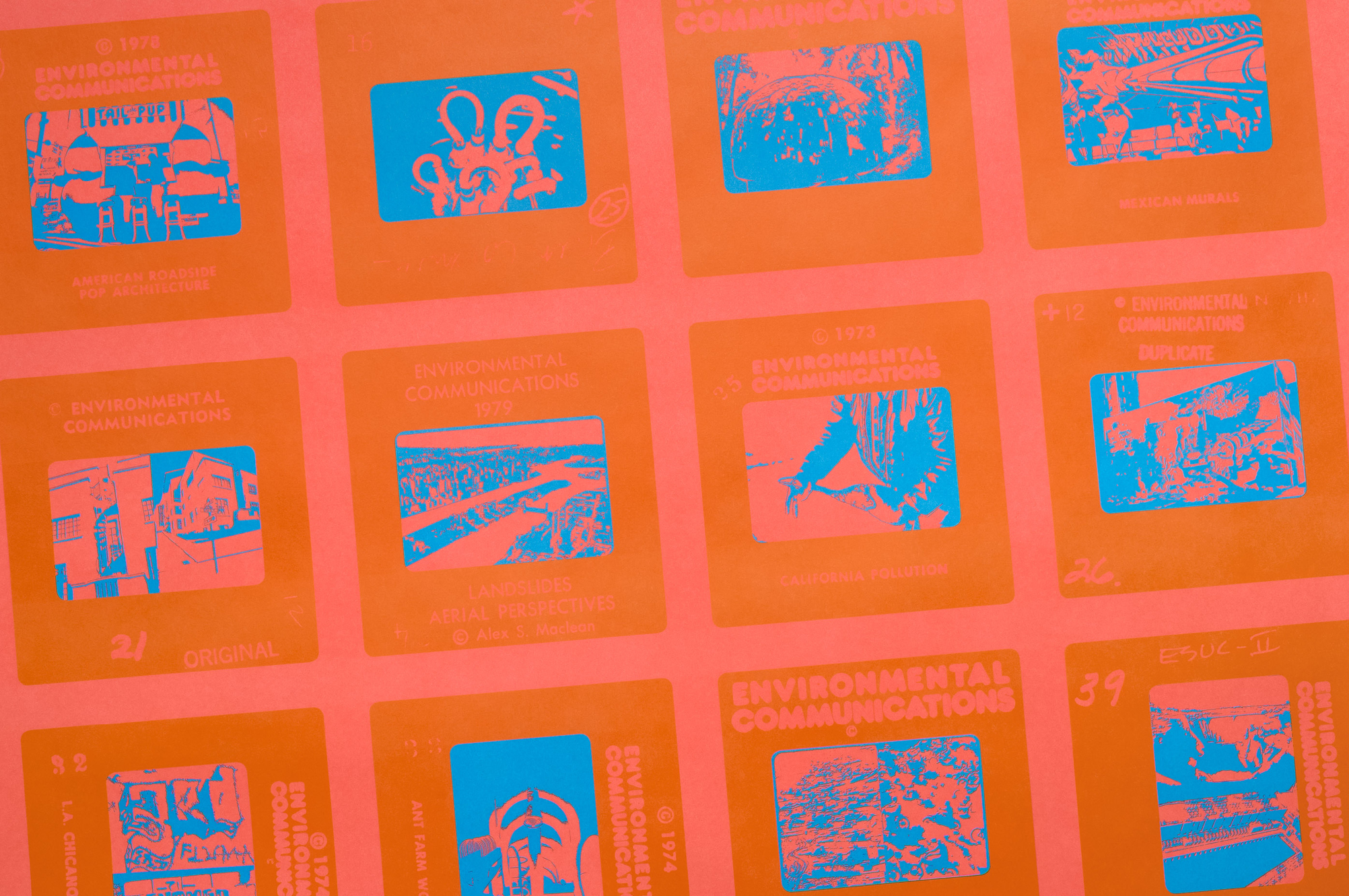
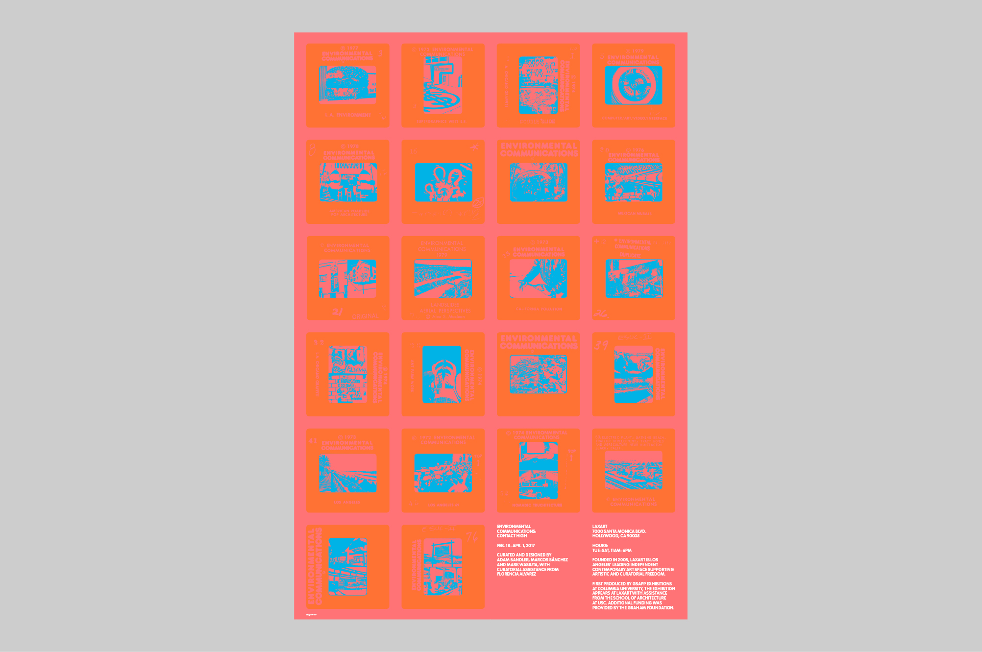
Environmental Communications: Contact High
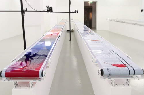
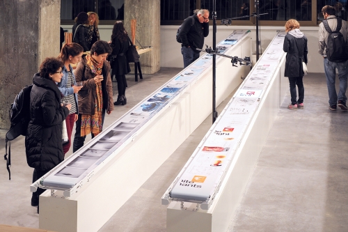
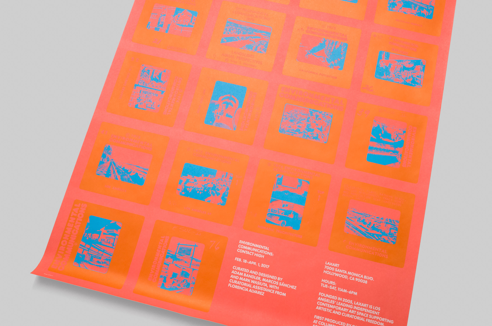
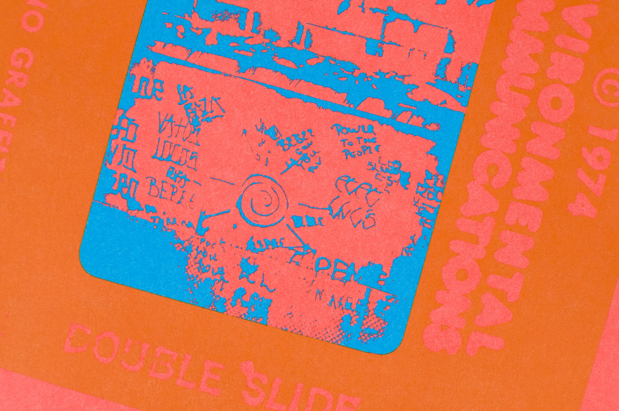
Environmental Communications: Contact High is the first major exhibition of the west coast media collective, Environmental Communications (EC), who honed an image practice from the late 1960s to early 1980s that aimed to constitute a new visual syntax for the late-twentieth-century city. The group speculated that their “environmental photography”, distributed to university slide libraries, would alter the consciousness of architecture students and therefore transform the discipline. The exhibition features ceiling-mounted lightboxes which display fields of EC slides, promotional catalogs, and documents like correspondence, while monitors present enlarged scans of the slides.
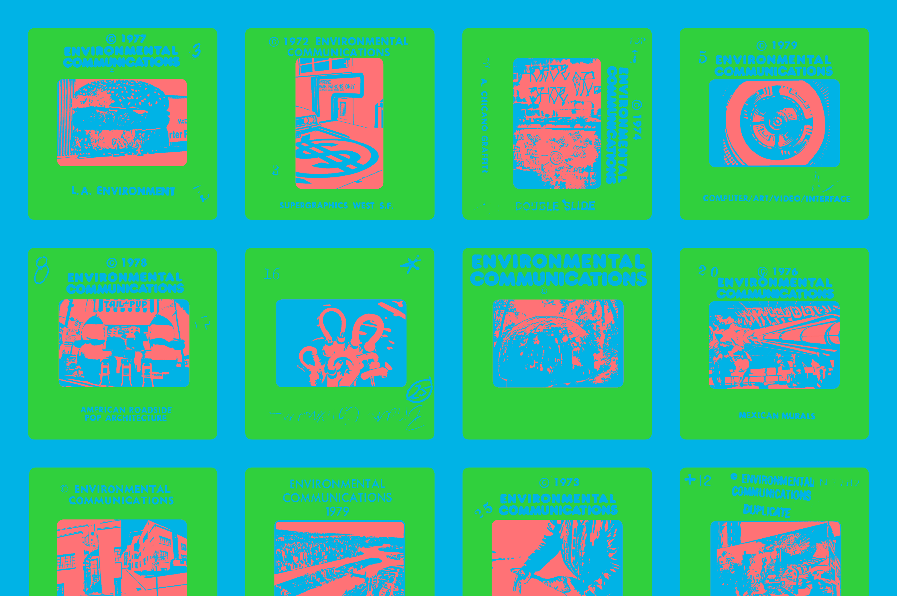
Inspired by both the high-contrast thumbnail images in EC’s slide catalogs and the curators’ decision to document each slide as both an artifact and image, giving equal emphasis to the transparency and the sleeve, MTWTF developed a poster incorporating both these moves while using a psychedelic color pallet to optically push the slides’ transparency and sleeve apart. The poster’s grid of 22 images are bitmap versions of EC originals; slides come forward, sleeves retreat, and vice versa, as the colors vibrate in different ways. A system of vinyl reference numbers and a booklet with captions and text help visitors navigate and understand the exhibition’s slides whether systematically or intuitively.
Curators and exhibition designers: Marcos Sánchez, Adam Bandler and Mark Wasiuta
Assistant curator: Florencia Alvarez Pacheco
Graphic design: MTWTF
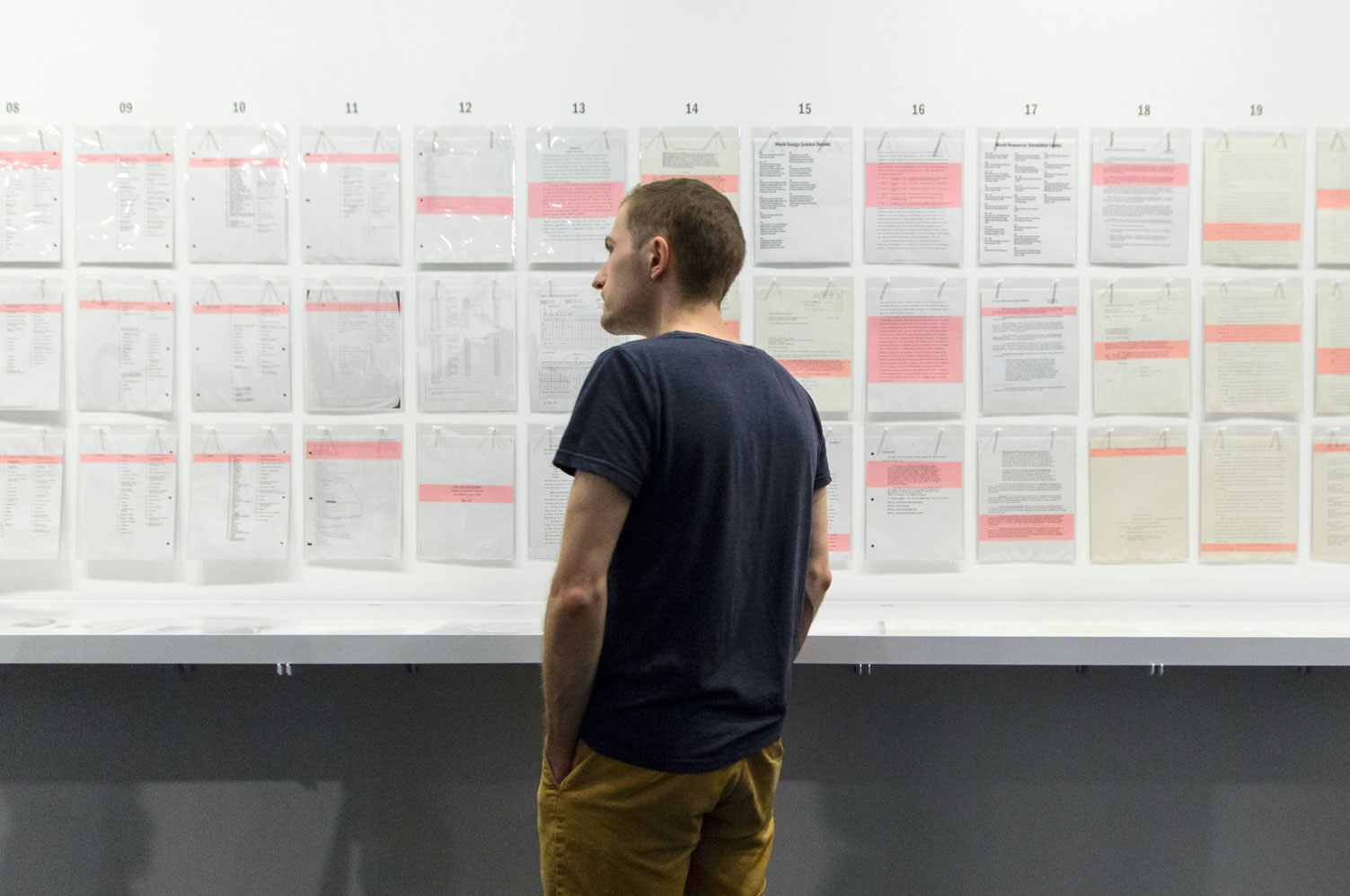
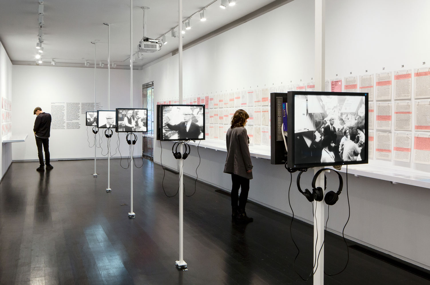
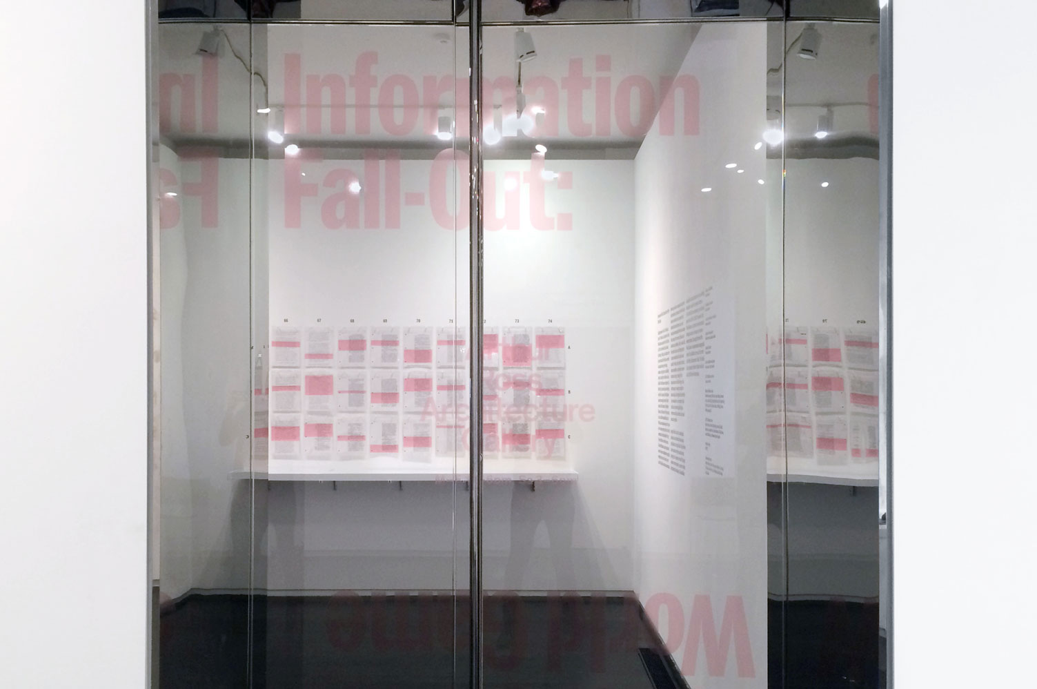
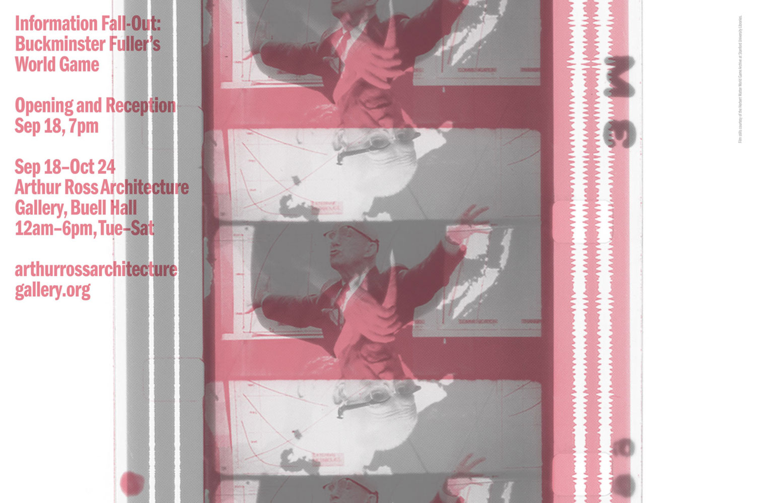
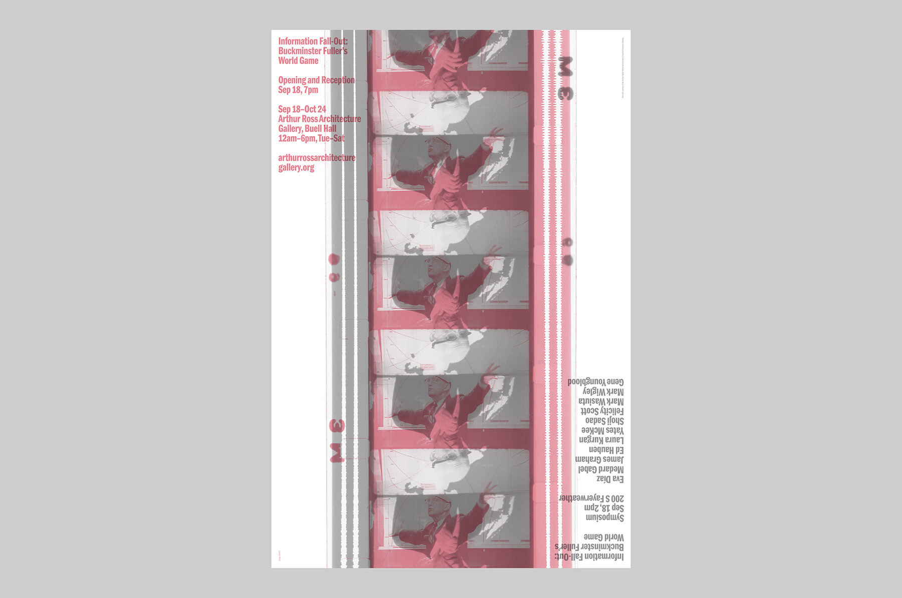
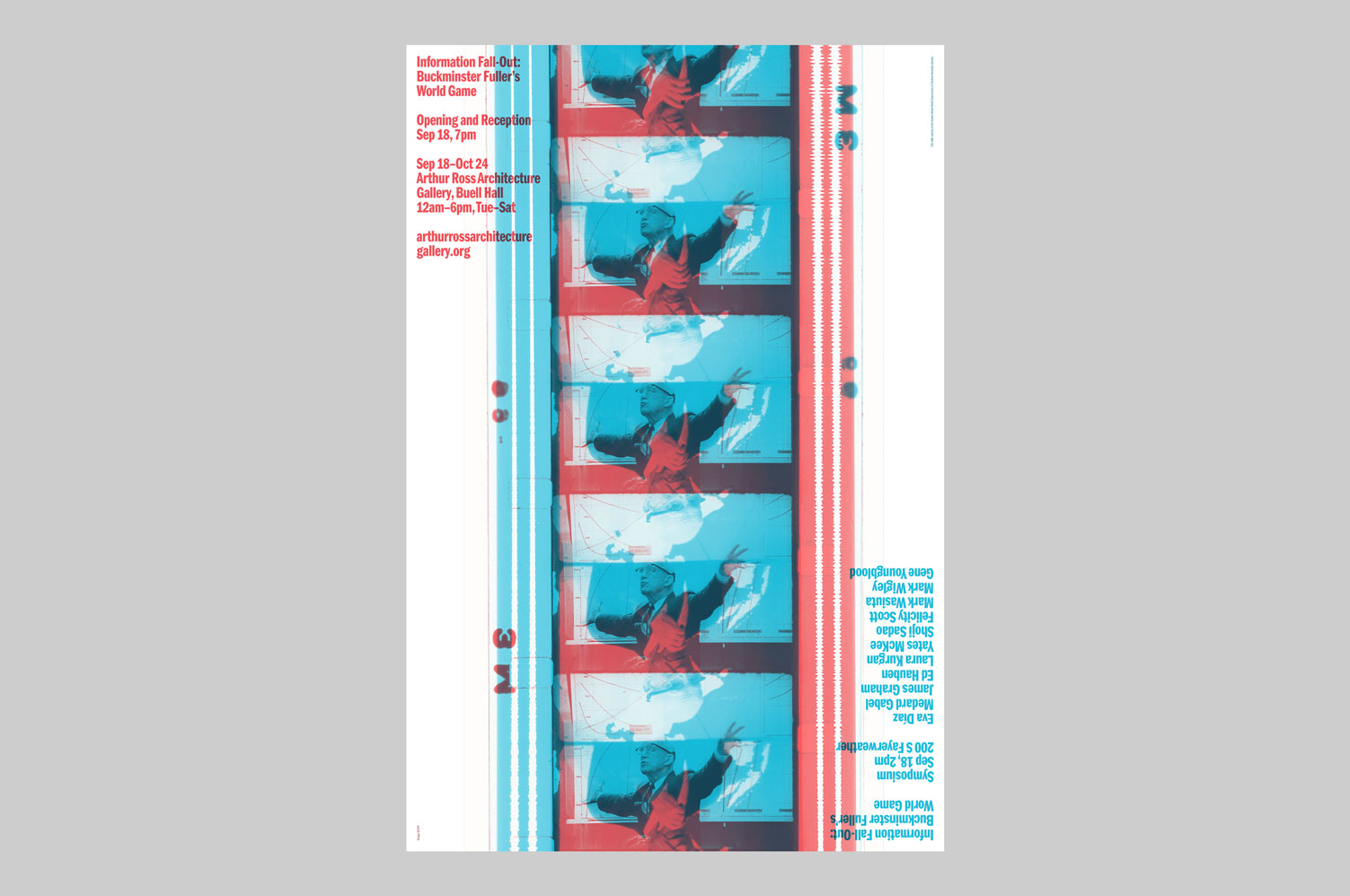
Information Fall-Out: Buckminster Fuller’s World Game
Information Fall-Out presents Buckminster Fuller’s World Game (conceived and played from 1964 to 1982) through a cross section of documents, slides, transparencies, a digital recreation of the Game’s original materials (dymaxion map and digital overlays) and ten hours of documentary footage. The exhibition assembles documents related to various iterations of the World Game and material from the World Resources Inventory to examine the project as a pedagogical experiment, a system for environmental information, and a process of resource administration.
MTWTF’s poster features a composite of stills from the exhibition’s films which show Buckminster Fuller expressively leading World Game proceedings. The exhibition’s transparent pink graphic title announces the show at the glass door while allowing a full view beyond. Likewise, transparent pink rectangles are overlaid onto documents displayed in gridded plastic sleeves on the walls to highlight key paragraphs, offering viewers a shortcut while retaining the original object’s integrity. A poster remix (mtwtf.com only) reconciles the original’s color pallet with the exhibition’s transparent pink mechanism.
MTWTF foregrounds the graphic layering present in Fuller’s World Game to highlight this technique’s various effects and associations, for example, providing multiple readings or suggesting expanded environmental consciousnesses.
Curators and exhibition designers: Mark Wasiuta, Adam Bandler
Assistant curator: Florencia Alvarez Pacheco
Graphic design: MTWTF
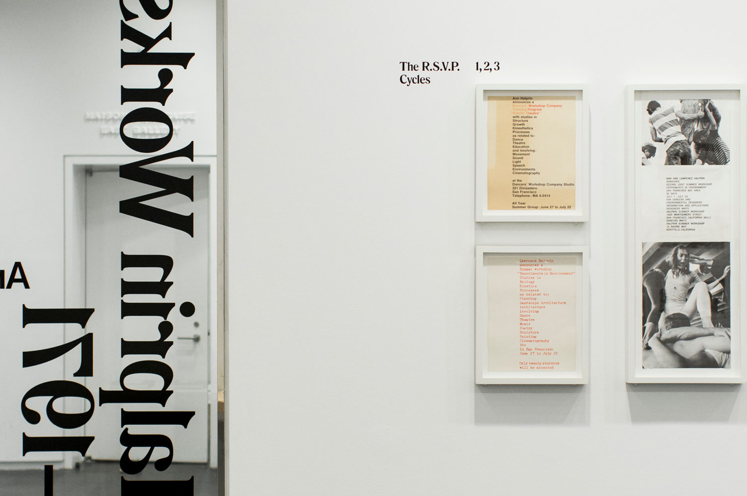
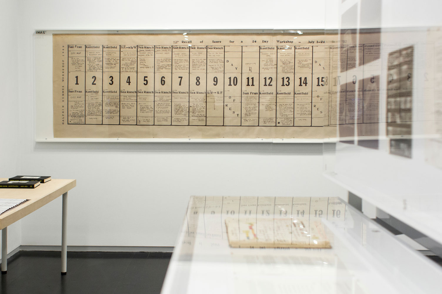
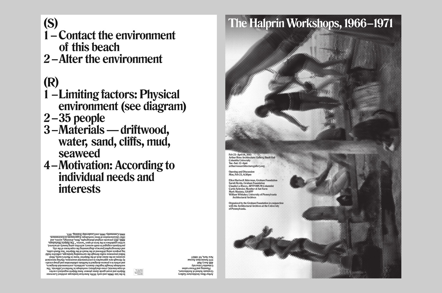
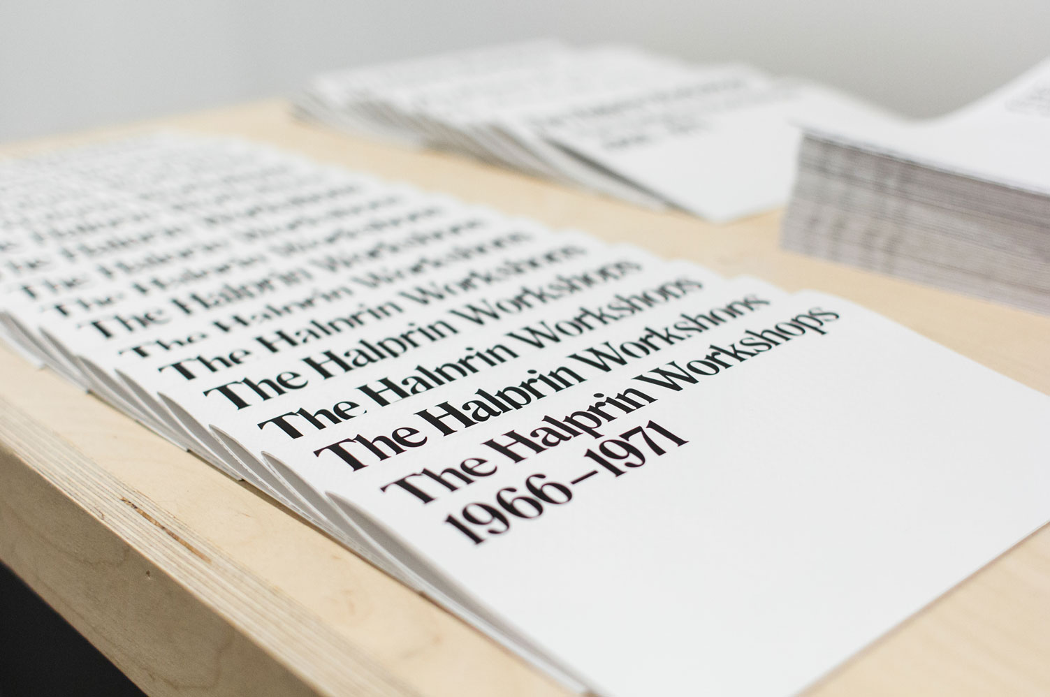
The Halprin Workshops, 1966—1971
In the late 1960s and early 1970s, landscape architect Lawrence Halprin and avant-garde dance pioneer Anna Halprin organized a series of experimental workshops in Northern California which brought together dancers, architects, designers, and artists in a process designed to facilitate collaboration and group creativity through new approaches to environmental awareness. The Halprin Workshops, 1966–1971 presents original photographs, films, drawings, instructions, and other documentation of three workshops: Experiments in Environment (1966); Community (1968); and Leadership Training (1971).
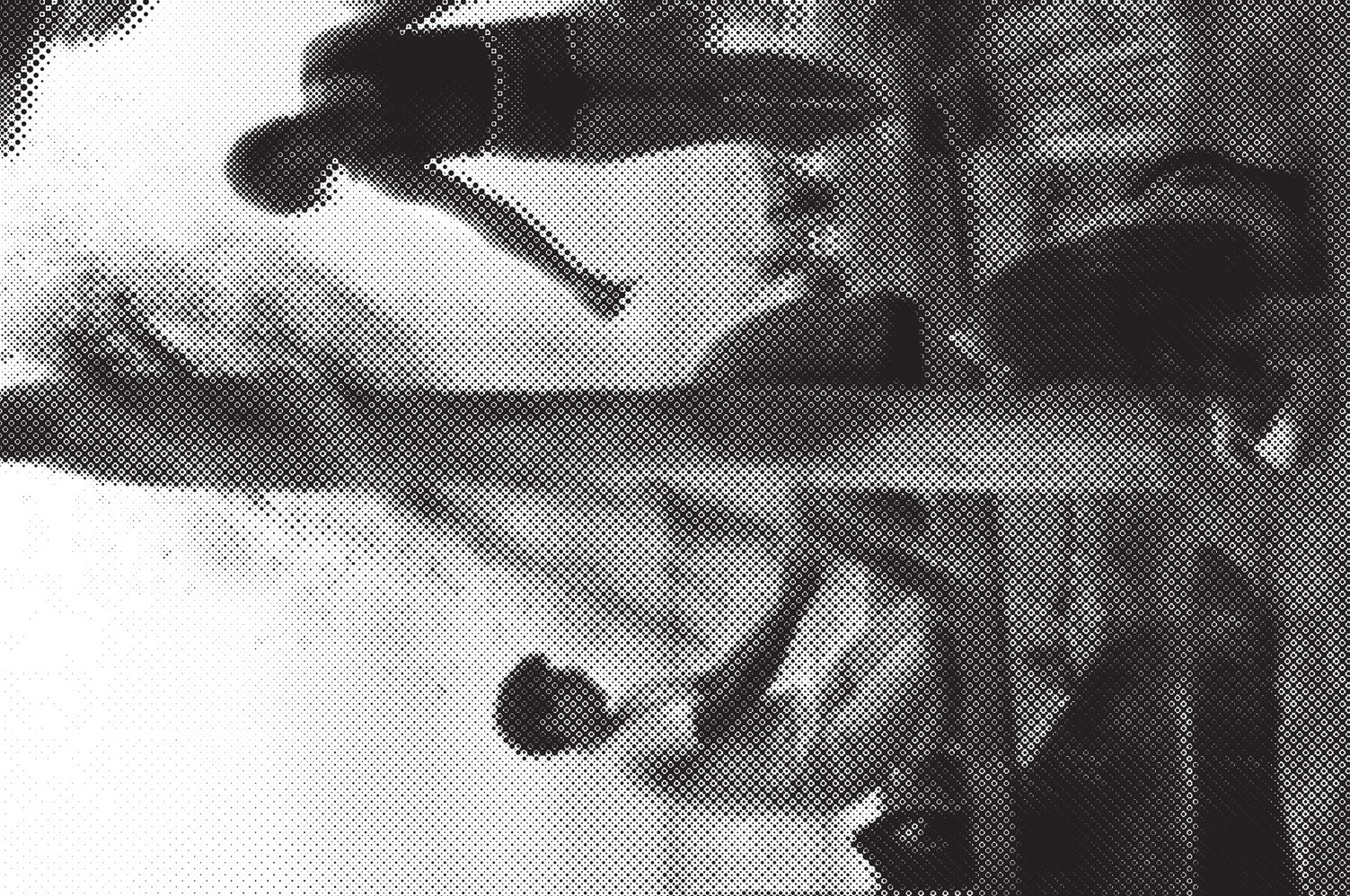
MTWTF’s poster juxtaposes and graphically re-presents two different descriptions of the same workshop: its script (what the Halprins called the “Score” and “Resources”) and a photograph of the proceedings - one on each side. The peculiar typesetting of the textual instructions, based on a commercial font used by the Halprins, and an inventive halftoning system for the photograph bring the two descriptions into conversation and conflict. By representing the same event in two ways, the poster reflects on the space between the two modes and offers viewers a critical entry into the exhibition’s materials.
Curators: Ellen Hartwell Alderman, Sarah Herda, William Whitaker
Exhibition design: Adam Bandler, Mark Wasiuta
Assistant curator: Florencia Alvarez Pacheco
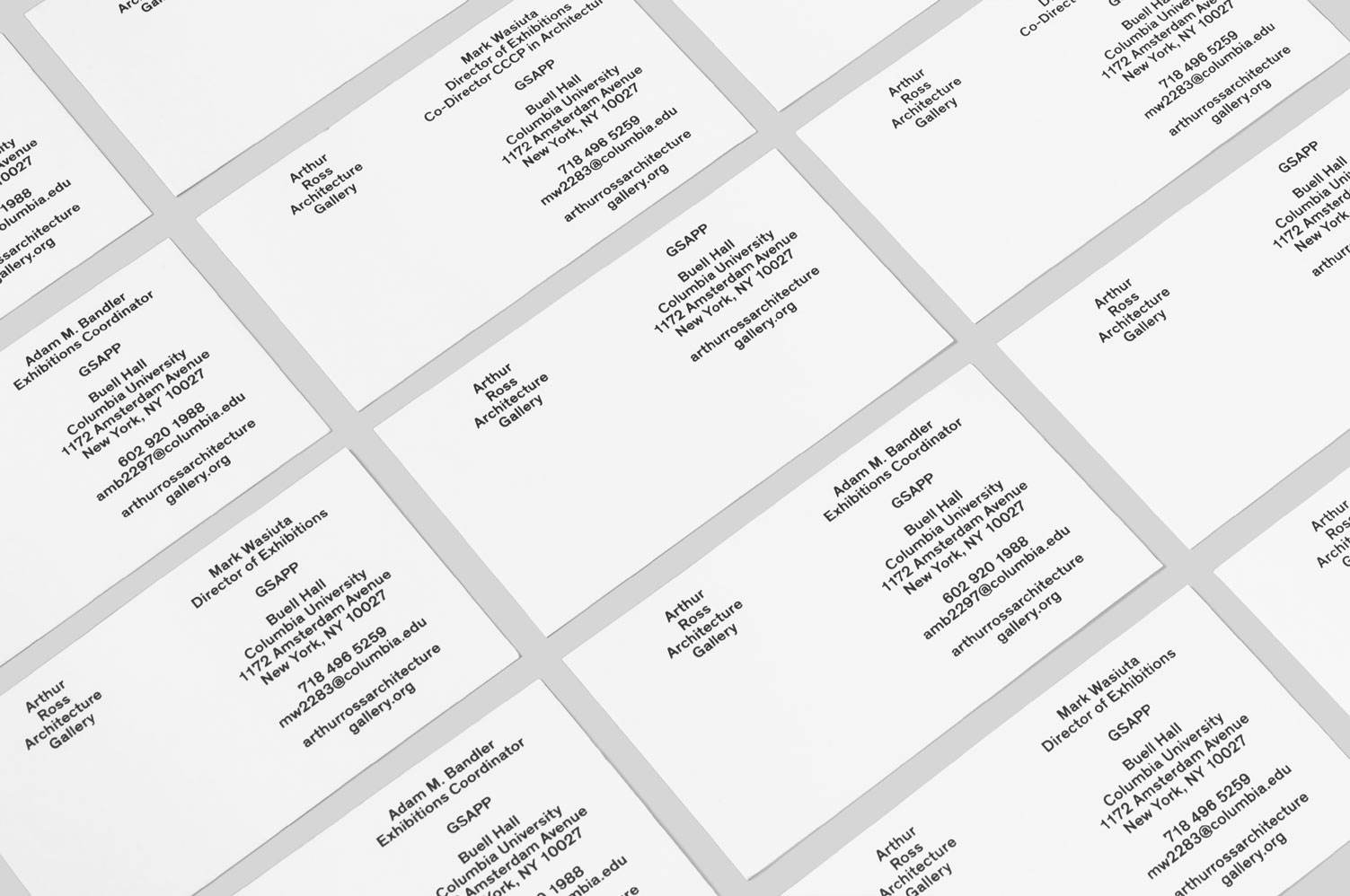
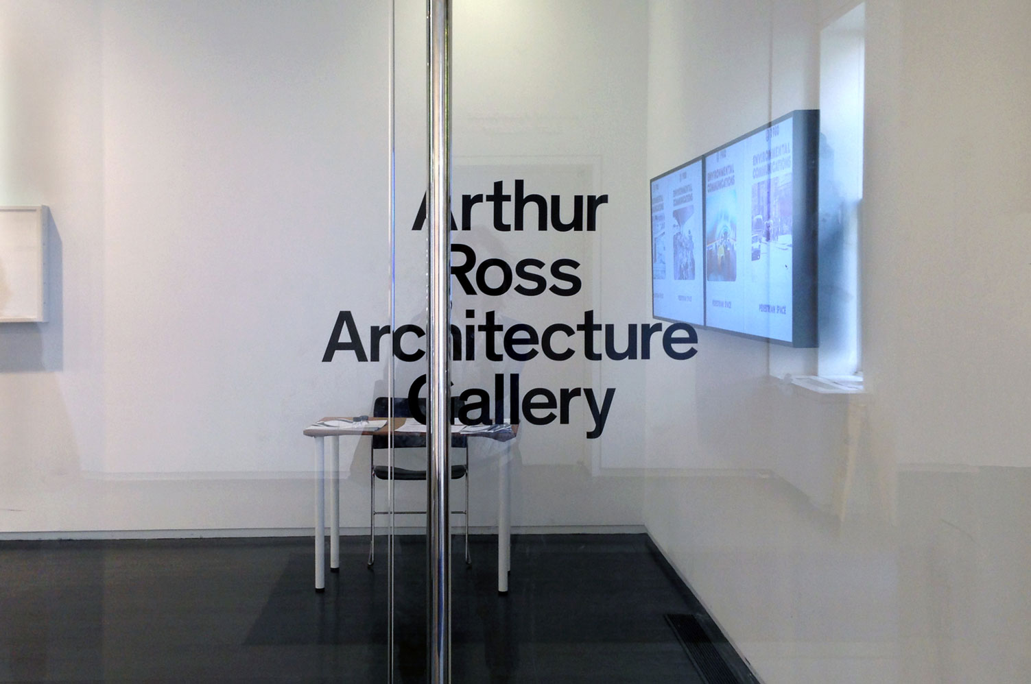
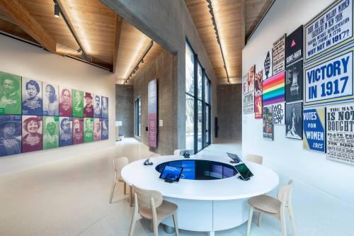
Arthur Ross Architecture Gallery identity
To celebrate the reopening of the Arthur Ross Architecture Gallery (ARAG), Director Mark Wasiuta commissioned a visual identity and a website to make the gallery’s research-driven programming accessible to a wider audience.
MTWTF developed a logotype that would contrast the gallery’s existing graphical language, thereby accentuating precisely what the gallery is not by presenting (and sometimes undermining) its opposite. The logotype’s words are center-aligned in a traditional fashion and the mark positions itself at the center of the compositions it occupies. For example, on the gallery’s asymmetrical glass doors the logotype sits dead center, however, it is partially obscured by the handle and obtrusively breaks between glass panels .
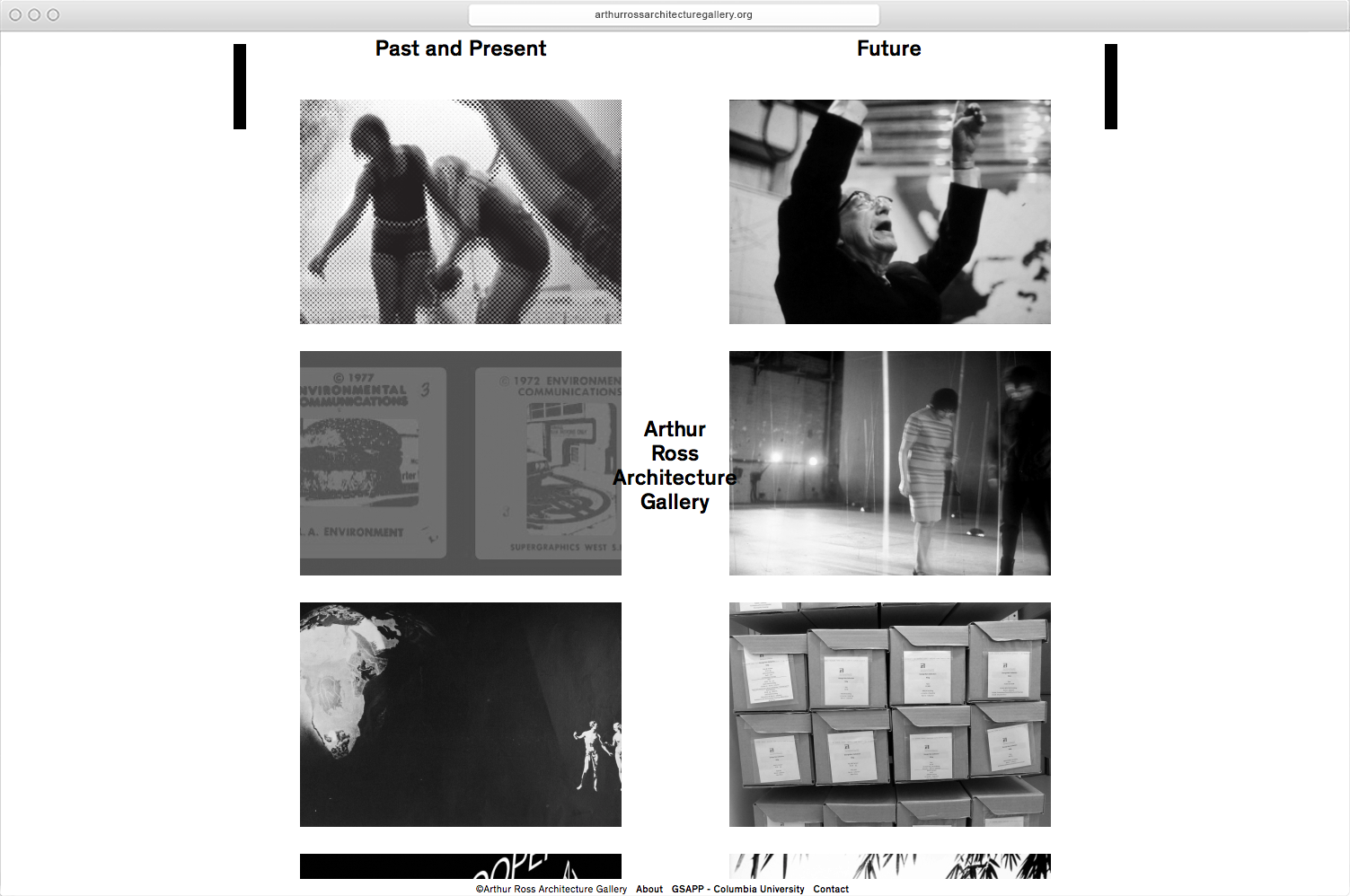
The ARAG website presents ten years of exhibitions produced by GSAPP Exhibitions and shown in the gallery or external institutions. The site’s homepage is divided into two diagrammatic columns: “Past” (deep archive) and “Future” (upcoming exhibitions/events), with ARAG (via its logotype/identity) centered in the middle occupying the present and acting as a mediator between archives and exhibitions.
Client: Arthur Ross Architecture Gallery; Mark Wasiuta, Director of Exhibitions and Adam Bandler, Exhibitions Coordinator
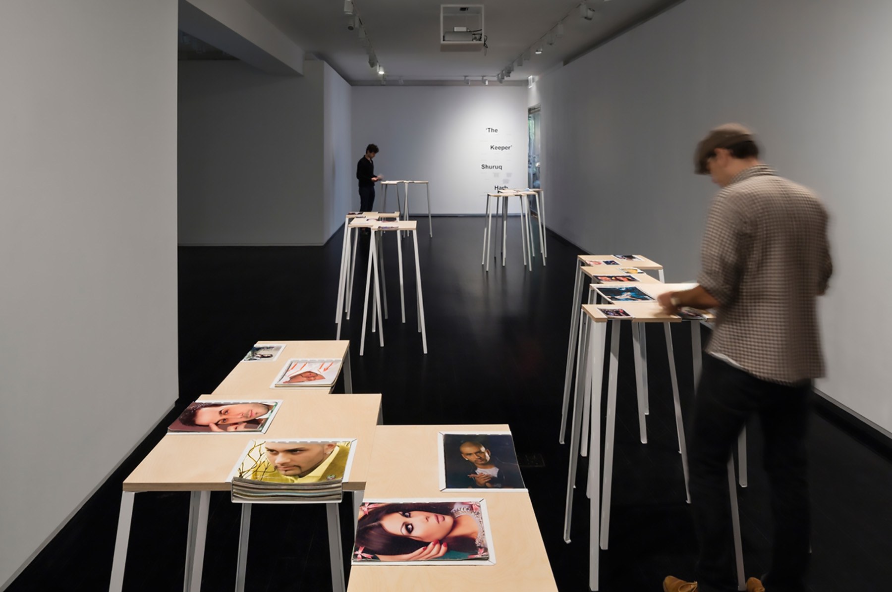
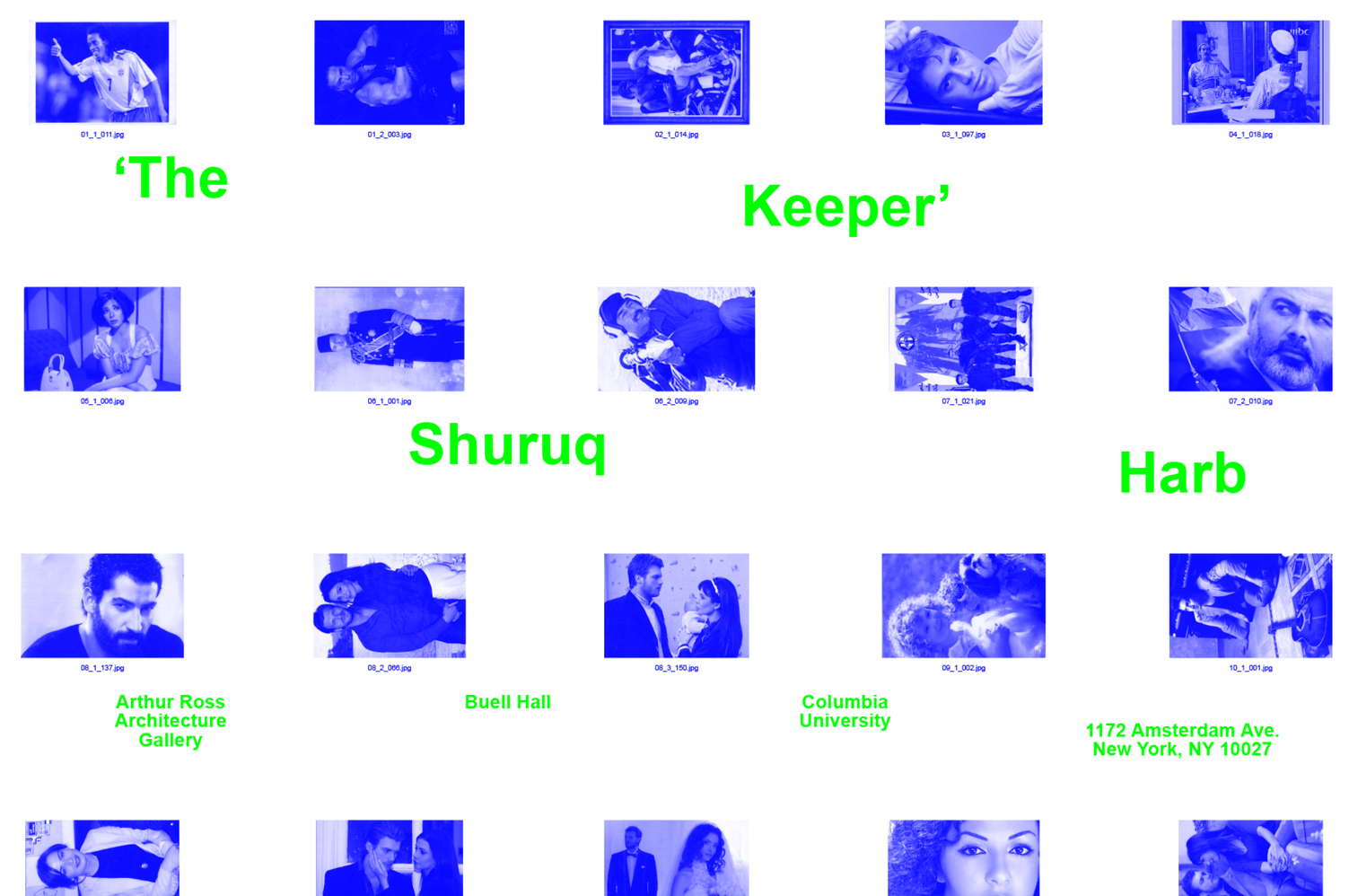
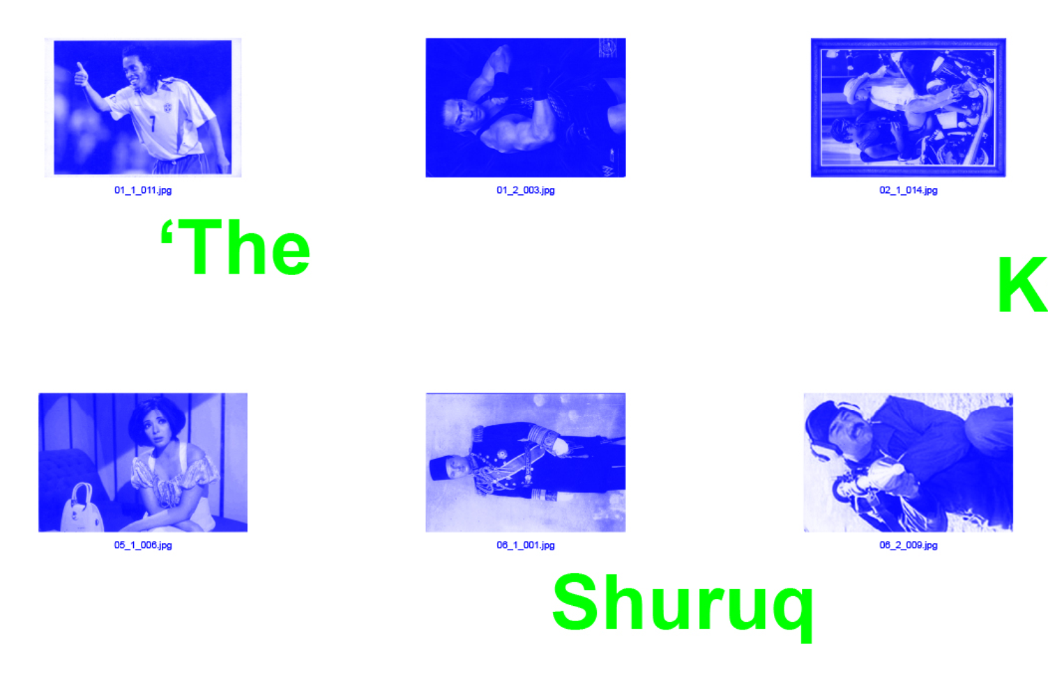
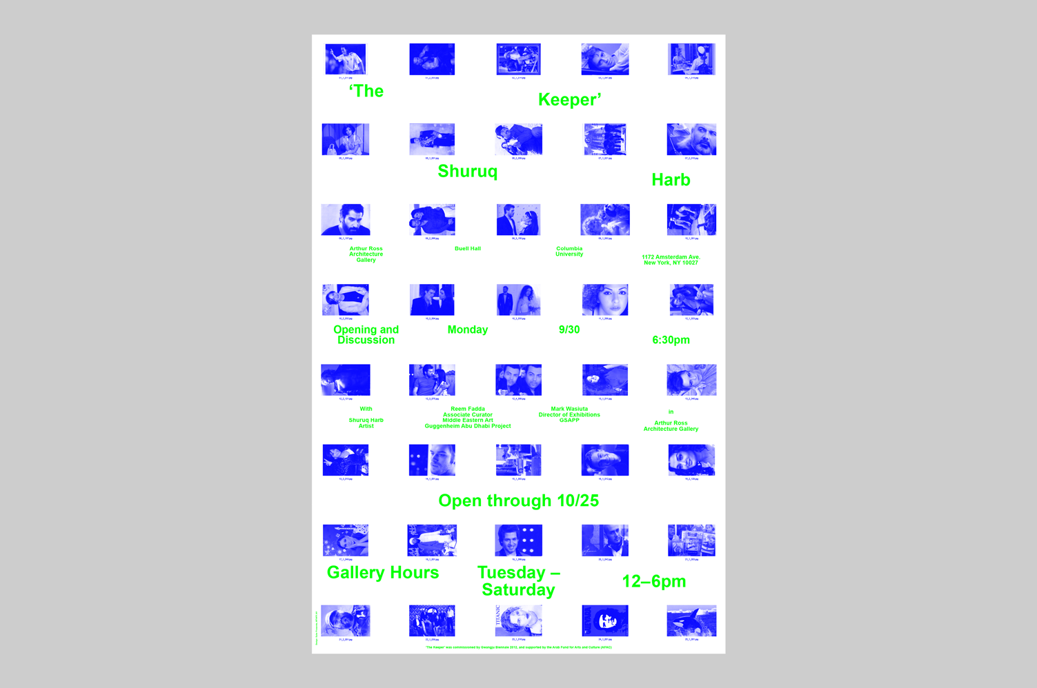
The Keeper
At the core of The Keeper are more than 2,000 photographs that artist Shuruq Harb inherited in 2010. They are part of a vast archive assembled by Mustafa, a young image entrepreneur who collected photographs online to print and sell on the streets of Ramallah.
The poster features a grid of images culled from the exhibition’s selection. MTWTF’s use of a thumbnail view format, digital file-naming conventions, and super-saturated RGB colors, all play off issues raised by The Keeper, from the relationship between the digital and analog to the experience and economy of today’s images.
Artist: Shuruq Harb
Associate curator: Reem Fadda, Middle Eastern Art, Guggenheim Abu Dhabi Project
Curators: Mark Wasiuta, Adam M. Bandler
Graphic design: MTWTF
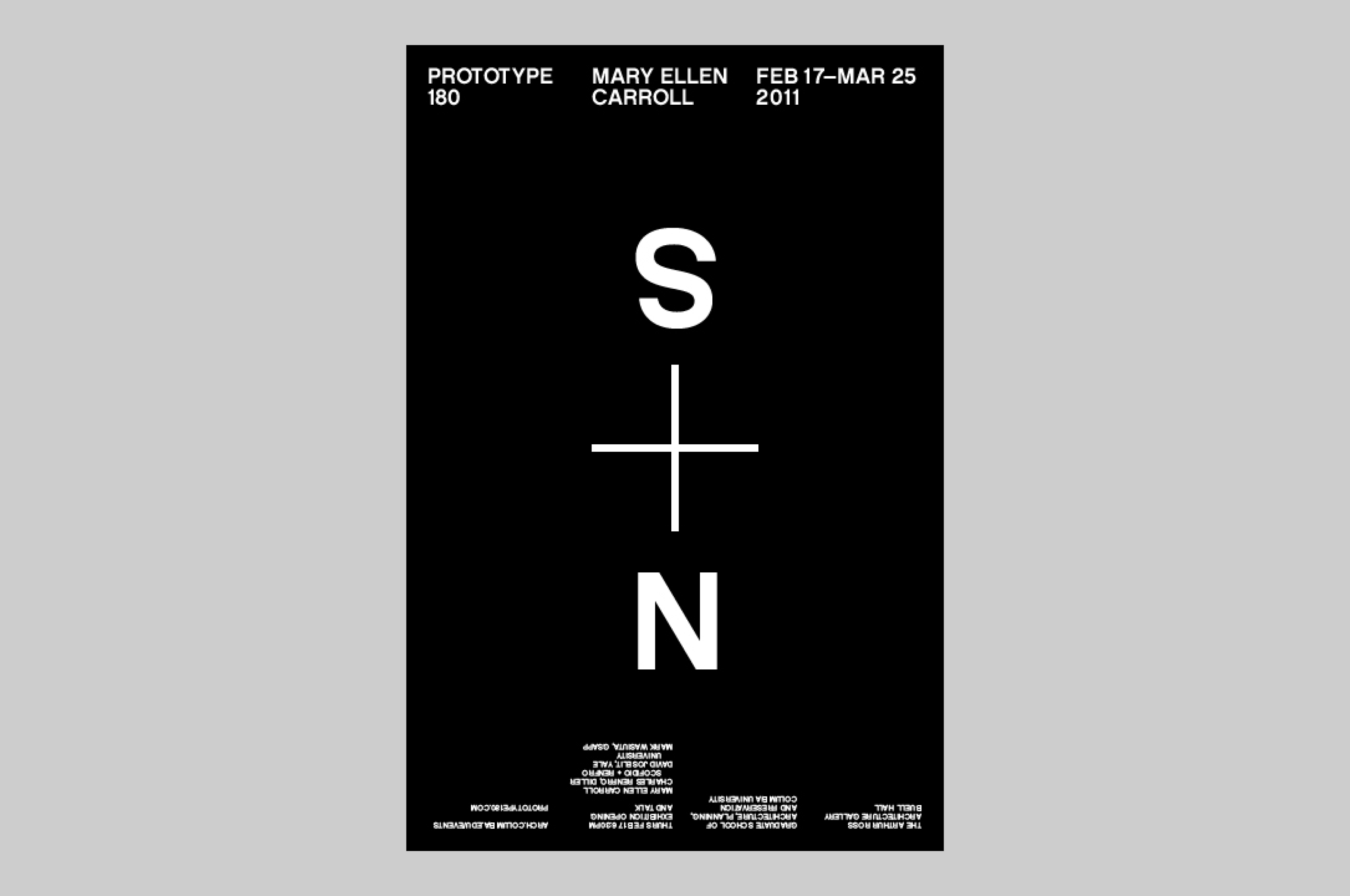
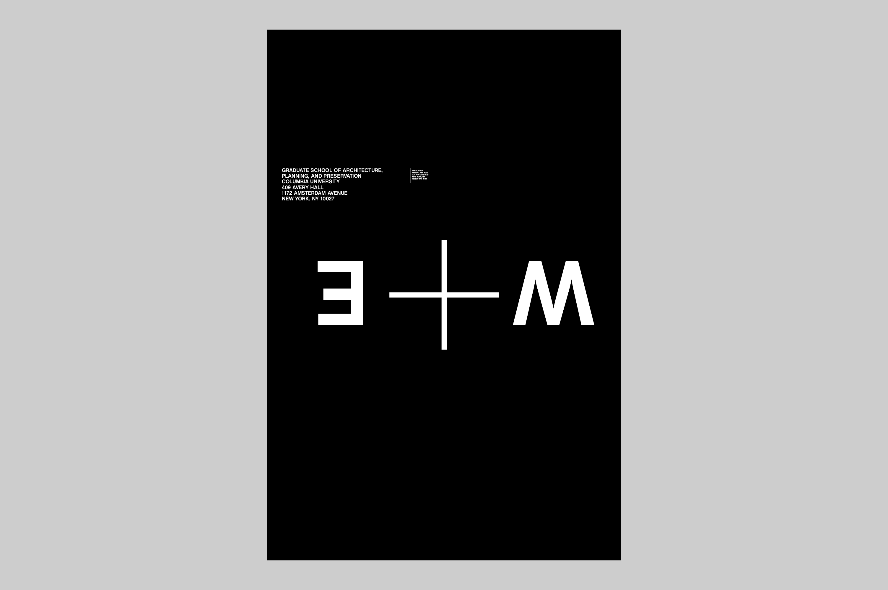
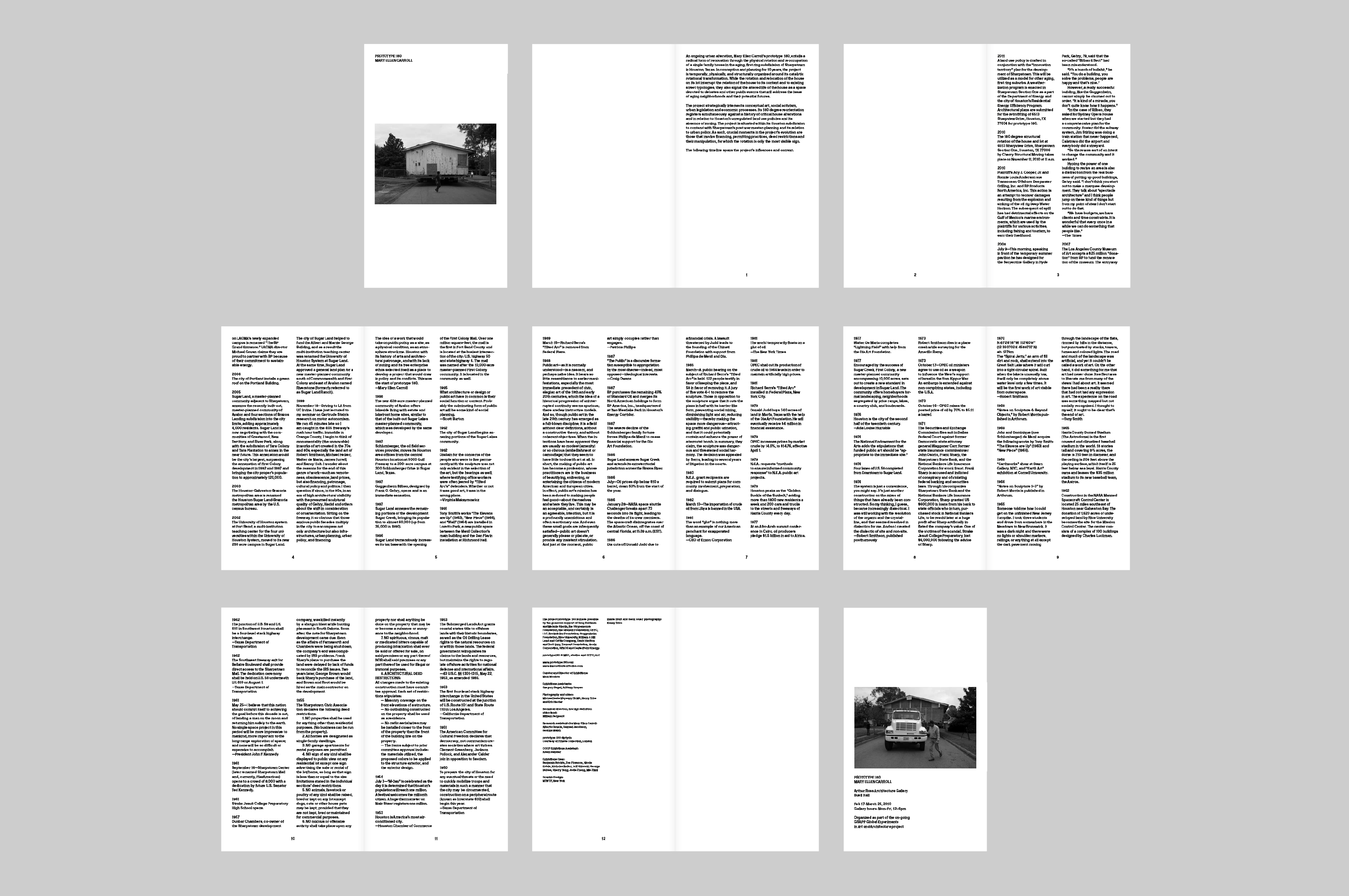
Prototype 180
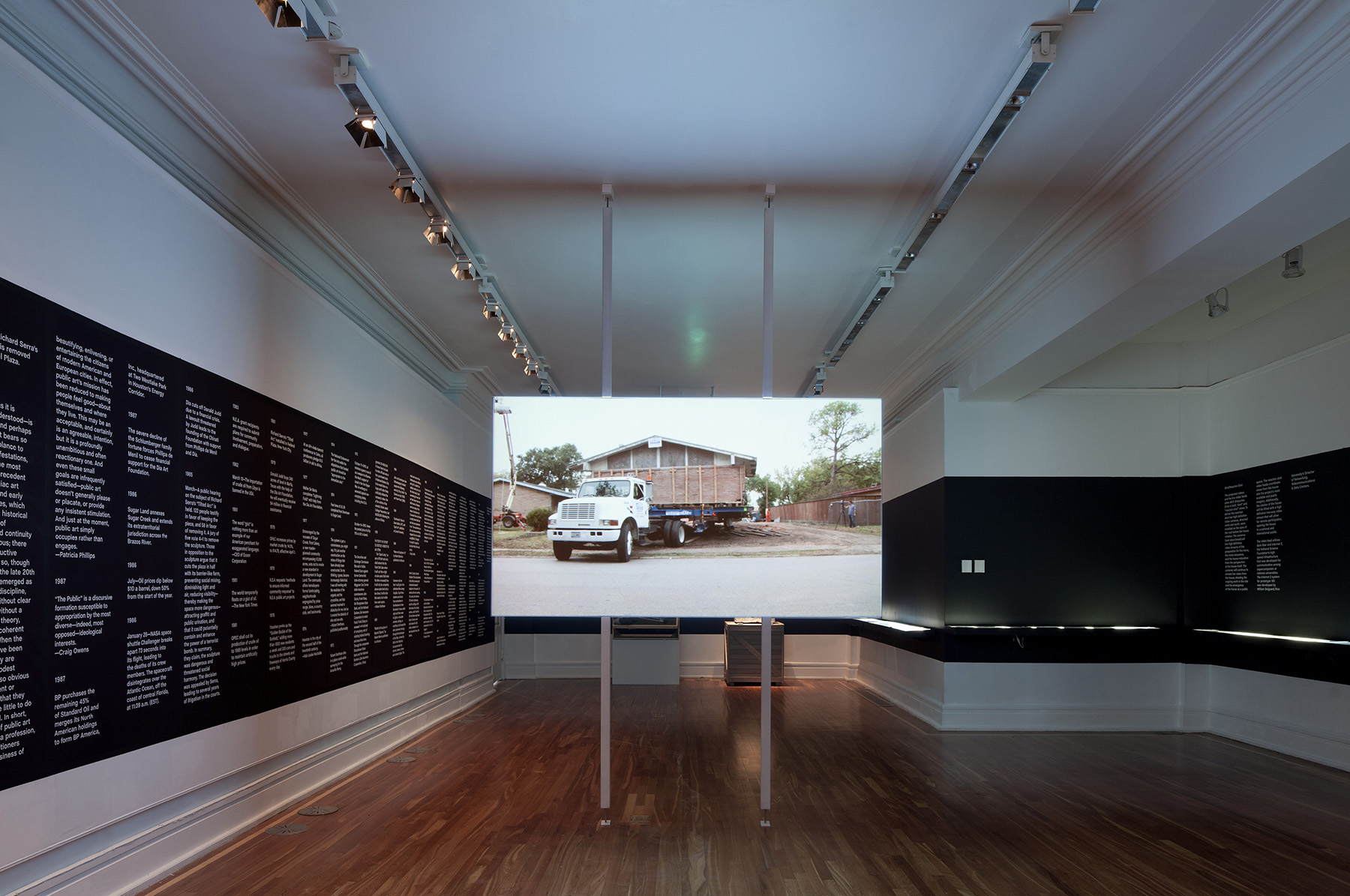
Artist Mary Ellen Carroll's Prototype 180 is an urban intervention and a conceptual work in which a single-family house in Houston, Texas is turned 180 degrees and then reconnected to city services and subsequently reoccupied. Planned over a span of 10 years, the project is temporally, physically, and structurally organized around its rotational transformation of a house object which reveals its many linkages to urban legislation, physical surroundings, economic processes, social activism, and conceptual art. The exhibition incorporates recorded and live video, physical models, photographic documentation, and a room-sized timeline.
MTWTF’s poster positions the title and date of the exhibition as a framework inside which a minimalist compass rose acts as a visual icon. On the compass, the directional indicators of N and S are rotated 180 degrees on the front, while the E and W appear rotated 180 degrees on the back. Because the N and S letterforms on the front are diagonally symmetrical, the effect of the rotation produces a subtle disorientation, echoing Mary Ellen Carroll's act itself.
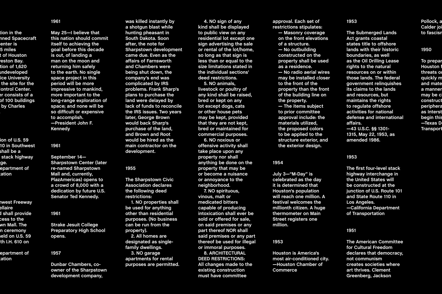
The room-scale typographic timeline situates Prototype 180 within a combined history of zoning policy and Land Art, and surrounds a two-sided screen showing the rotation of the house from both sides. The timeline also appears as a takeaway booklet within the exhibition.
MTWTF’s poster manipulates the symbols of orientation to disorient viewers – inviting us to look more closely at weary dichotomies, like front and back, which we think we know.
Artist: Mary Ellen Carroll
Curator: Mark Wasiuta
Assistant curator: Adam Bandler
Concept and graphic design: MTWTF
Photography and video: Michael Isabell/ eyespy FILMS, Kenny Trice and Eric Hester
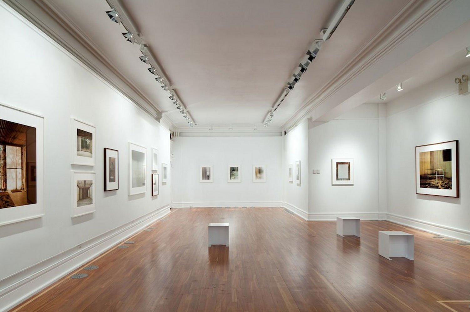
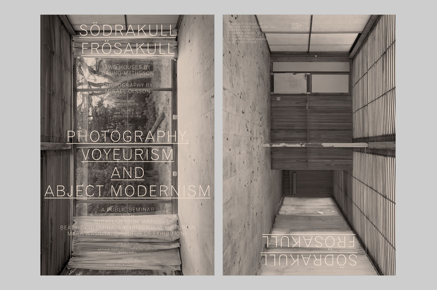
Mikael Olsson: Södrakull Frösakull
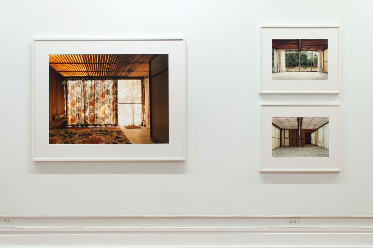
Mikael Olsson: Södrakull Frösakull presents photographs of two houses by Swedish designer and architect Bruno Mathsson: the summer house at Frösakull built in 1960 and the house at Södrakull built in 1964–1965. The Frösakull photographs, shot from within the house, have an invasive, obsessive quality while the Södrakull ones, shot from the exterior, have a voyeuristic quality. Olsson’s project looks at the relationship between architecture, photography and preservation, exploring the condition of these houses as preserved through photography, while questioning what may be neglected or erased through subsequent repair and reoccupation.
Reflecting the duality of the exhibition’s content, the poster pairs an exterior image of the house at Södrakull, looking in, with an interior image of the house at Frösakull, peering out through a floor to ceiling window. As opposed to the traditional placement of a photograph inside a composition, the poster uses full bleed images rotated 90 degrees to create an disorienting visual field and function as a window between interior and exterior.The poster’s front and back act as a dialectical, that speak to the themes of intimacy and distance, and public and private, themes that Olsson’s photography engages.
Curators: Mikael Olsson, Mark Wasiuta
Artist: Mikael Olsson

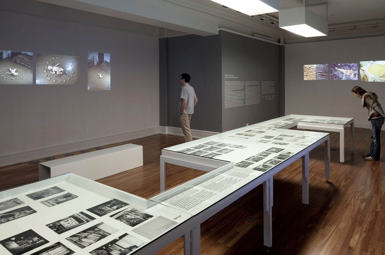
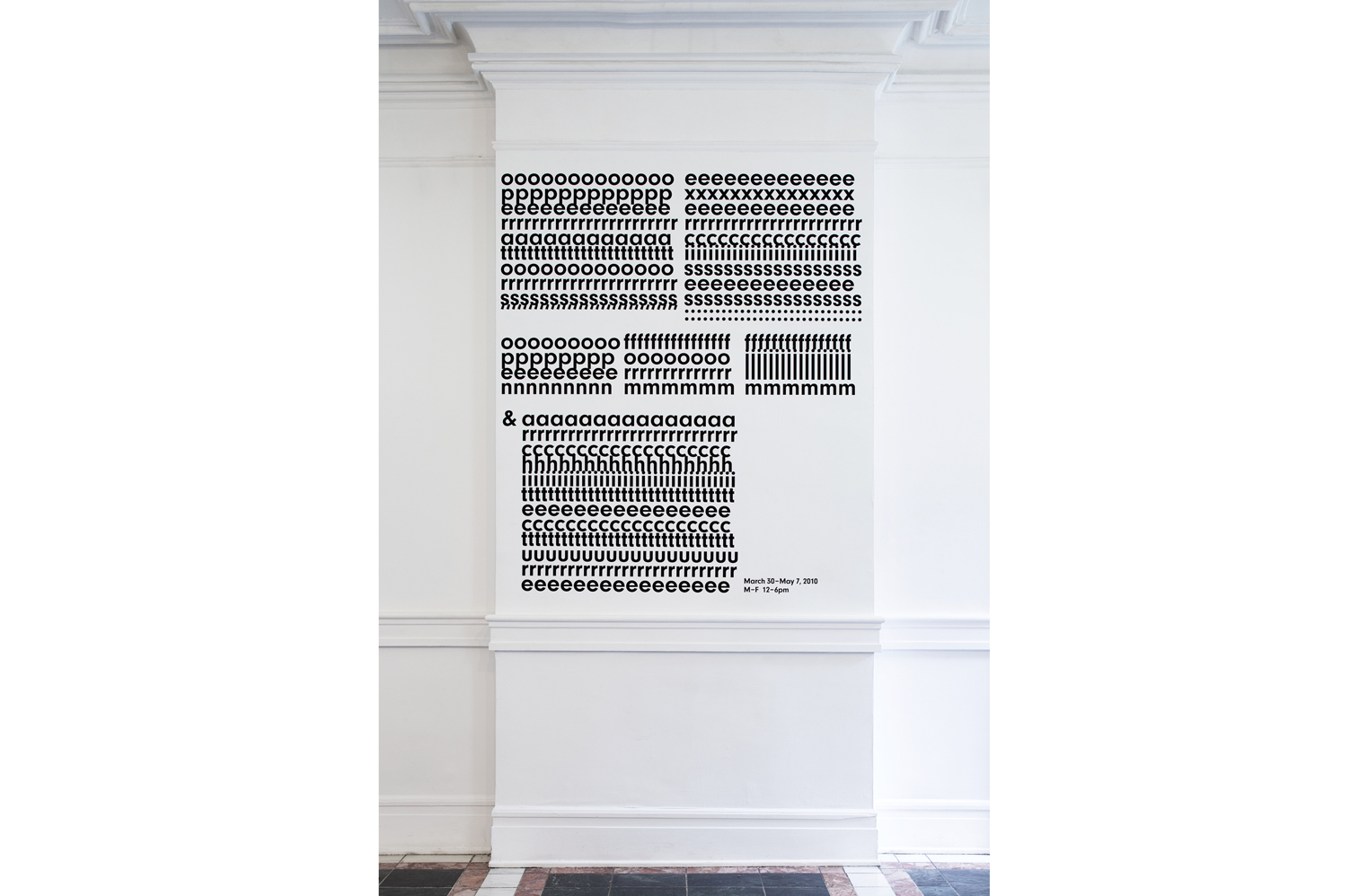
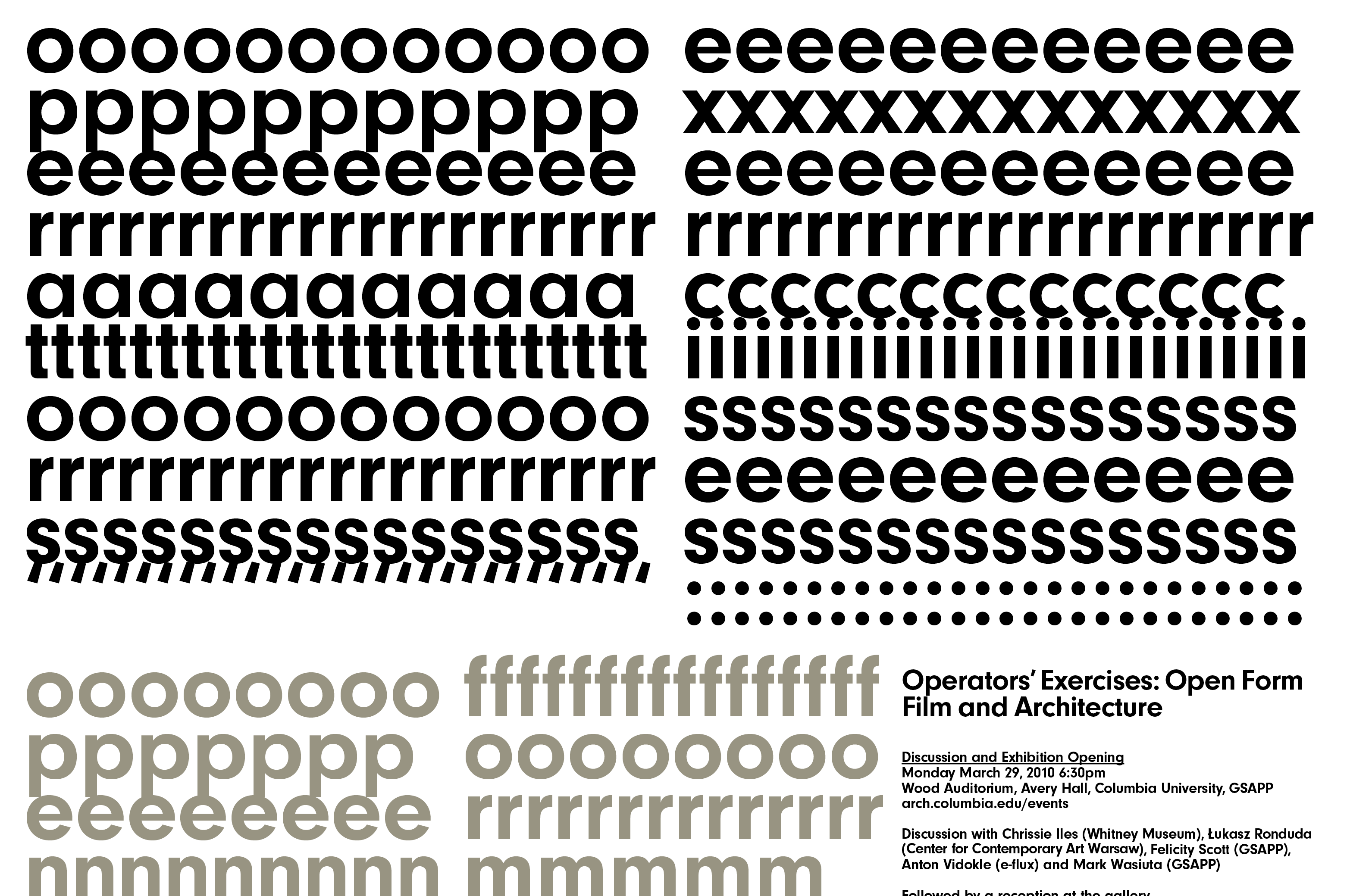
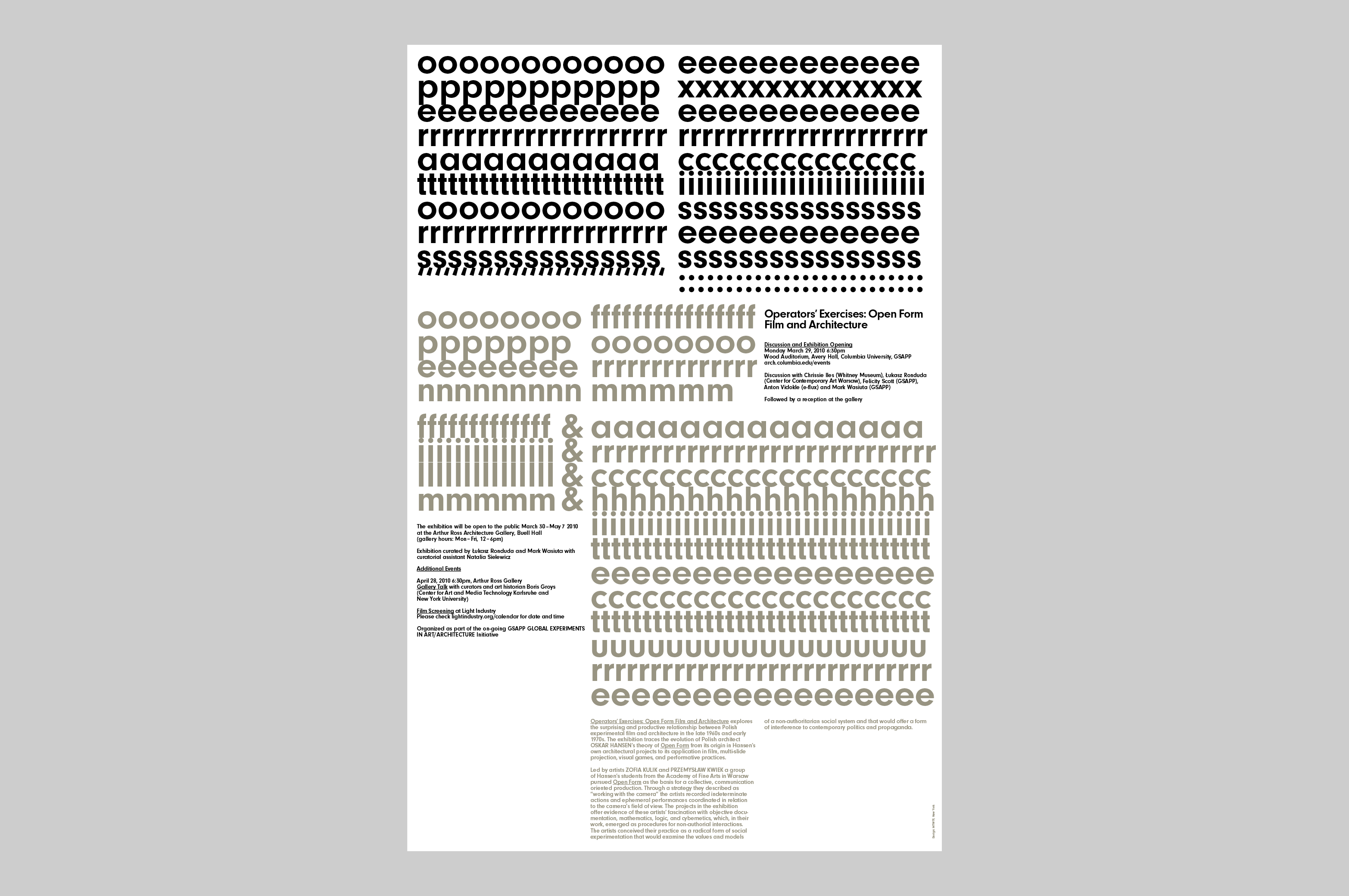
Operators Exercises: Open Form Film and Architecture
Operators’ Exercises: Open Form Film and Architecture explores the surprising and productive relationship between Polish experimental film and architecture in the late 1960s and early 1970s. The exhibition traces the evolution of Polish architect Oskar Hansen’s theory of “Open Form”, a collective, communication-oriented, non-narrative approach to filmmaking involving indeterminate and ephemeral actions. The resulting procedures took the form of film, multi-slide projection, visual games, and performative practices. The exercises were conceived as a radical form of experimentation that examined the values and models of a non-authoritarian system, offering new ways of engaging social and political spheres.
Inspired by Oskar Hansen and his students’ exercises, as well as the experimental typography of Hansjörg Mayer, Emmett Williams, Reinhardt Döhl, and Carl Andre, MTWTF invented a textual game where each word of the title is spelled vertically while each letter is repeated across to form a block, creating an unexpected visual field that challenges accepted ways of reading while celebrating the strangeness of language and letterforms. The exhibition handbook contains both the captions for the entire exhibition as well as an inset of film stills. Another reflection of process, the handbook performs an exercise in image printing by using a digital stippling generator to convert the analog film stills into a voronoi halftone, rendering them large and vivid.
Curators: Lukasz Ronduda, Mark Wasiuta
Assistant curator: Natalia Sielewicz
Exhibition design: Adam M. Bandler, Mark Wasiuta
Graphic design: MTWTF
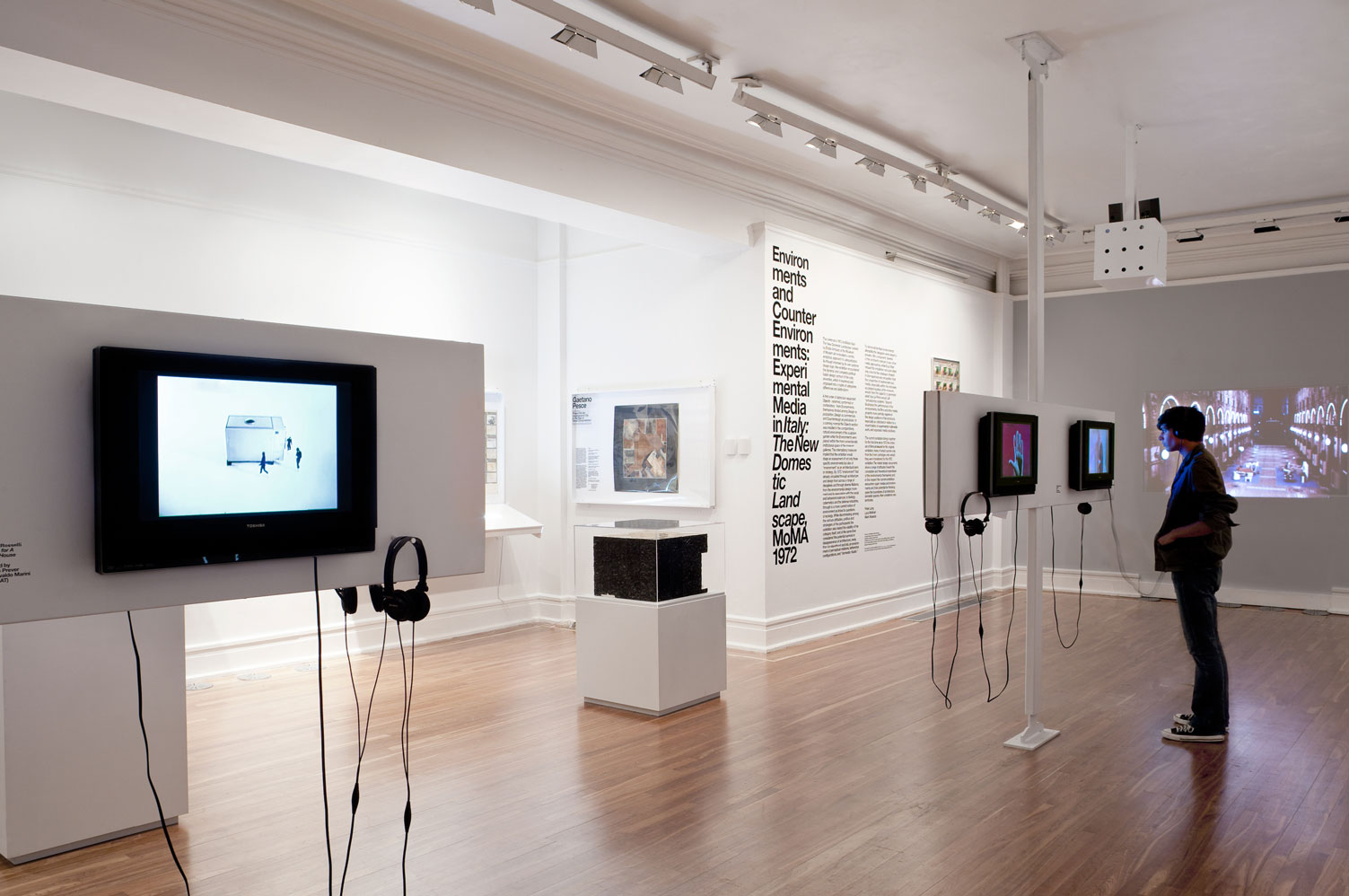
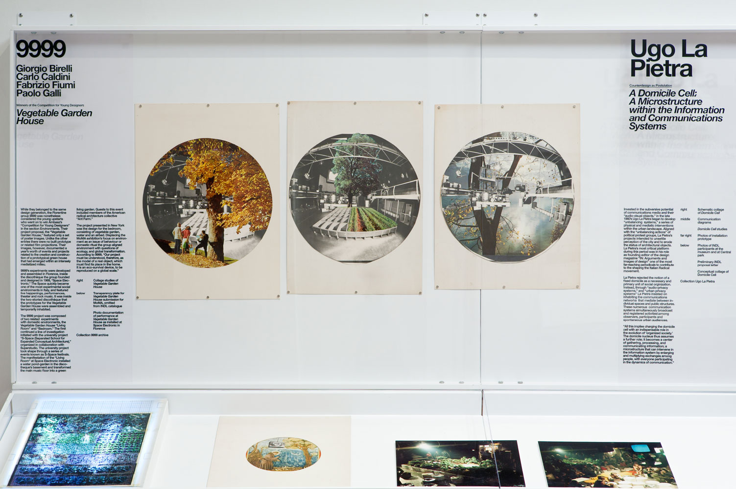
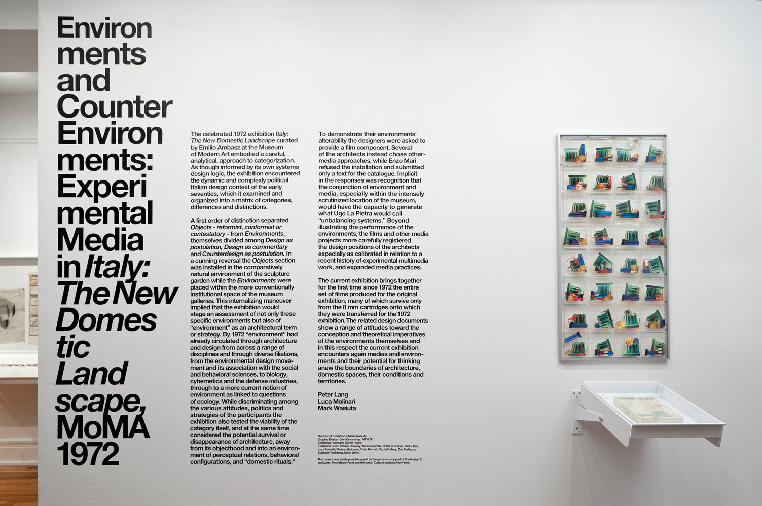
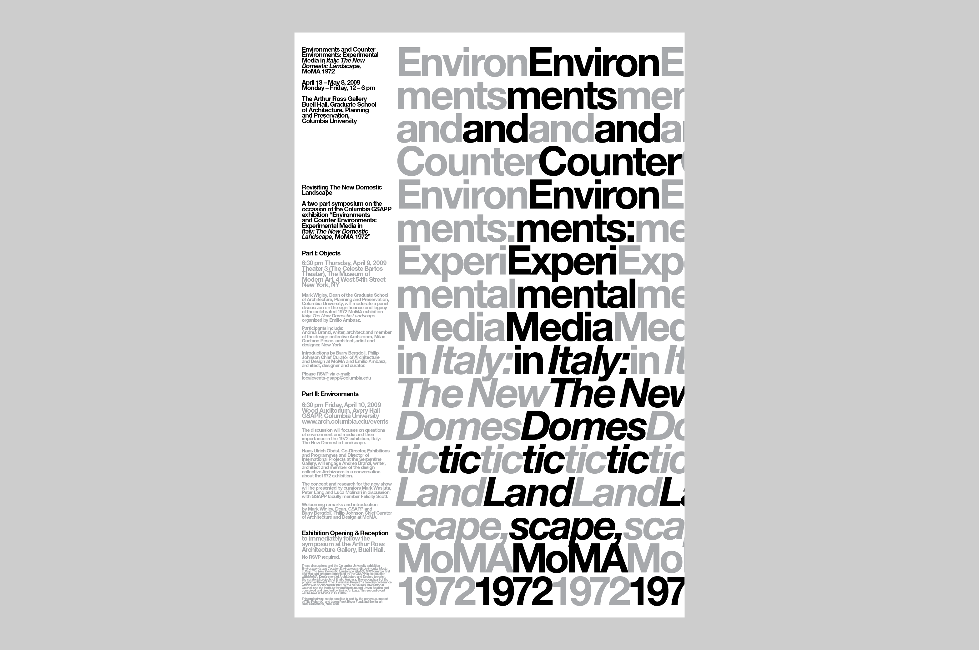
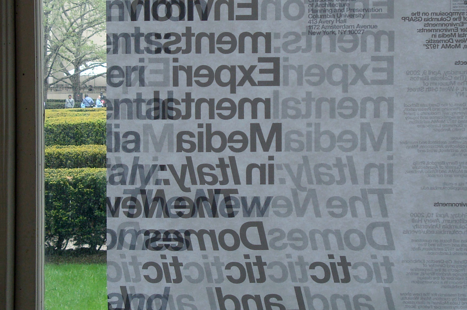
Environments and Counter Environments: Experimental Media in Italy: The New Domestic Landscape, MoMA 1972
“Environments and Counter-Environments: Italy: The New Domestic Landscape, MoMA 1972” re-stages an expanded fragment of an exhibition at the Museum of Modern Art organized by Emilio Ambasz in 1972, which displayed and theorized radical Italian product design of the late 60s and early 70s. In addition to presenting domestic design objects, divided into three critical categories, the original exhibition commissioned twelve environments with attendant films, representing two opposing attitudes: (1) “Design”: projects that take problem-solving—within their natural and socio-economic milieu—as their goal and (2) “Counterdesign”: projects which believe that only a renewed interest in philosophical discourse and socio-political involvement can bring about meaningful structural changes in society.
Arthur Ross Architecture Gallery’s “Environments and Counter Environments…” gathers the original set of films which accompanied the commissioned environments, as well as communication and planning documents related to the exhibition. The installation asks viewers to consider anew the imperatives and context of their own environments.
Inspired by both the curators’ and Ambasz’s critical frameworks, MTWTF explored two ways that the announcement might simultaneously assert itself as a poster and counter-poster: (1) by expanding beyond a single object-orientation, becoming more than one format (poster, mailer, and 2 sheet display) and (2) by both embracing and avoiding compositional assumptions about posters. The counter-poster arranges the exhibition title as a tall stack of syllables, which then repeat horizontally like a text. The second instance of each syllable, whose position is dictated by the first, appears strongly in black, while the first instance occupies a less dominant optical position in silver. The exhibition’s graphics and labels extend the poster’s typographic preferences, forming tall, vertical columns which align with the objects they reference.
Curators: Mark Wasiuta, Peter Lang, Luca Molinari
Exhibition design: Mark Wasiuta, Adam M. Bandler
Graphic design: MTWTF
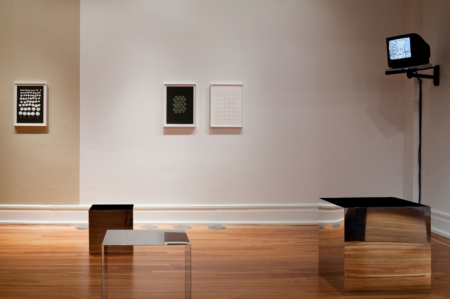
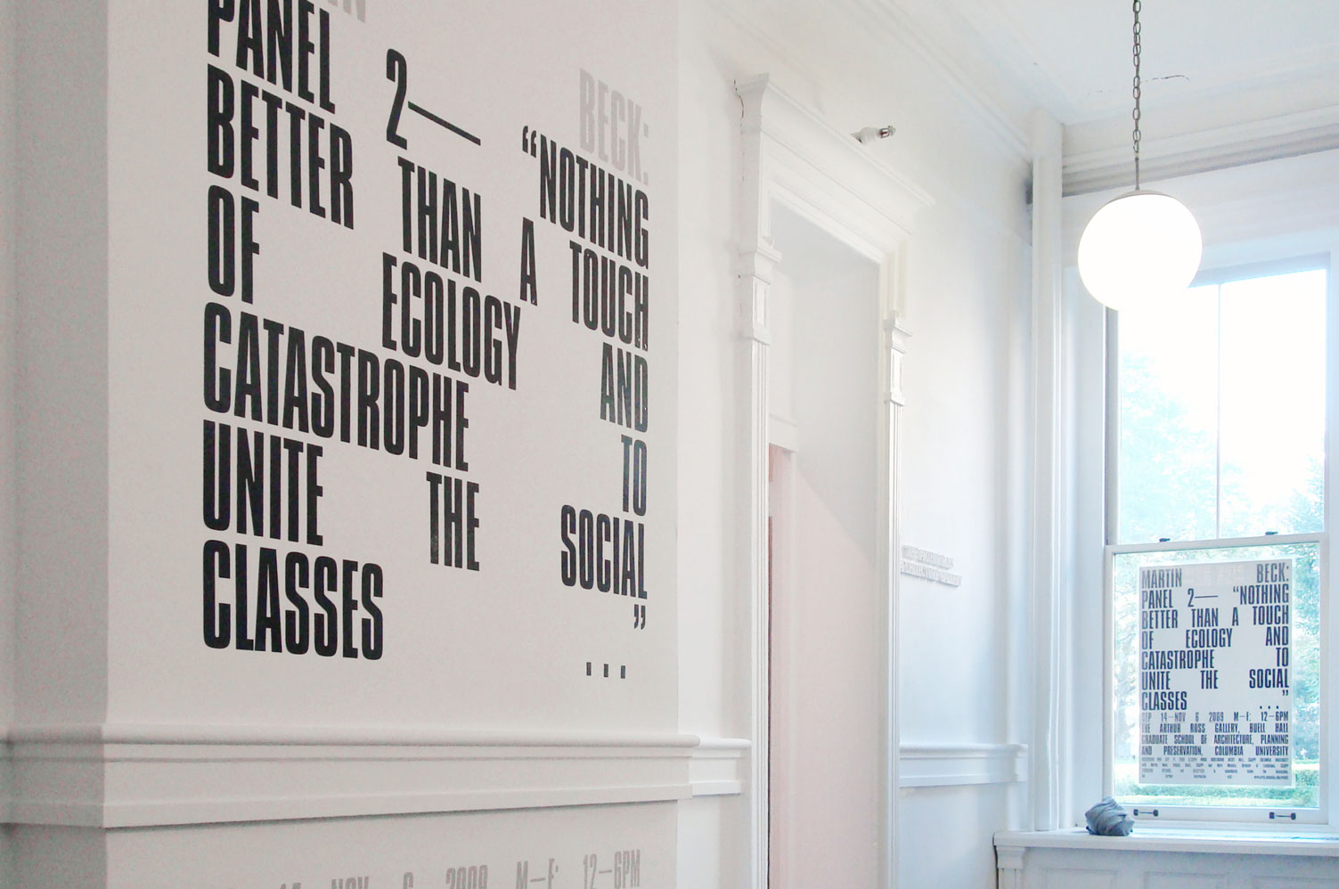
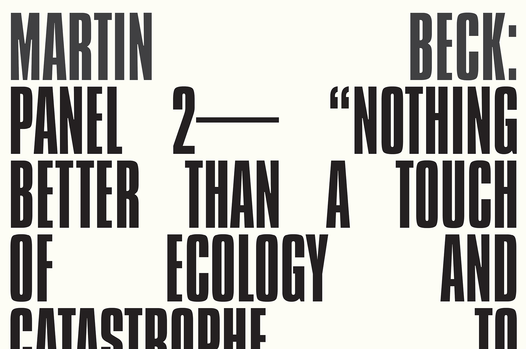
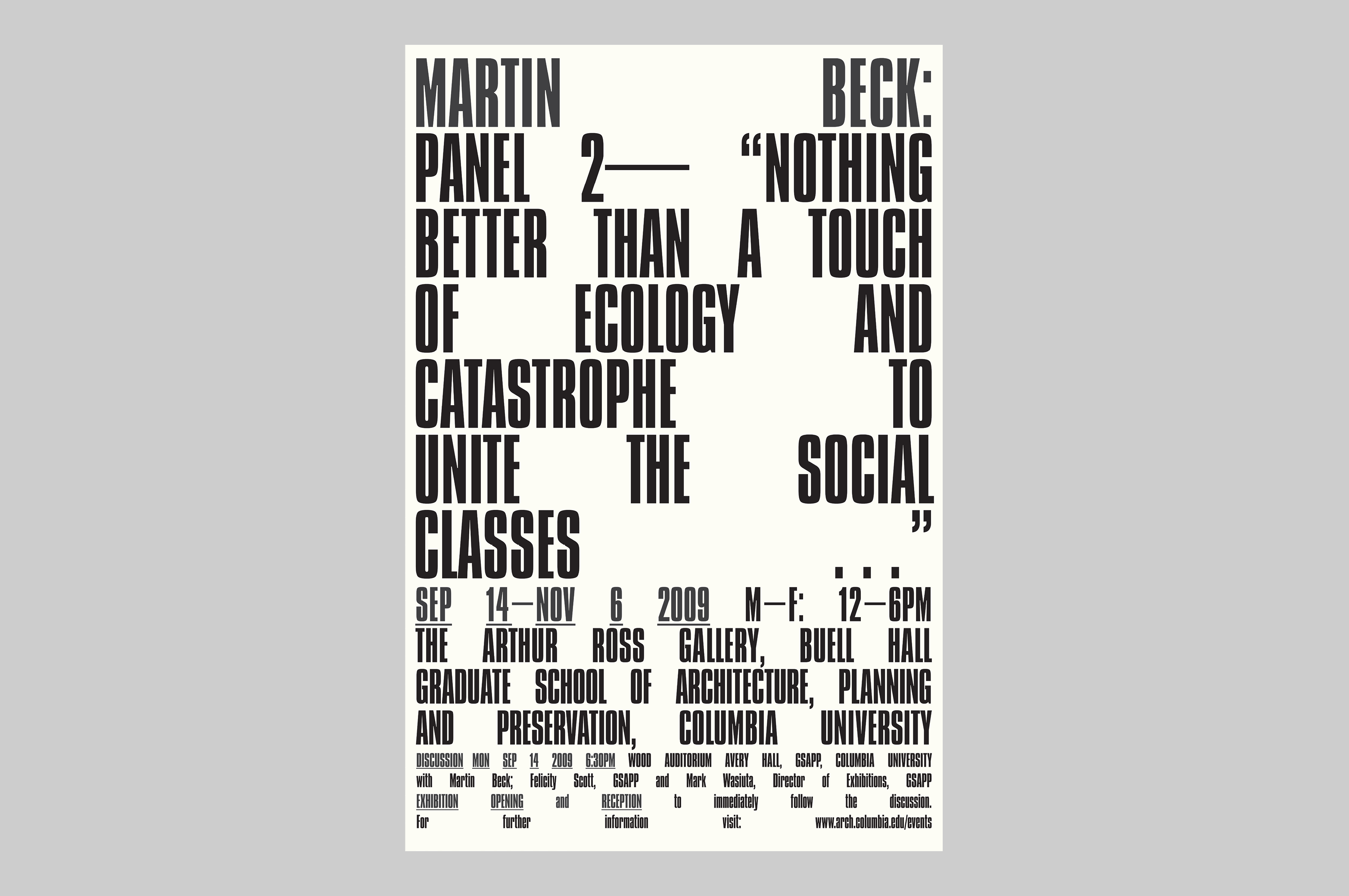
Panel 2: Nothing Better Than a Touch of Ecology and Catastrophe to Unite the Social Classes
Martin Beck’s “Panel 2” installation employs a heterogeneous set of art objects, media, and display techniques to conjure the ideological clash between the design establishment and students that occurred at the 1970 International Design Conference in Aspen, Colorado (IDCA). The installation’s title “Panel 2 — Nothing Better Than a Touch of Ecology and Catastrophe to Unite The Social Classes…” is an excerpt from Jean Baudrillard’s statement “The Environmental Witch-Hunt” which was read at the conference. The installation uses a range of techniques to suggest, reveal, induce, and agitate connections between art and design practices and their intimate relations with capitalism.
MTWTF’s poster borrows the formal aspects (font choice and color palette) from collateral created for an earlier version of the exhibition in London and redeploys them as a dispersed and varied typographic field.
Inspired by the way Martin Beck's installation prompts viewers to make connections between its components, MTWTF pursued several related interests through the design of this poster: 1) early minimalism’s proportion systems, and color pallets, 2) soft modularity of (see Ivan Chermayeff’s Aspen leaf prints), 4) ways of dividing space and filling the divisions with "fields of type" rather that creating compositions with " type objects" 5) celebrating the spatial logic of graphic layout software.
Artist: Martin Beck
Curator: Mark Wasiuta, Director of Exhibitions
Graphic design: MTWTF