Newark Riverfront Park identity and wayfinding 
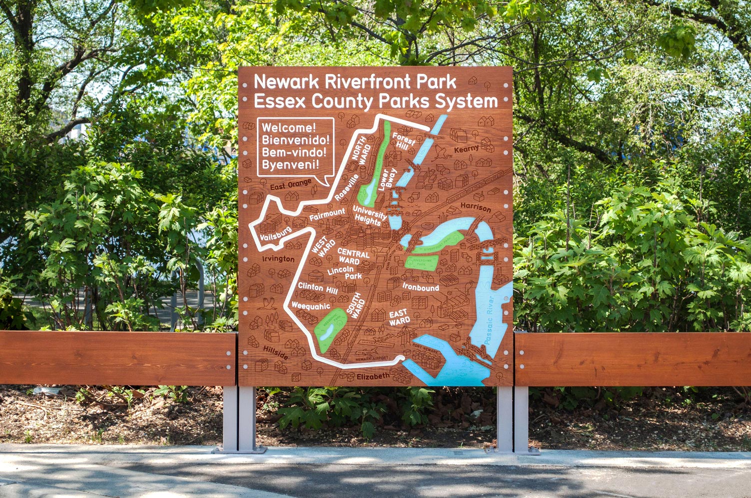
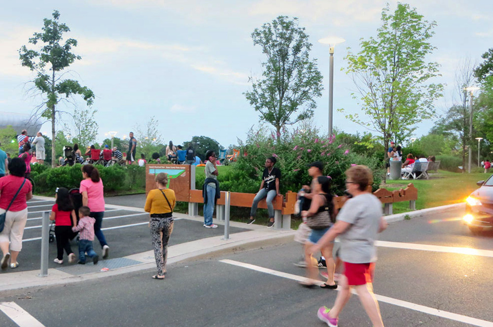
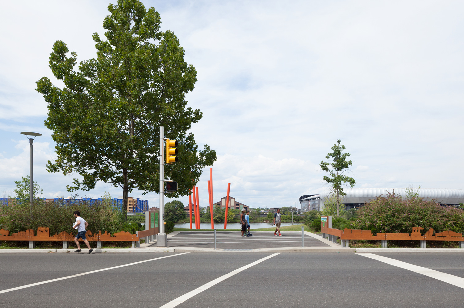
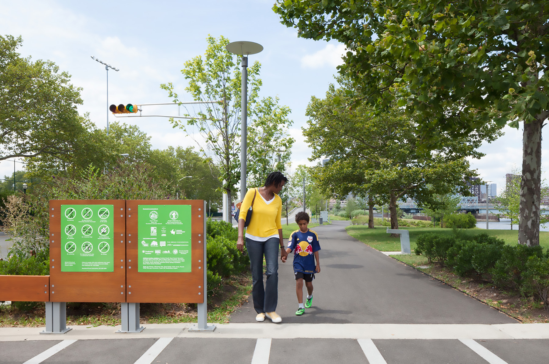
MTWTF’s signage for Newark Riverfront Park extends from wooden railings, marking the park’s entryways and guiding visitors to its key amenities. The graphics were optimized for their specific manufacturing processes so the resulting illustrations, icons, and typography could appear simple, clear, and toy-like.
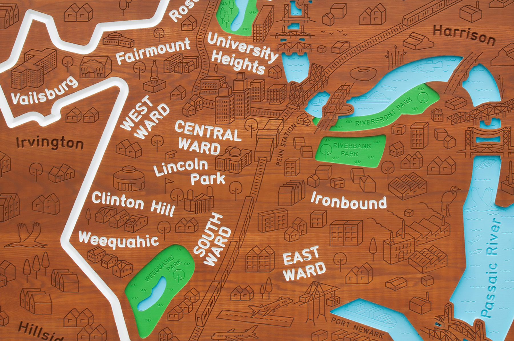
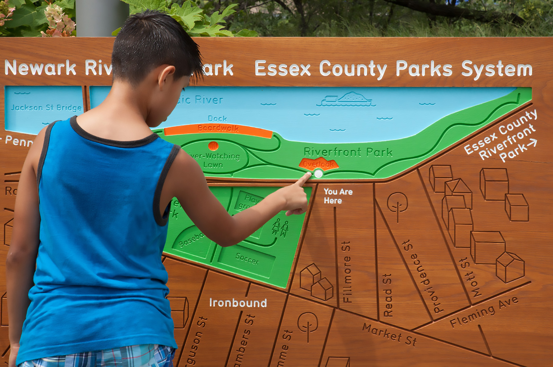
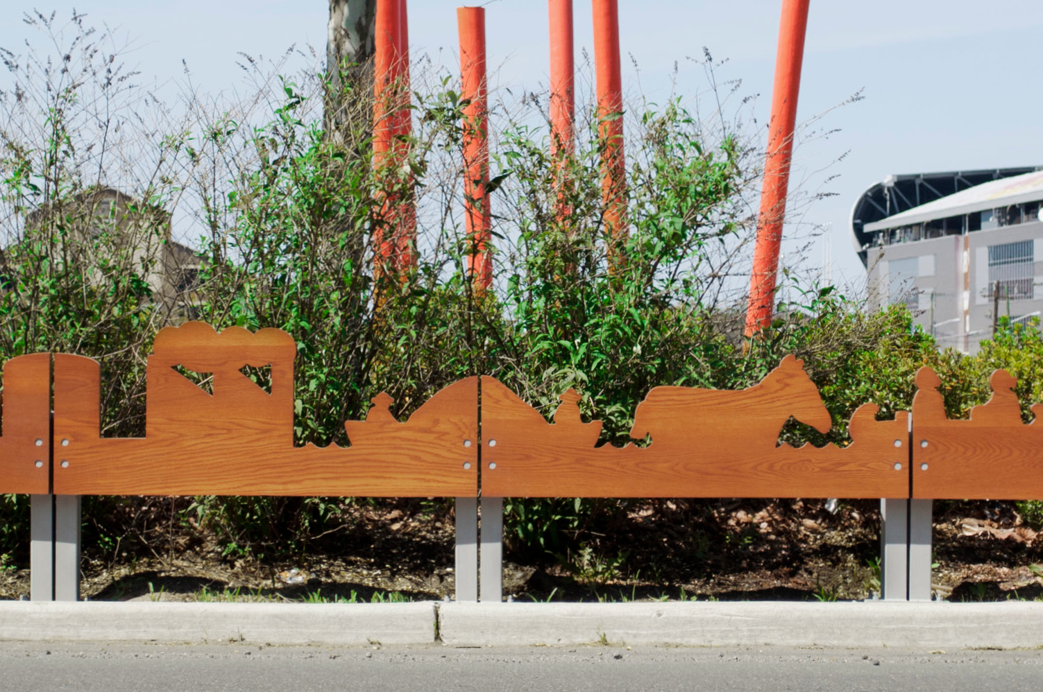
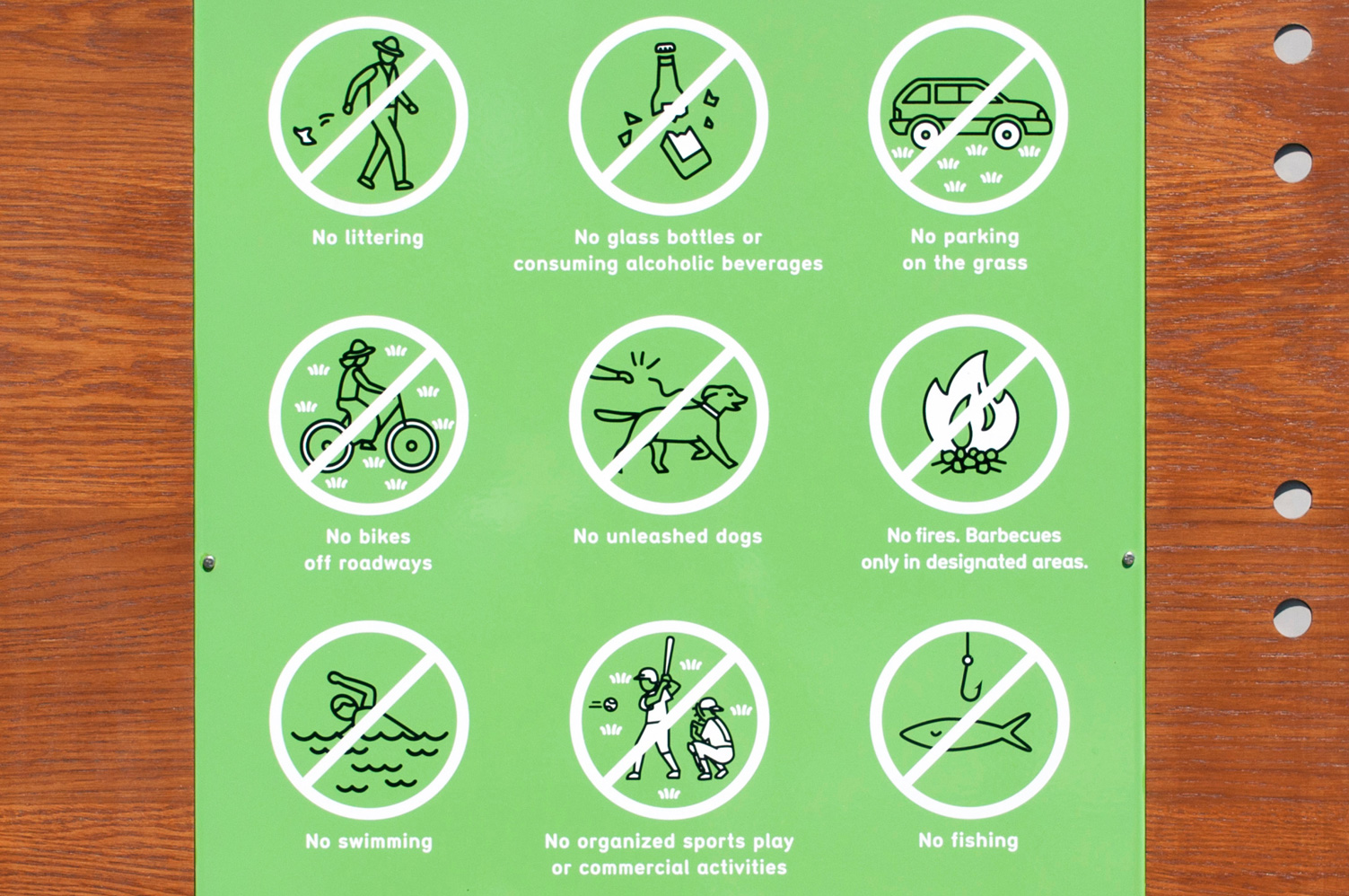
There are four types of signs: the vehicular identity signs, the pedestrian wayfinding signs, the park rules signs, and the welcome rails. (1) The carved, wooden welcome sign demarcates the park’s main entrance; upon closer inspection the sign shows Newark Riverfront Park and other green spaces within the city’s neighborhoods and wards, featuring illustrations of key landmarks that help viewers situate themselves in relation to the map. (2) The jumbo, tactile wayfinding signs likewise greet visitors and situate them within the park and the city, highlighting key features of LWLA’s landscape design, such as the river-watching lawn, the orange sticks, and the recycled plastic boardwalk. (3) The enameled steel park rules signs are mounted on wooden railings at the entrances, and use a system of custom, two-color icons to share the regulations with visitors. (4) At the entryways, carved welcome rails feature large figurative icons, foreshadowing the environmental stories the park’s interpretive signs tell inside. They act as a visual shorthand evoking the eclectic history of the park.
MTWTF aimed to combine materials and graphics to communicate as directly as possible, and to reduce the presence of signs inside the park by locating information at entry points and using a parkesque material palette. The identity signs conjure the popular, nature-area feeling of national park or trailhead signage through rustic and graphic simplicity, letting visitors know they are entering a non-urban zone that is different from the surrounding city: a renewed landscape with post-industrial stories to share. Overall, the signs are conceived to engage the public at a human scale and to operate maintenance-free.
Client: City of Newark, New Jersey and the Trust for Public Land
Riverfront planner: Damon Rich
Landscape Architect: Lee Weintraub Landscape Architecture
Fabricator: Signs & Decal
Newark Riverfront Park interpretive signage

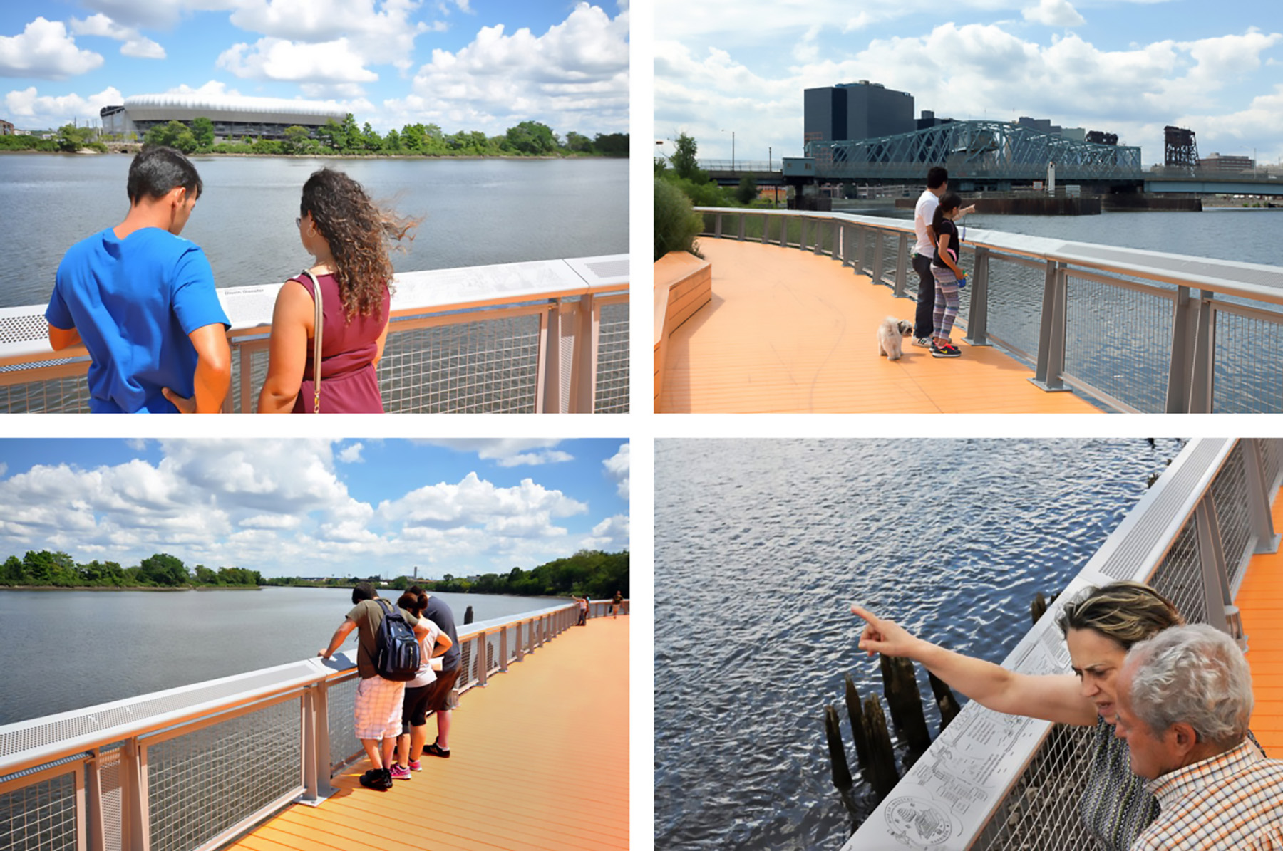
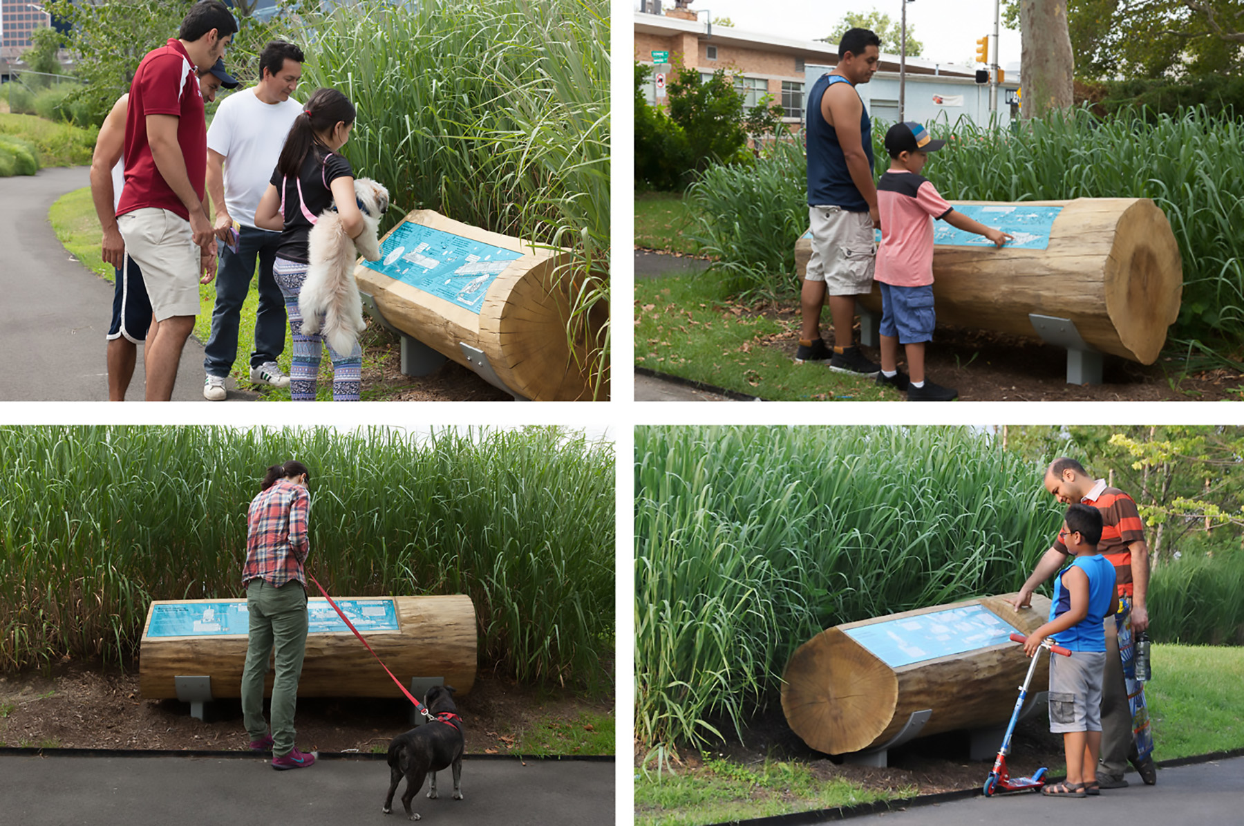
Newark Riverfront Park was envisioned as a learning/teaching park - a place where student groups, and local families, could gather to discover the past and future of the park’s post-industrial site and the river. MTWTF was charged with relating these site-specific stories through a system of interpretive signs.
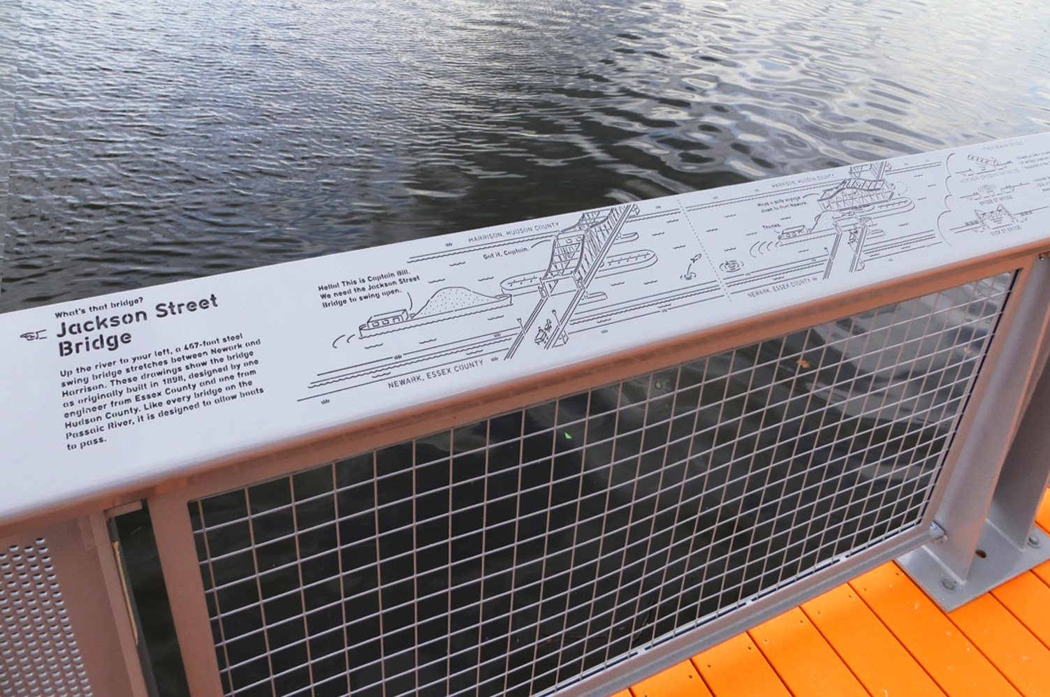
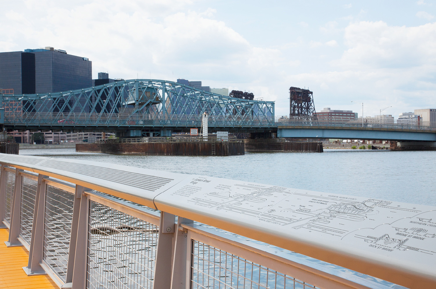
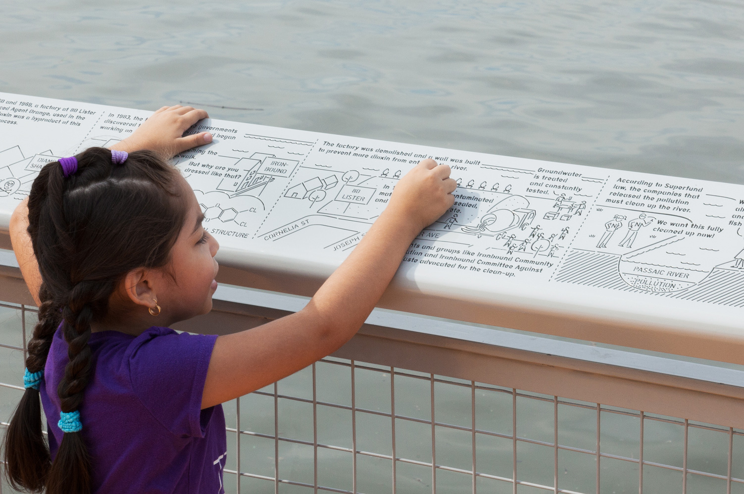
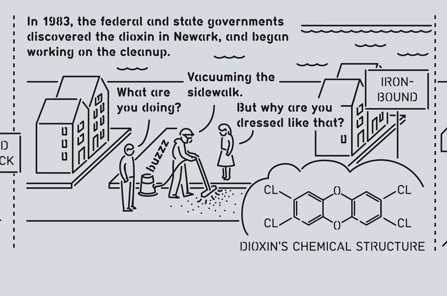
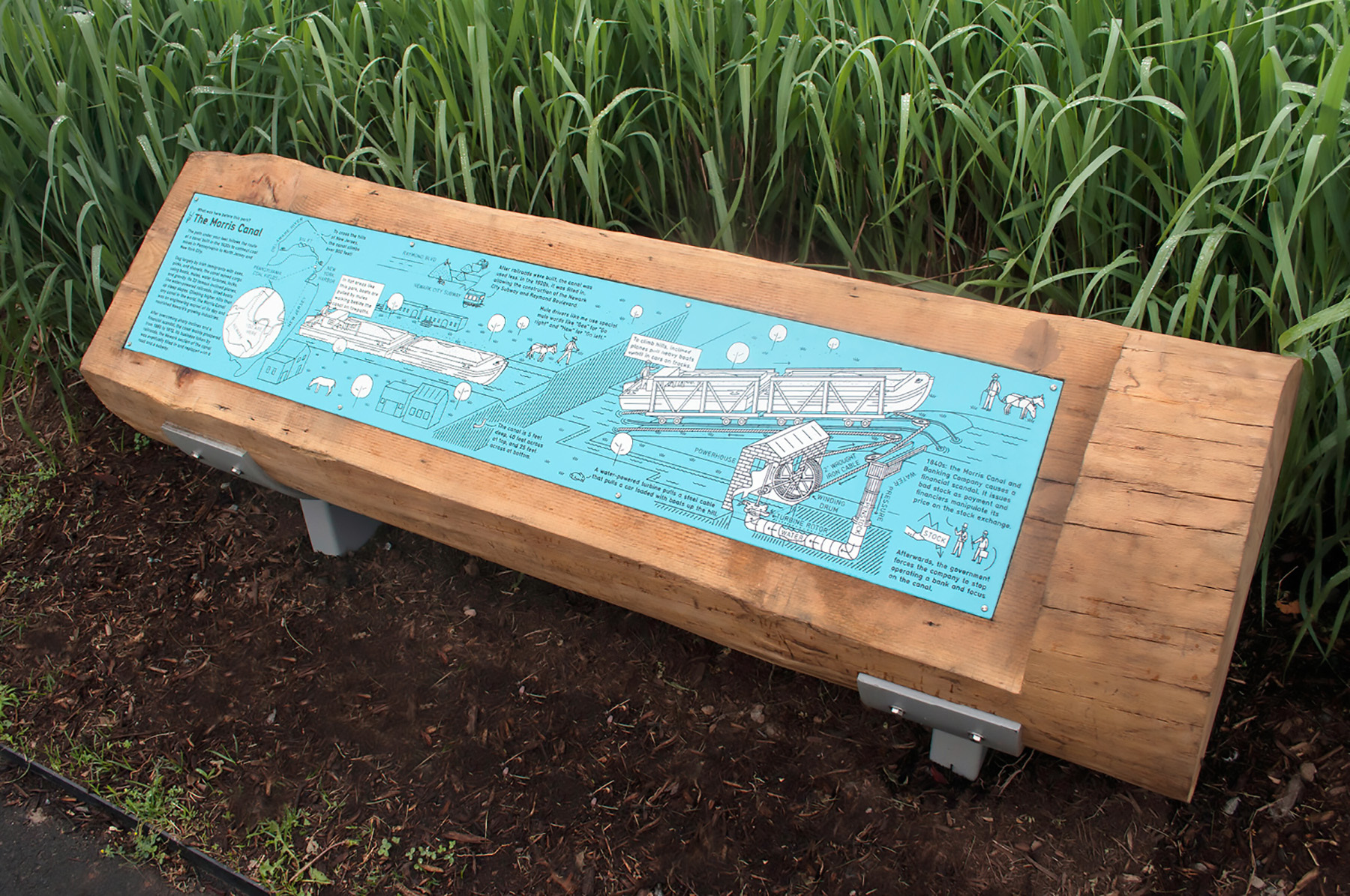
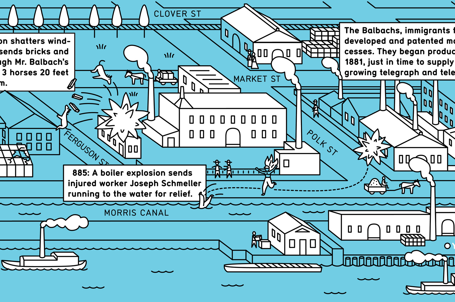
The park’s interpretive signage uses existing structures to maintain a small footprint whenever possible. There are two types of interpretive signs: waterjet-cut metal railings that run along the boardwalk at the river’s edge and blue enamel signs mounted to logs and positioned in view-specific locations. (1) The railing graphics are stencil-cut through the tops of the steel railings and each of the six panels describes something the park visitor can see from where they stand: the story of Harrison New Jersey’s industrial shoreline just across the river, the way the Washington Street Bridge functions, the evolution of Newark’s Combined Sewerage Outfall system emptying from underneath the boardwalk, the story of the Diamond Shamrock Dioxin Disaster which occurred a half-mile downstream, the fishing practices of the Lenape Tribe whose livelihood was deeply connected to the river, and a guide to the indigenous wildlife gradually returning to the area. (2) The enamel signs consist of richly illustrated markers mounted on logs to create additional site-specific narrative moments within the park; these explain vignettes such as the community groups’ fight for Riverfront Park, the Smelting Plant which used to occupy the site until the turn of the century, and the Morris Canal which ran along Raymond Boulevard.
The signs’ stories are conveyed through pictorial means, making them more accessible to Newark’s multilingual population, especially children. The need for strong visual elements that would require little or no maintenance led MTWTF to develop graphic systems optimized for specific manufacturing techniques. MTWTF’s intention was to create a “talking park”, one that tells its many tales in an immediate and appealing language.
Client: City of Newark, New Jersey and the Trust for Public Land
Riverfront planner: Damon Rich
Initial Illustration Styles: Marion Bizet
Fabricator: Signs & Decal
Newark Riverfront guide

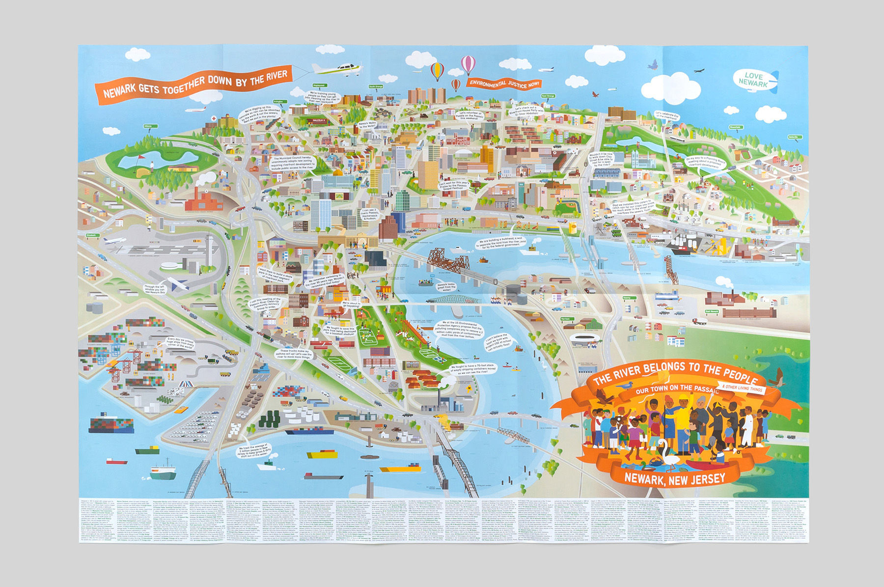
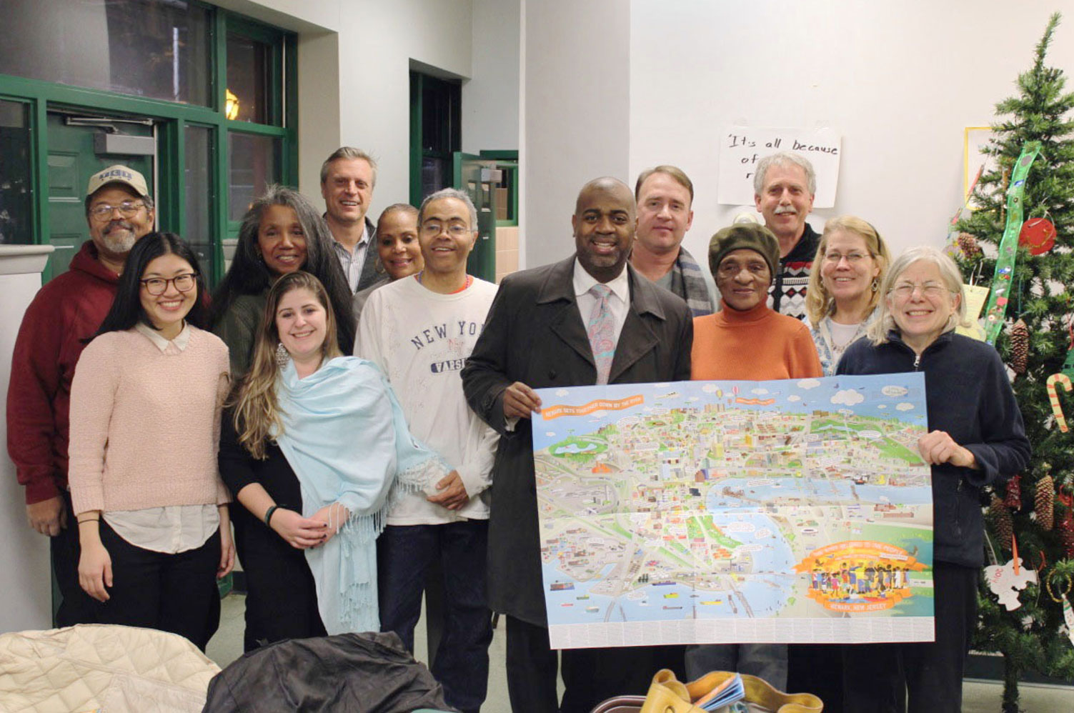
MTWTF and design studio Hector created the Newark Riverfront Guide for the city’s planning office to support and extend Newark Riverfront Revival’s efforts to inform and involve Newarkers in the revitalization of the riverfront and city. The guide brings together the insights and knowledge of dozens of citizens and local experts in an accessible, visual format meant for people of all ages and backgrounds.
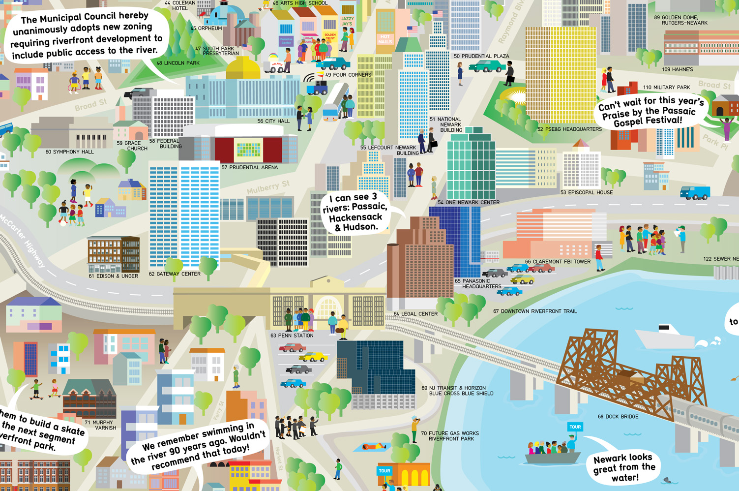
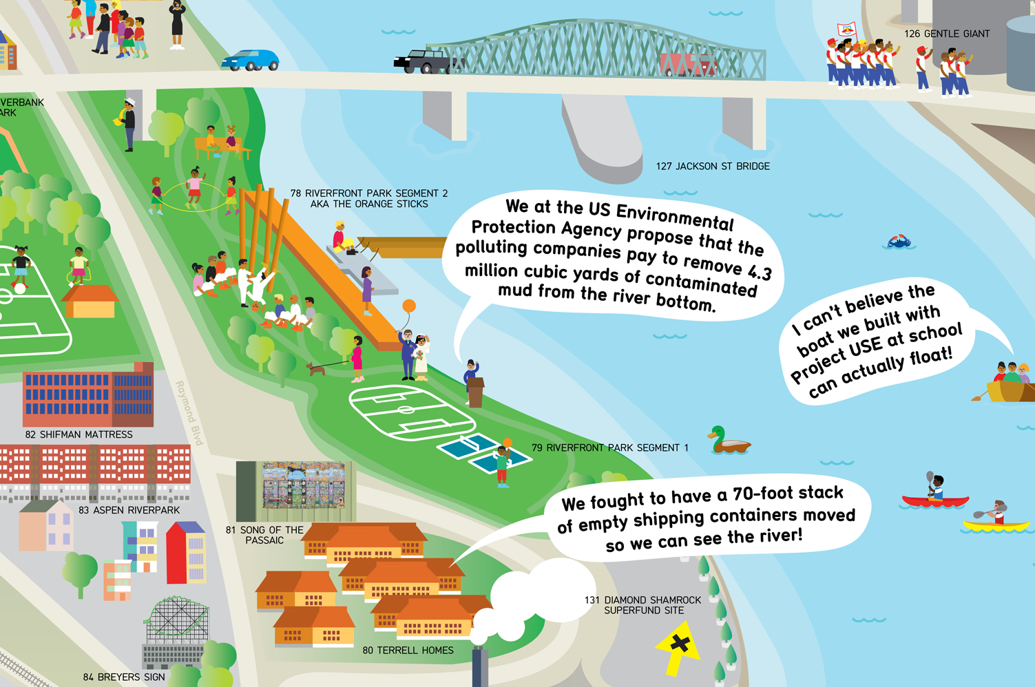
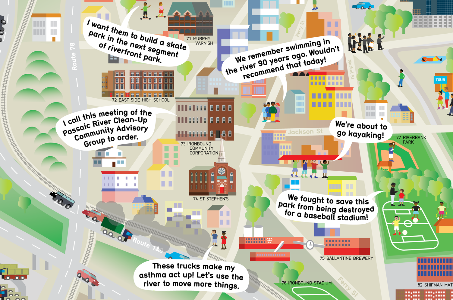
The Newark Riverfront Guide is designed to be used as both a booklet and a set of graphic posters, to be unfolded and shared. The Guide’s posters include (1) an illustrated history of Newark’s Passaic riverfront, (2) an environmental briefing about the current state of the river and efforts to revitalize it, (3) a map showing the city’s plan for more riverfront parks and trails, and (4) a richly illustrated map of the City of Newark and surrounding areas which identifies and illustrates 164 noteworthy buildings, landmarks and infrastructure around the city. The speech balloons and written descriptions of each place allow for quick reading at a glance while rewarding closer study.
Conceiving the publication as a “people’s guide” (by the people), rather than a “top-down communication” (from the city government, for the people), allowed the participatory process of gathering information and reviewing illustrations to bolster community links and help shape the content. Throughout the project, all elements were made as visual and identifiable as possible, contributing to the guide’s pragmatic and optimistic tone. Since the guide is meant to foster a new, shared mental map of Newark and its Riverfront, it’s important that it speak as broadly and to as many people as possible.
The map is an amalgam of many Newarkers’ memories and preferences. MTWTF and Hector employed numerous strategies throughout the process to make it communicative and intelligible. For instance, picturing the city from the Northeast, across the Passaic, allows readers to see Newark’s integral relationship with its waterfront, and rendering the buildings’ and structures’ most prominent view as a modular visual system led to the creation of an extensive family of illustrations which residents could recognize and feel connected with.
To date 5,000 copies have been distributed through schools and local community events.
Client: City of Newark, New Jersey and the Trust for Public Land
Riverfront planner: Damon Rich
Illustration guidelines: Marion Bizet
Printer: Masterpiece Printers
