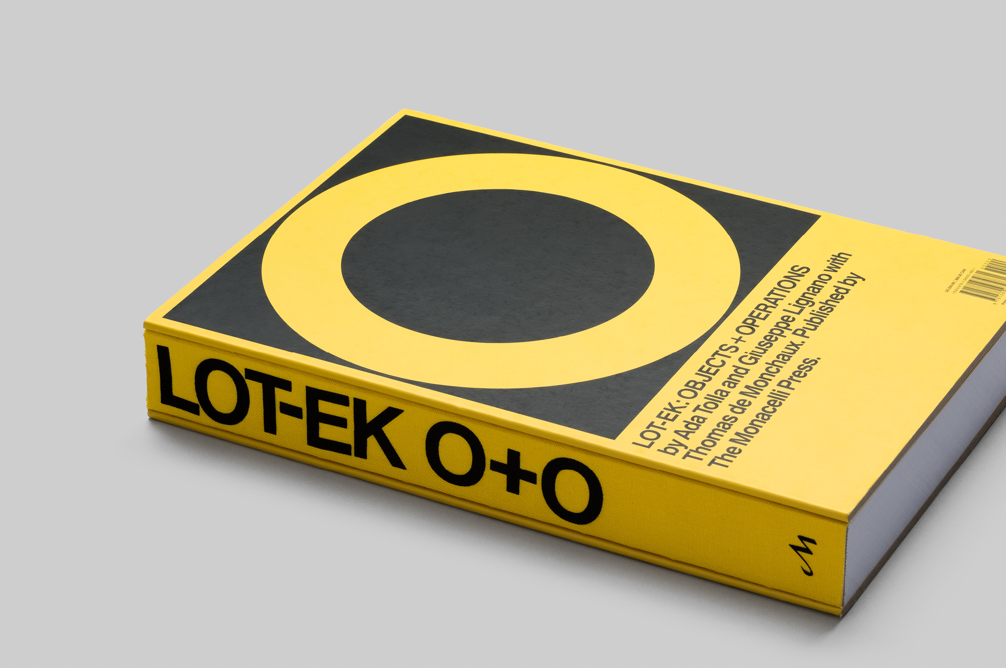
Objects+Operations
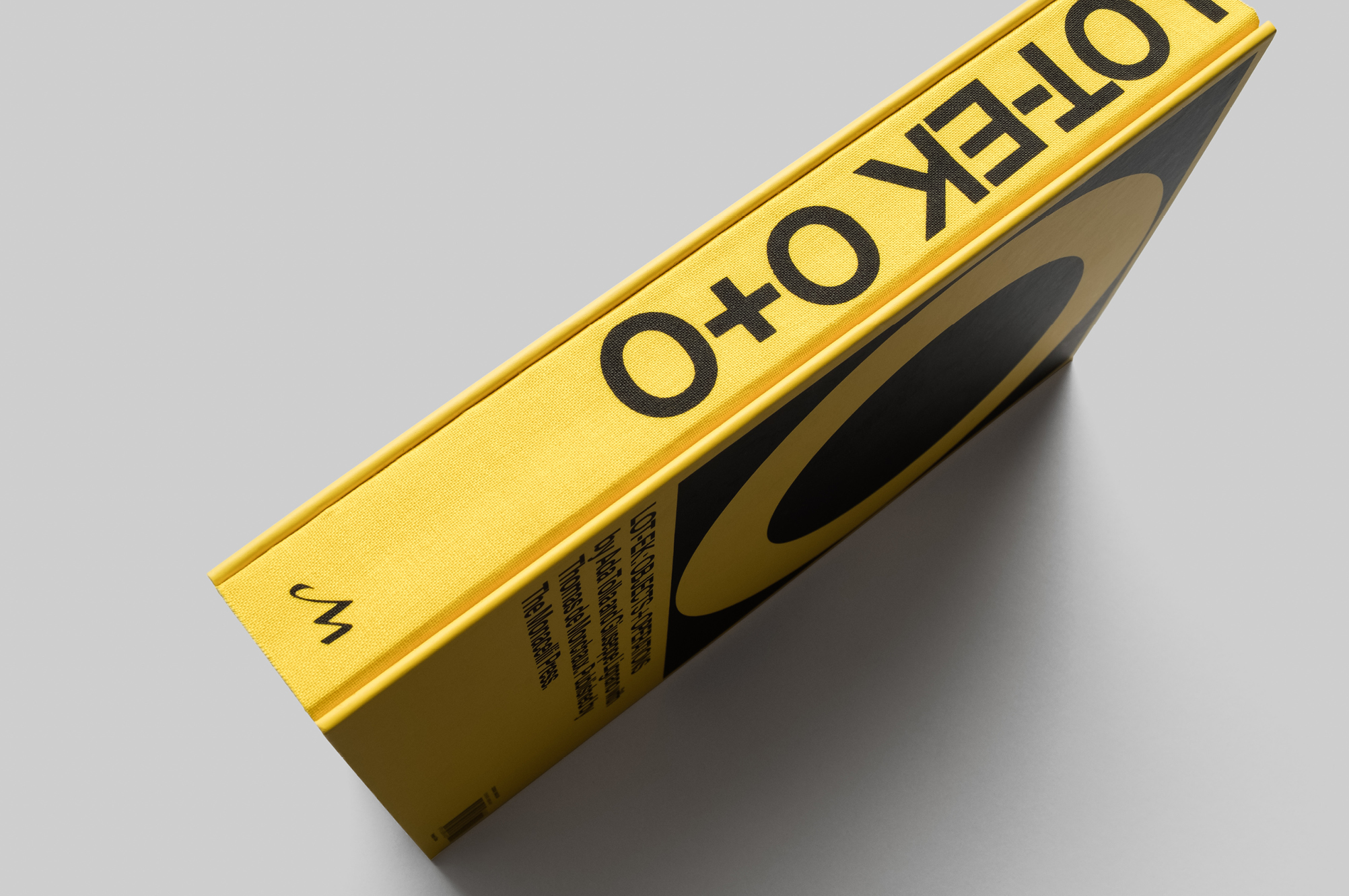
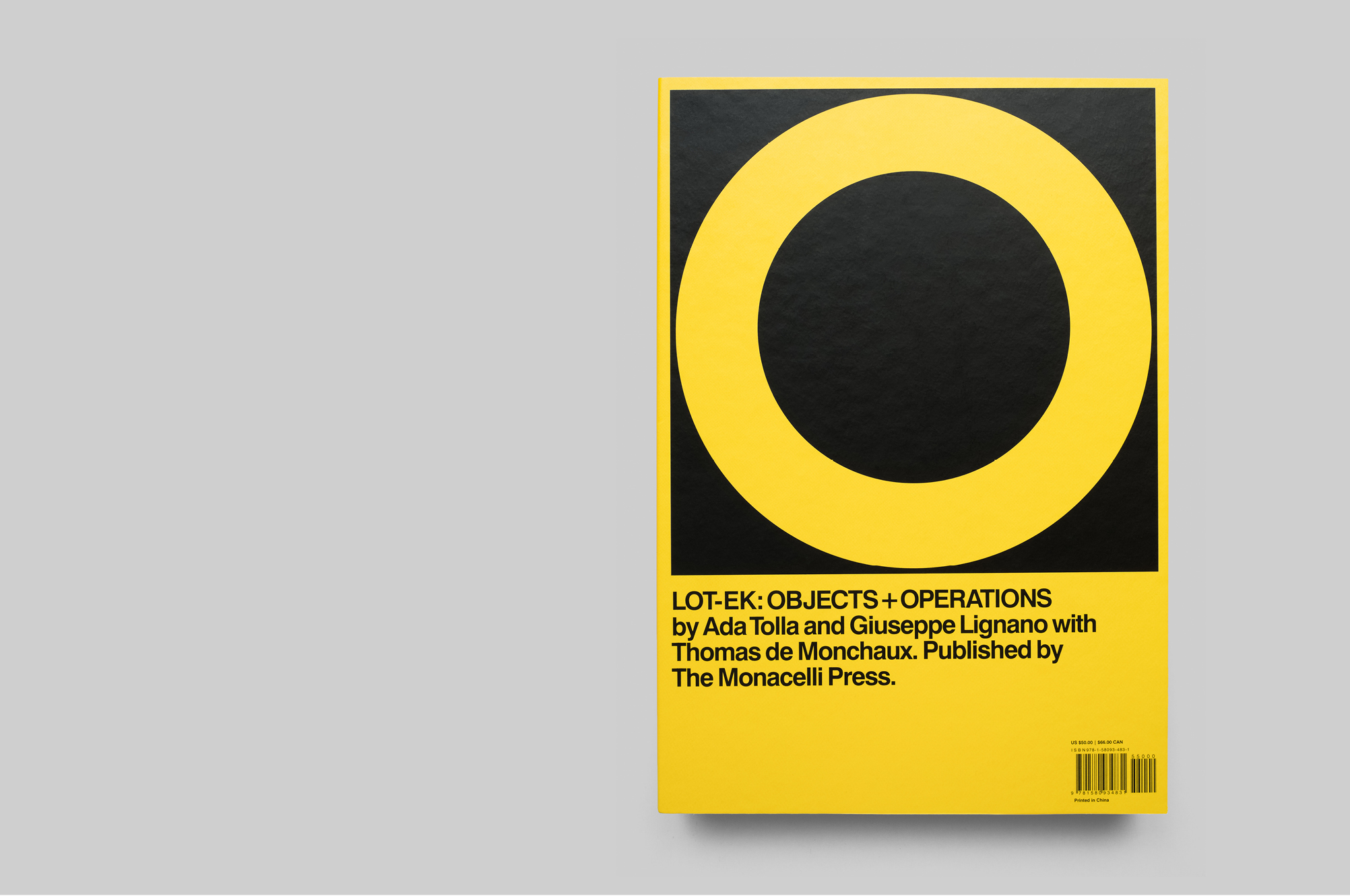
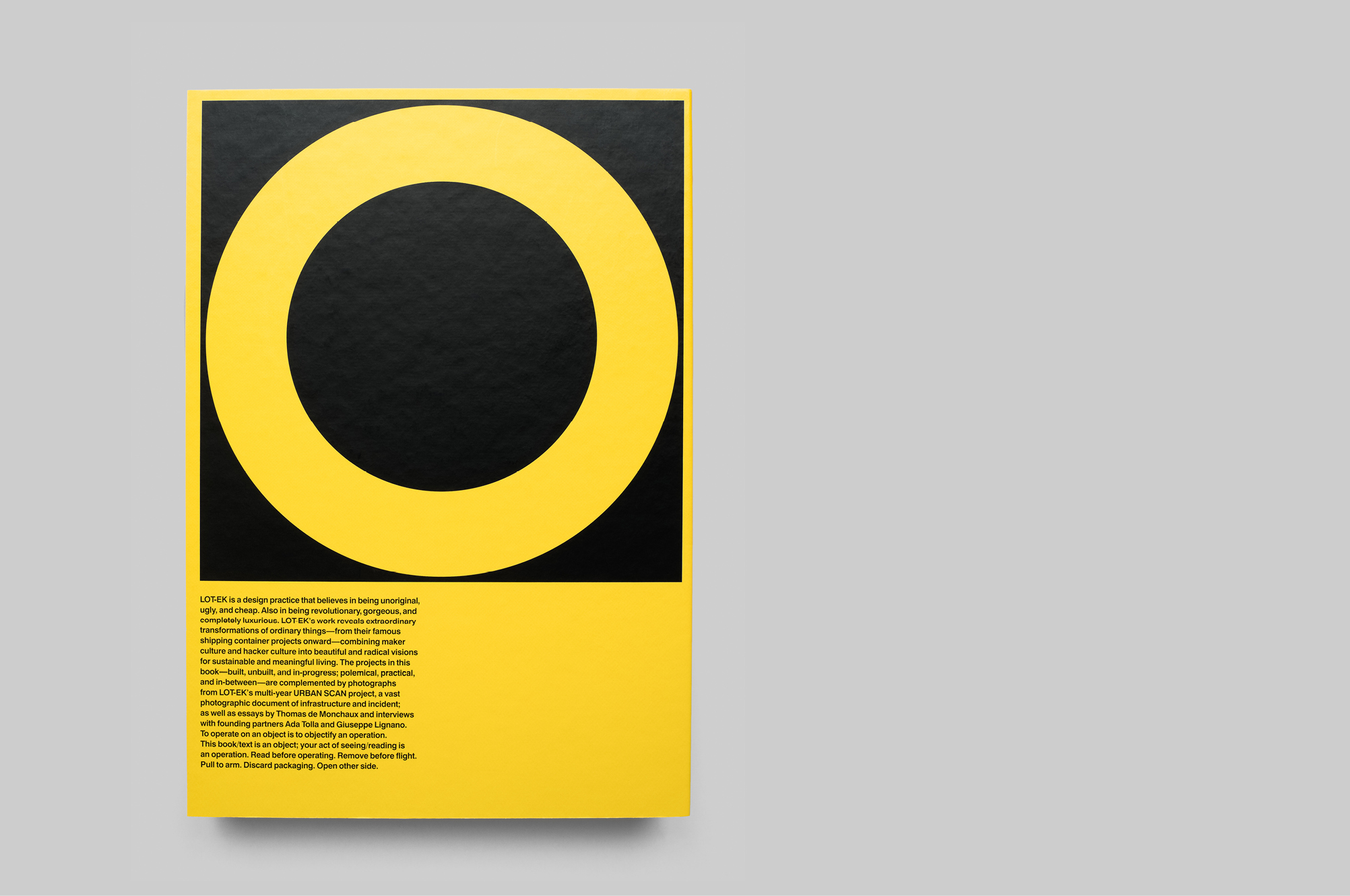
Monacelli Press’ “LOT-EK: Objects+Operations" is the studio's first major monograph and their first publication since Lawrence King Publishing's "Urban Scan A-Z” in 2002. “LOT-EK: Objects+Operations" presents the work of NYC architecture studio LOT-EK - led by founding partners Ada Tolla and Giuseppe Lignano. LOT-EK is best known for its internationally celebrated projects that use repurposed shipping containers as a raw material. Although their shipping container work is most often cited, the studio's work takes inspiration from industrial materials of all sorts — from stacked drywall to stacked concrete septic tanks. Their projects utilize everything from airplane fuselages to road cases, transforming these industrial materials into signature structures and spaces.
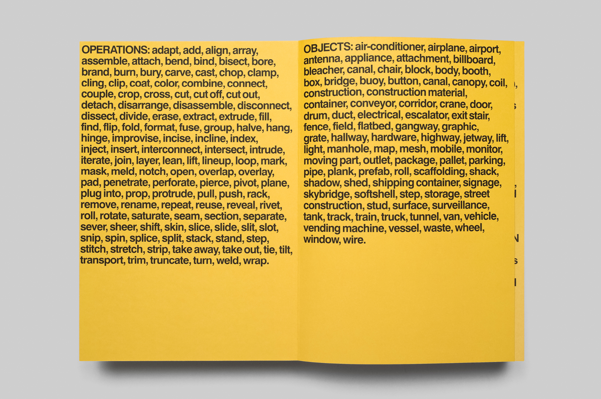
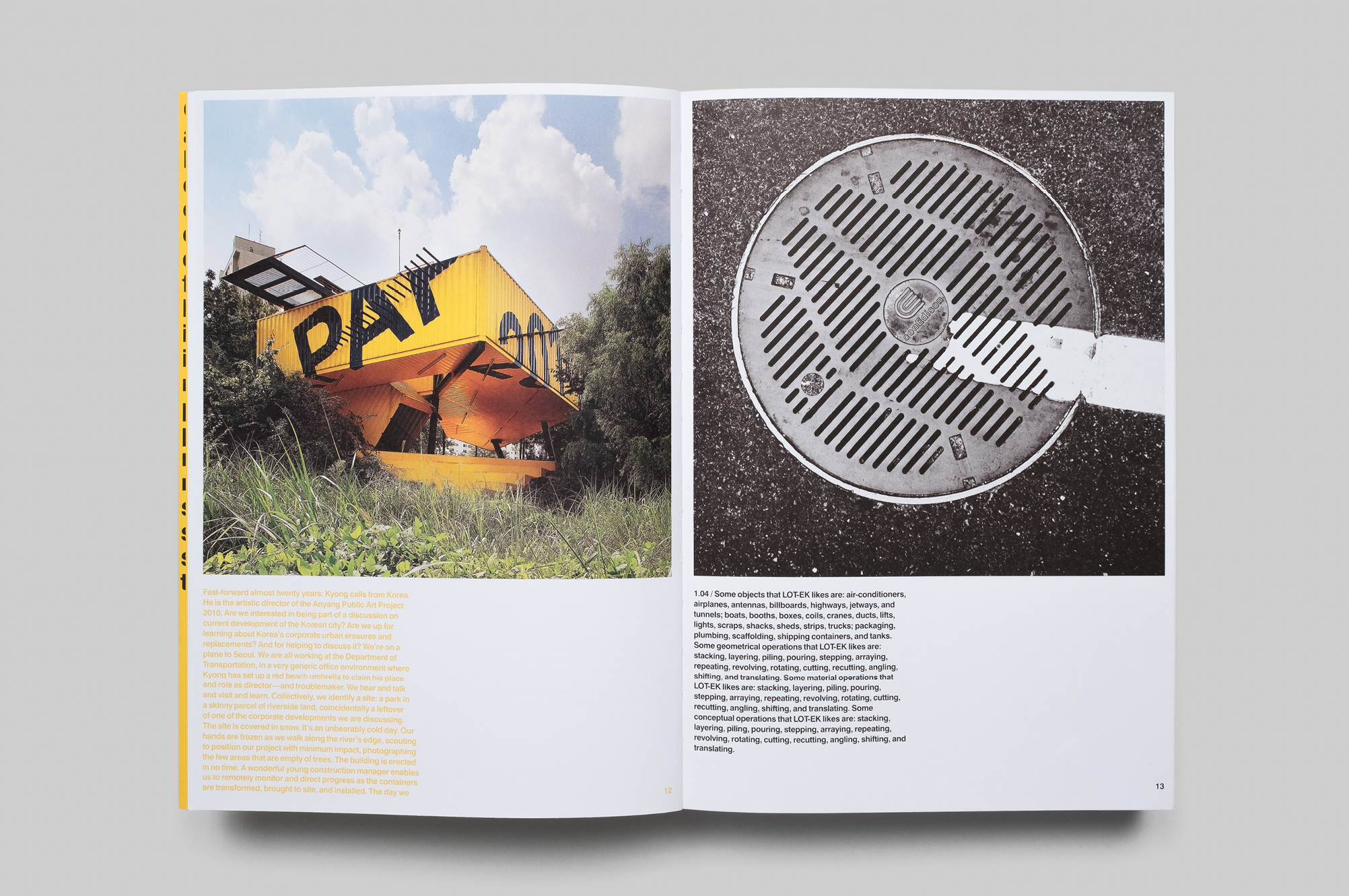
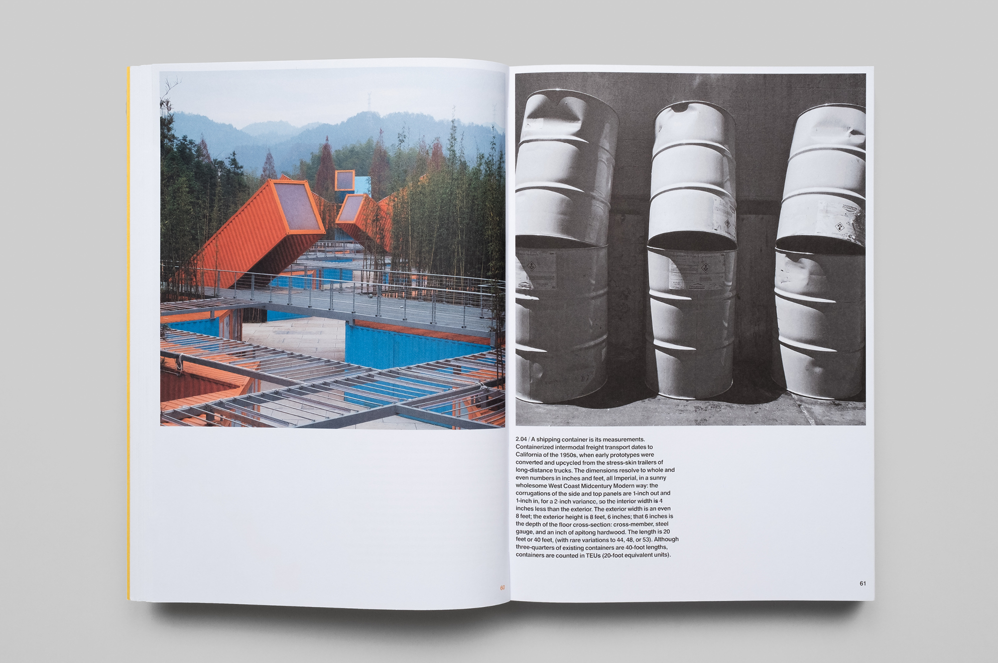
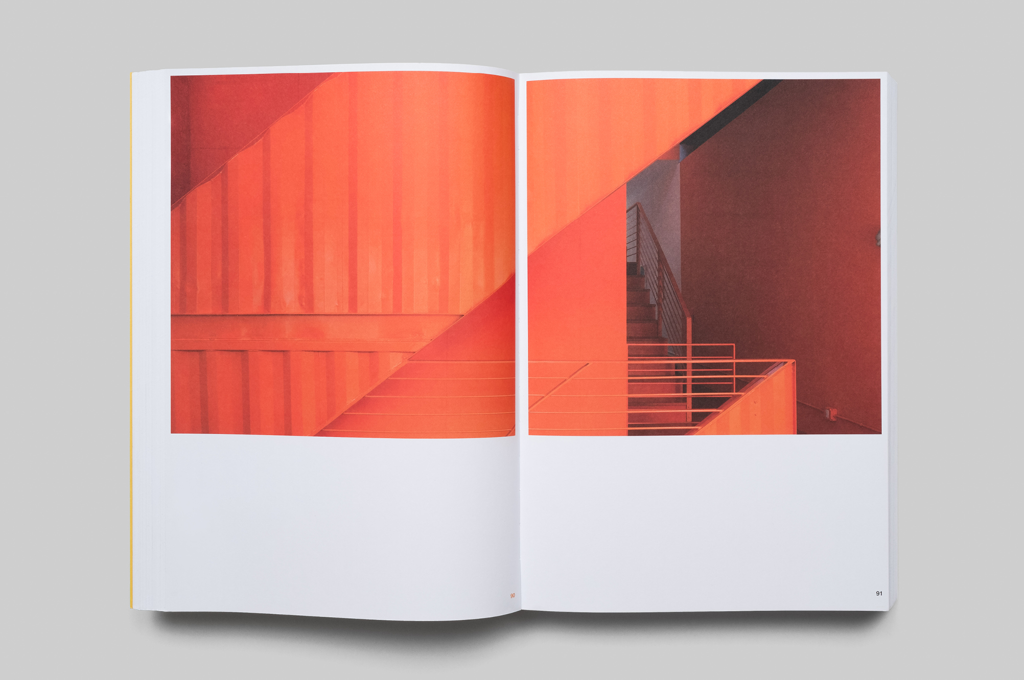
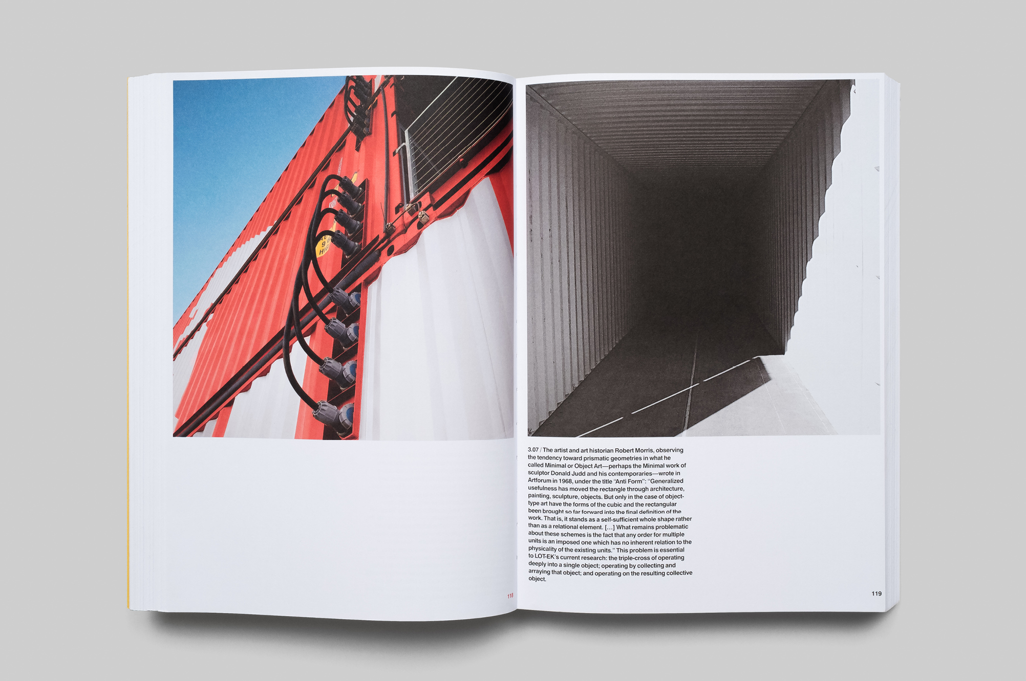
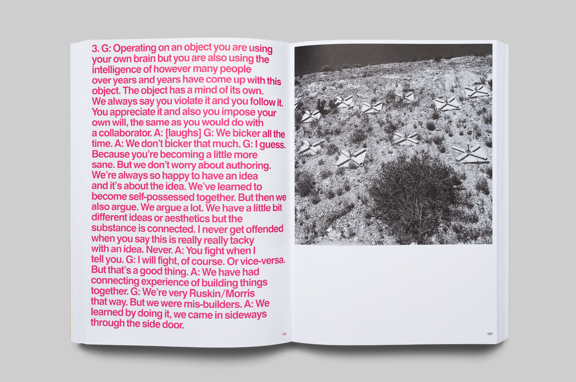
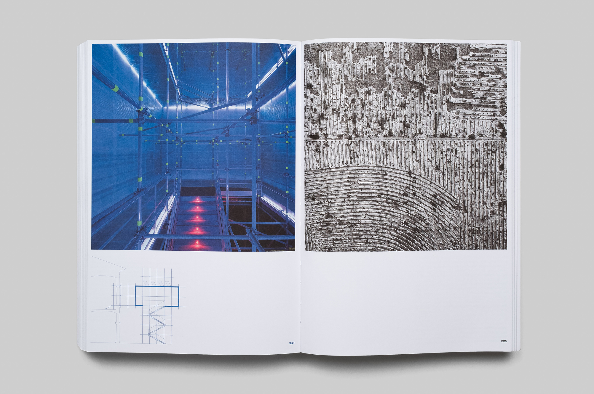
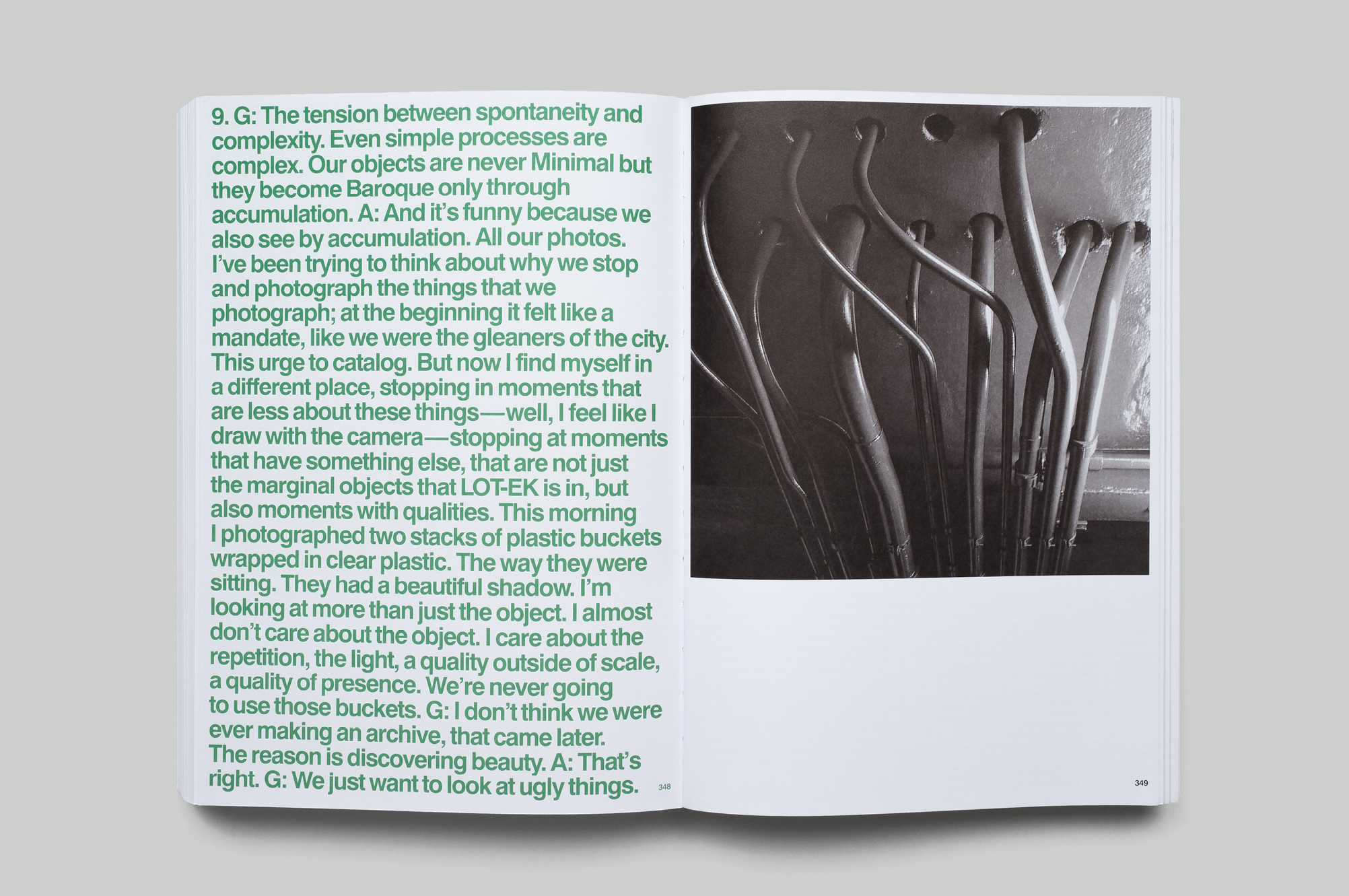
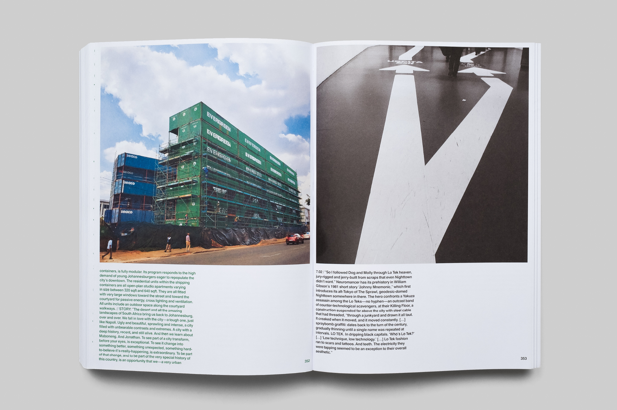
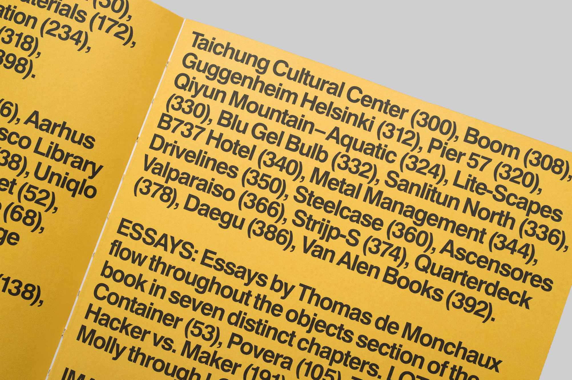
“LOT-EK: Objects+Operations” presents two concurrent narratives, one on the left-hand pages, one on the right. On the right, the studio’s built, in-progress, and unbuilt projects are organized by color, beginning and ending with yellow. On the right, excepts from the ongoing photography project that Tolla and Lignano refer to as "Urban Scan” are presented as black and white photographs. Studio projects are captioned with project descriptions while the Urban Scans are framed by essays by LOT-EK collaborator Thomas de Monchaux. These parallel sequences — of projects and photographs — create poetic juxtapositions by pairing elements of industrial landscapes with the the studio’s work.
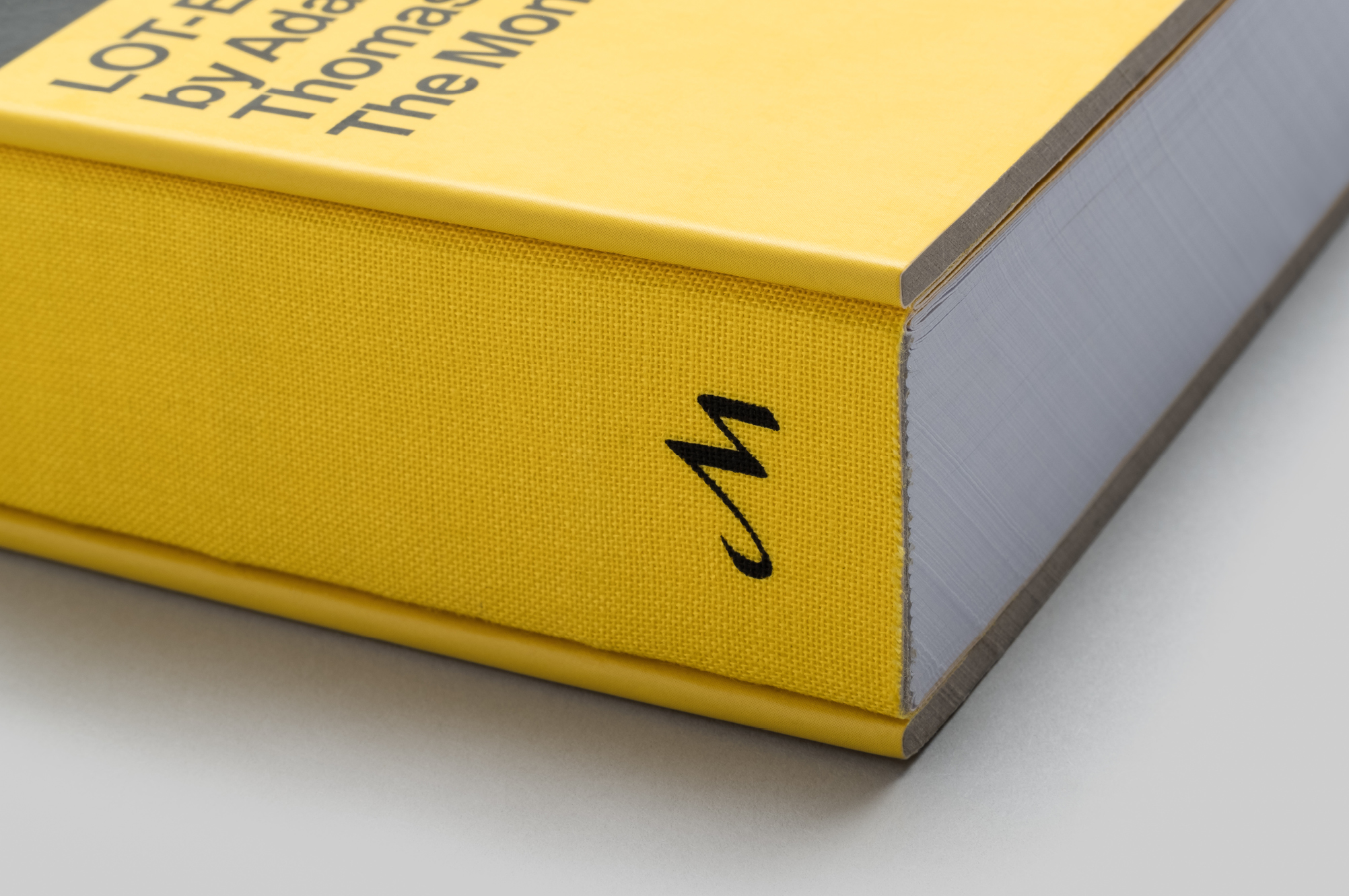
The “Verso vs. Recto” structural conceit of the publication is reinforced by a spare approach to typography in the middle in deference to the unique juxtapositions of the publication's two independent image sequences. Bold typography in the front and back matter of the publication ground the sequences and reinforce the progression of colors from yellow to a range of vibrant colors and back to yellow. As an object, this sizable text block is glued to a two piece binding with a silkscreened cloth spine, whose top, bottom and fore edge are trimmed after binding to give the book an industrial feel. This also allows the book to open precisely at the left edge, so the square image on every page is fully visible.
LOT-EK with Thomas des Monchaux
Publisher: The Monacelli Press